Aston Martin was a client with Kantar Millward Brown for some time. In 2018 I was asked to review the design of the reports that went to the client as there was a general feeling that they didn't feel "premium" anymore, the content was cluttered and the data visualisation hard to understand.
Among the many changes I made, was to source brand new images, ensuring they were high resolution, weren't out of date, and contained sufficent copy space.
Among the many changes I made, was to source brand new images, ensuring they were high resolution, weren't out of date, and contained sufficent copy space.





For the data visualisation I wanted to create a standard colour for Aston Martin that was the same throughout the document and that stood out on slides with lots of data. The original slides also suffered from way too much content, duplicate and redundant legends and commentary that came across as hard to read and cluttered. The client still wanted to see a lot of data, but was happy with the Dieter Rams less is more approach I came up with.
In this example the original design had two legends using both logos and text to identify different brands. The second legend also repeated the line colour, which took up more page space. It also wasn't easy to identify which line was Aston Martin. Using gold for the client and to signify "premium" I ensured that Aston Martin had a different line design to the other brands.
I also moved around the copy on the page. Swopping the title and subtitle around to make it more obvious what the commentary on the data was for this slide.
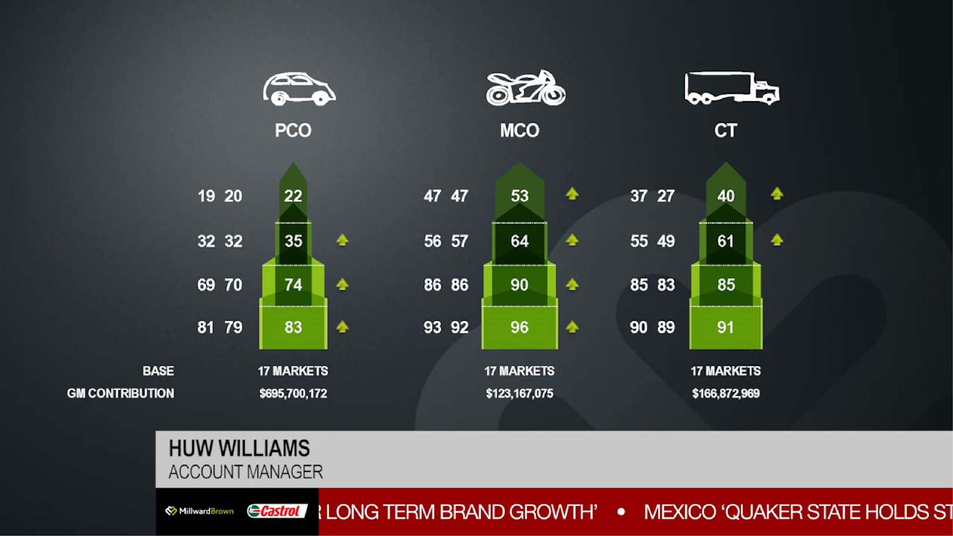
For this bar chart I made some very simple changes. The first was to reduce clutter, eliminating the arrows in the original as they didn't help draw the eye to the important takeaway data on the slide. Instead I added the red colour to draw the eye and aid the story and I lightened the grey in the other bars to lessen their impact. Headers and other text were also moved to ensure consistency.
And in this final example I made similar changes to the other slides. Introducing more white space made the data more readable and having the colour was more prominent ensured it helped tell the story better.

