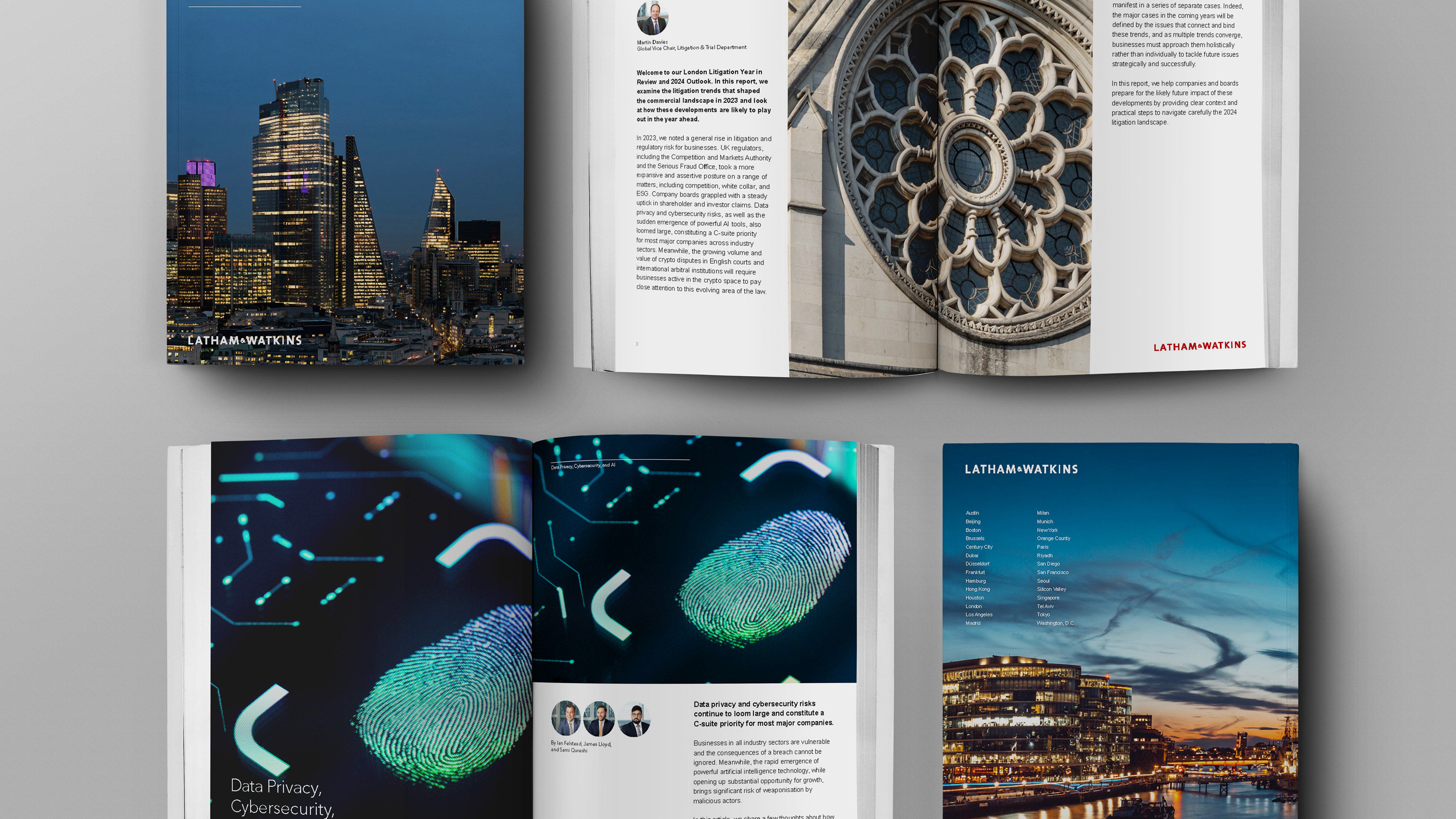
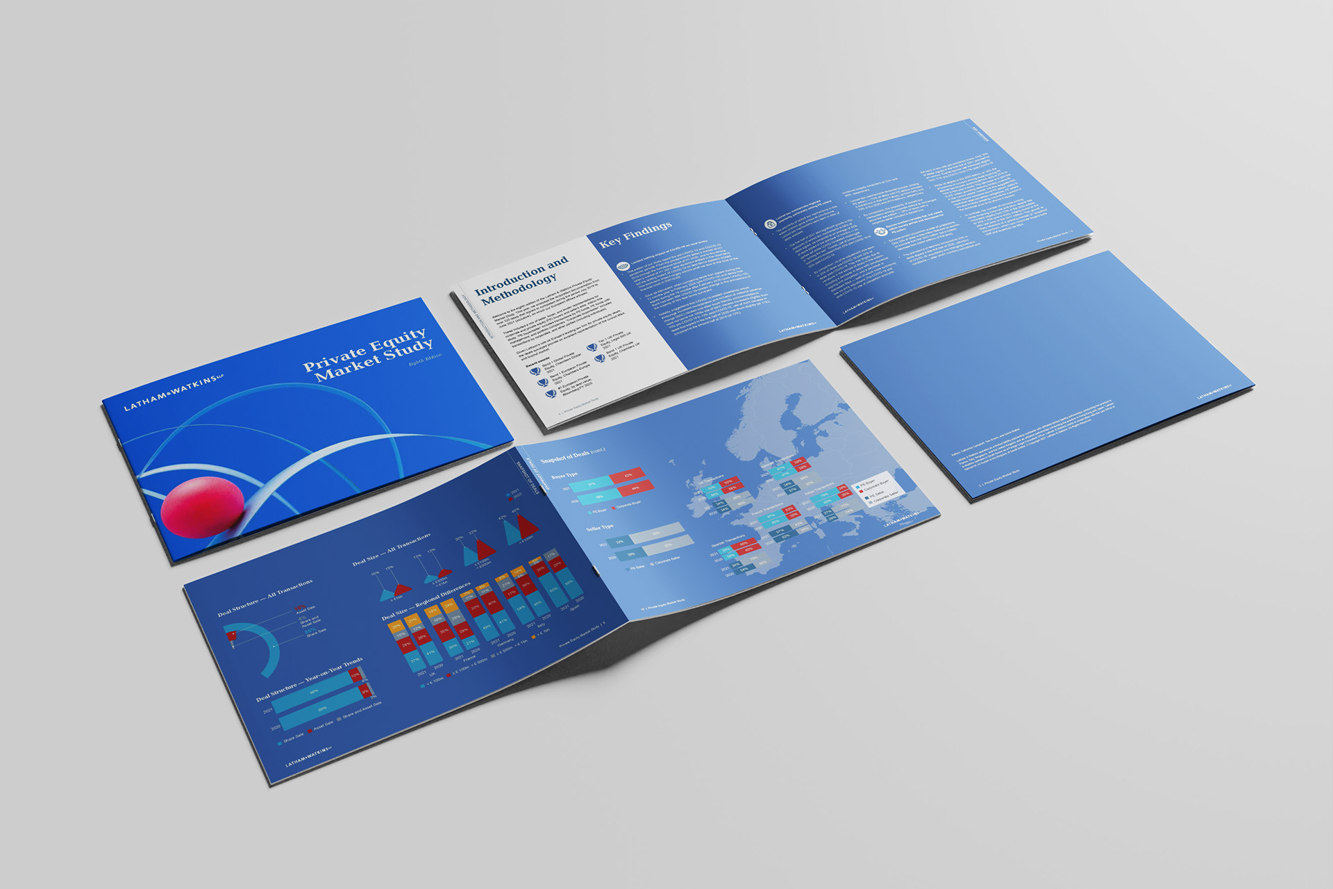
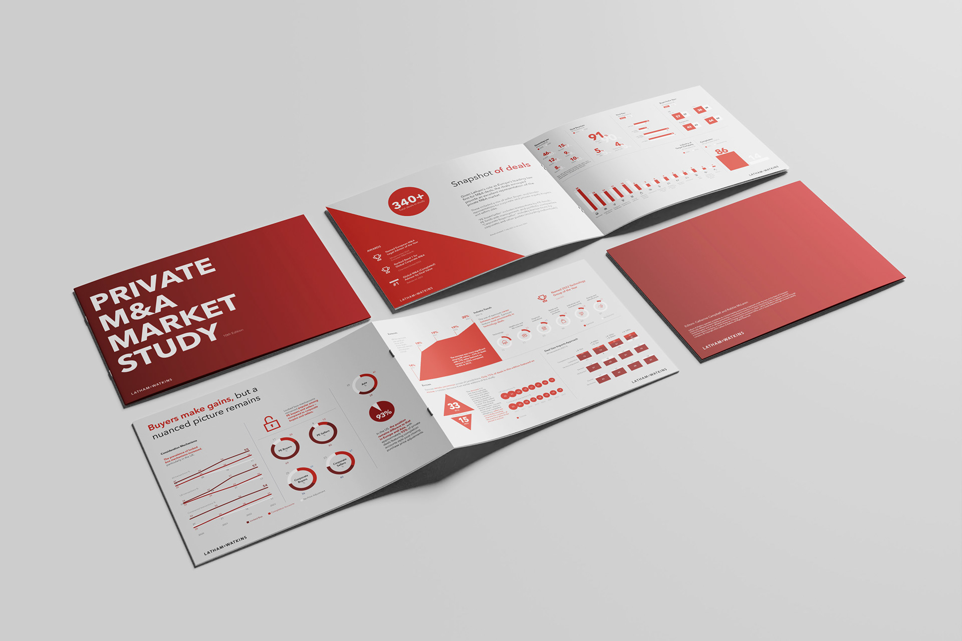
Produced for Latham & Watkins, this annual Private Market Study offers strategic insight into trends shaping private capital and institutional investment. While the research was robust, the previous year's design had struggled to support it—resulting in a dense, visually inconsistent report that diluted its impact. The brief this time was to elevate the entire experience, turning it into a confident, client-facing asset.
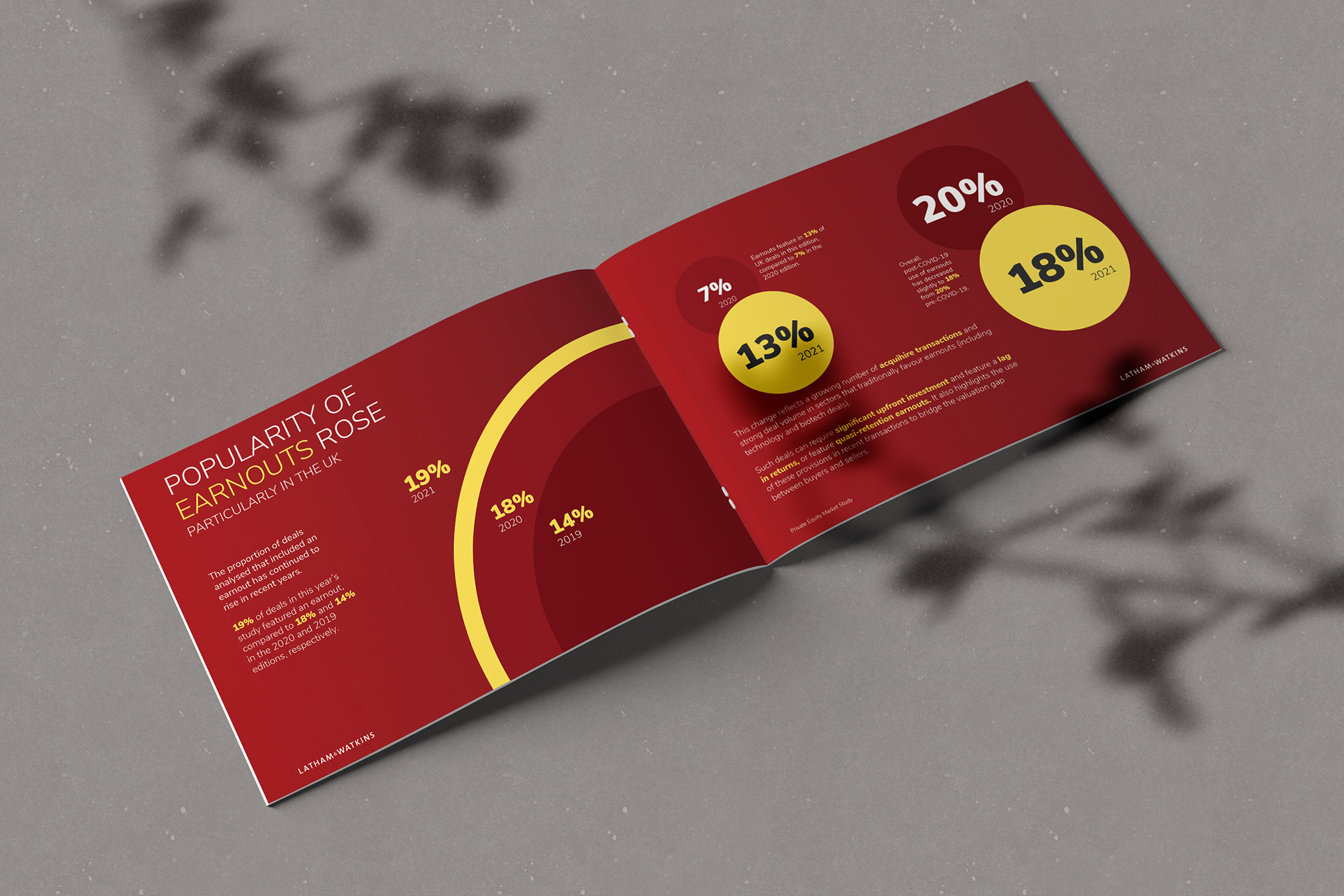
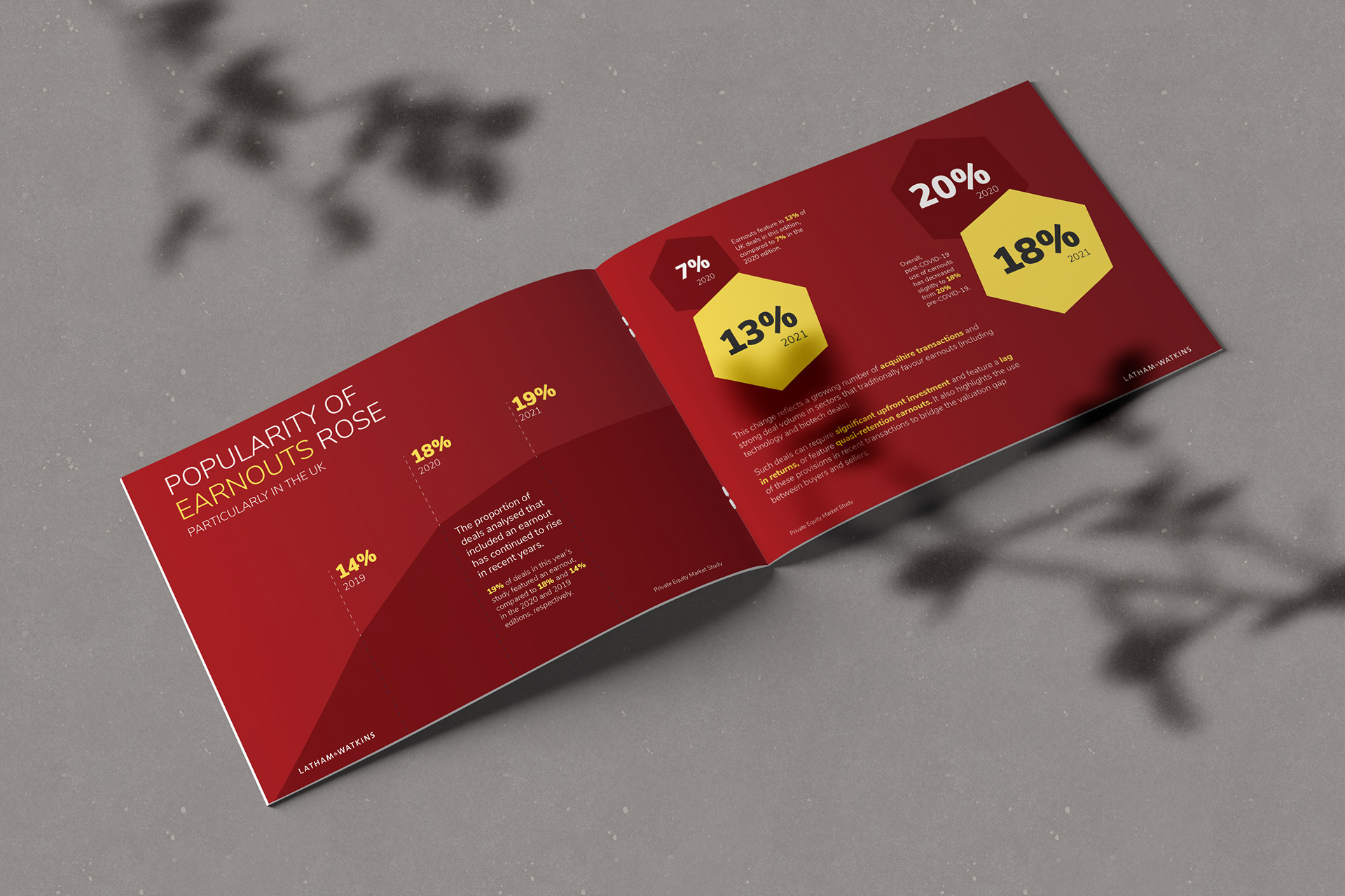
I developed a premium editorial system from the ground up—introducing a clear typographic hierarchy, structured layout principles, and visual pacing that brought clarity and flow to complex content. Charts were redrawn for legibility and cohesion, with data visualisation treated as a storytelling tool rather than decoration. Where needed, I challenged the inclusion of data that didn’t add value—encouraging the client to follow a more selective, purposeful approach in line with Dieter Rams’ tenth principle: “Good design is as little design as possible.”
The result was a report that read with ease and purpose—clear, confident, and visually assured. It reinforced Latham’s position as a trusted thought leader while demonstrating the power of considered design in turning insight into influence.
To secure partner buy-in, we invested time in demonstrating the power of well-crafted data visualisation. Through a series of design-led presentations, we showcased multiple ways to tell the same story—using bespoke iconography, a tightly controlled colour system, and initial explorations that paired data with editorial-style photography to bring added texture and context.
While the photographic route didn’t move forward beyond early concepting, it sparked genuine interest from the partners—who responded positively to the fresh, design-forward thinking. Their enthusiasm led to deeper conversations around the value of innovation in professional reporting, and gave us the space to further refine and evolve the visual approach beyond what had been originally scoped.
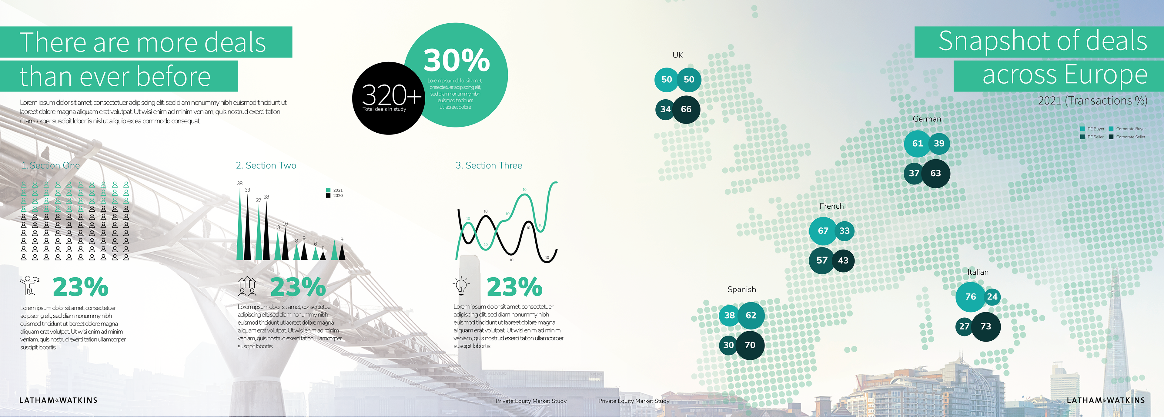
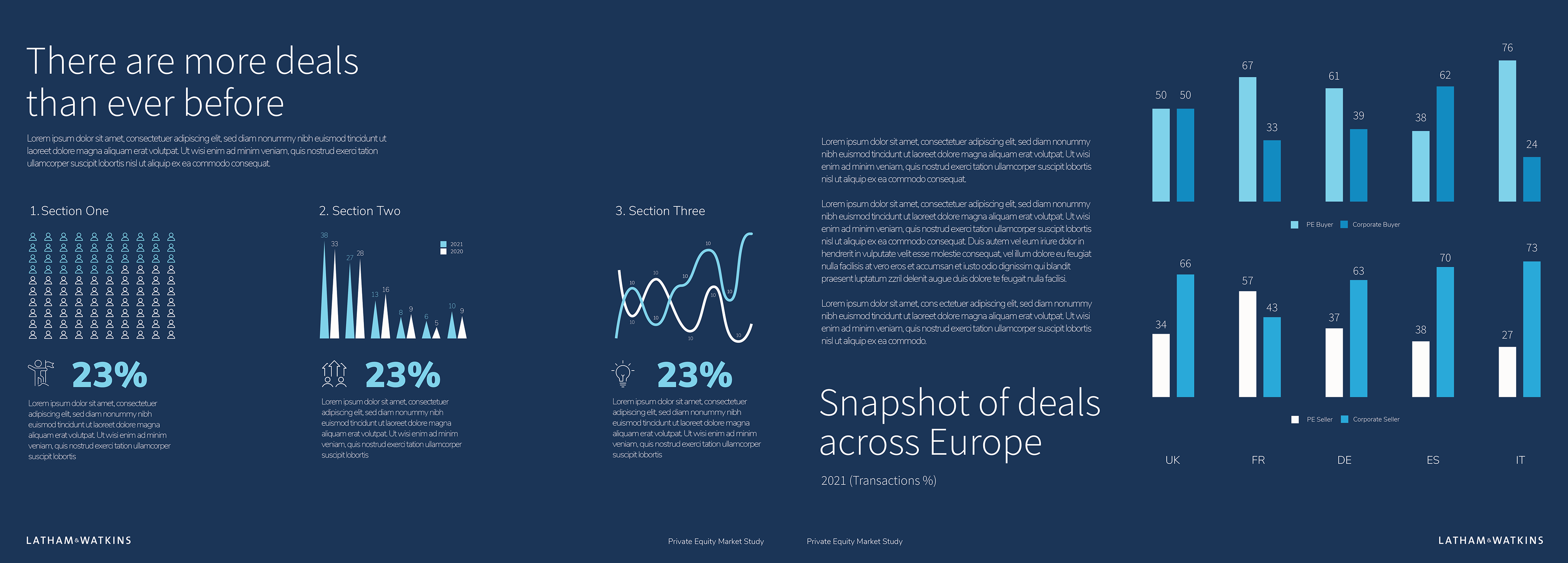
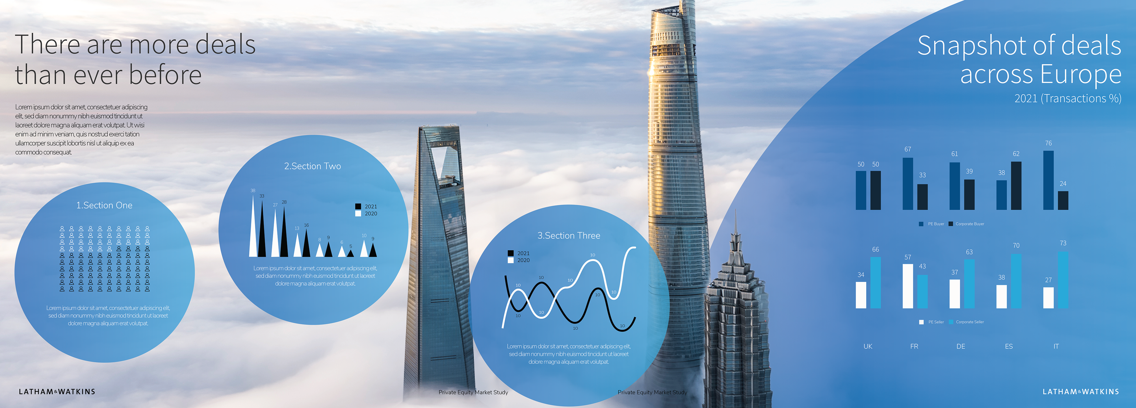
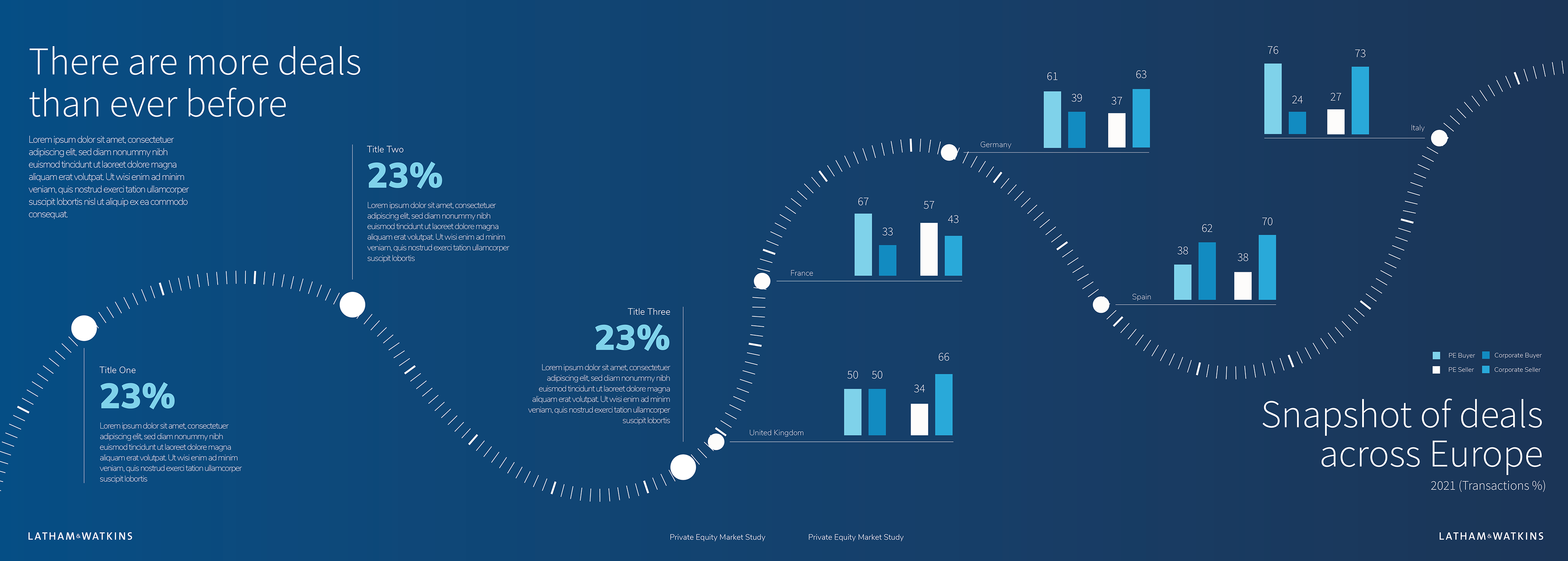
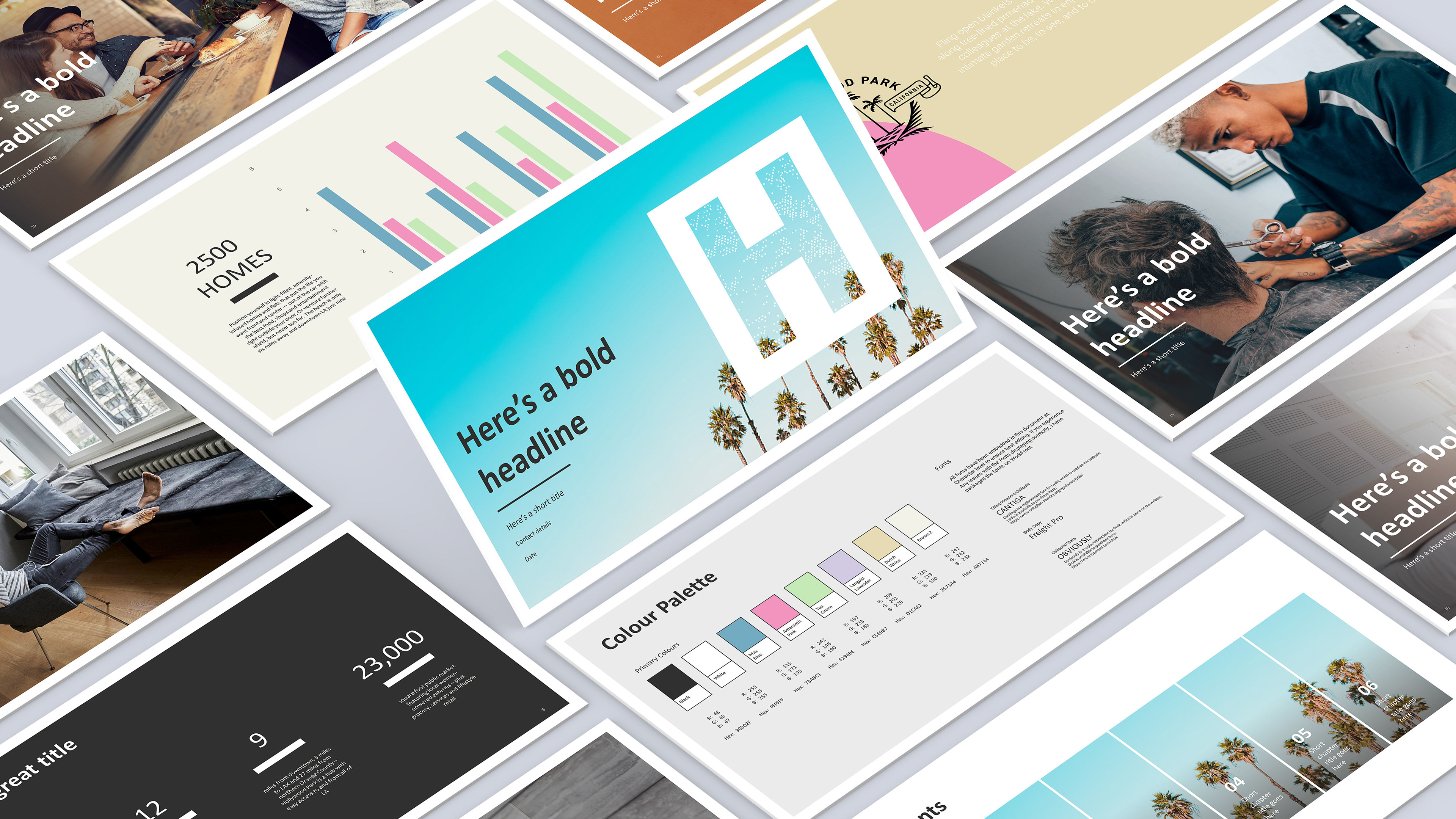
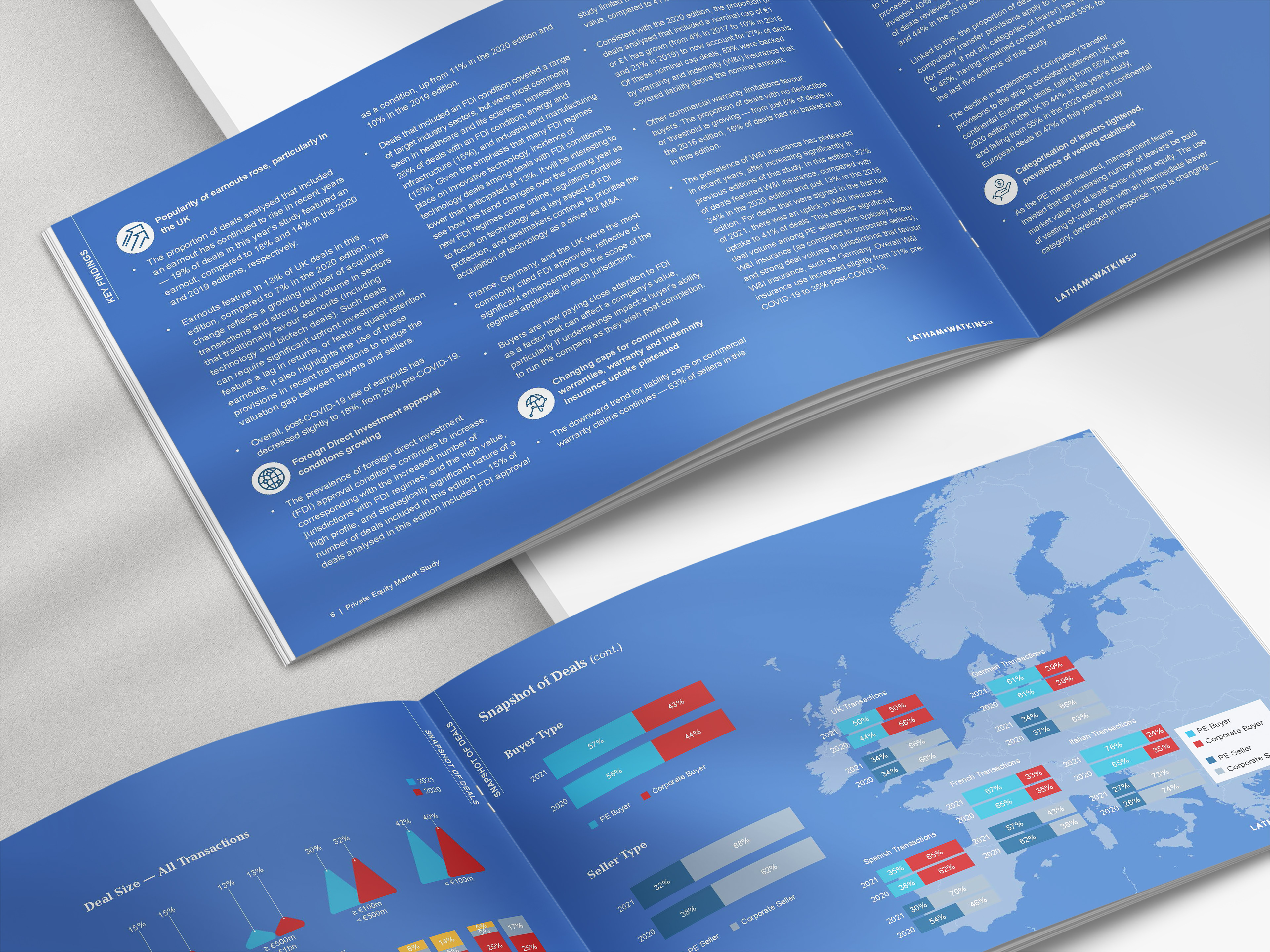
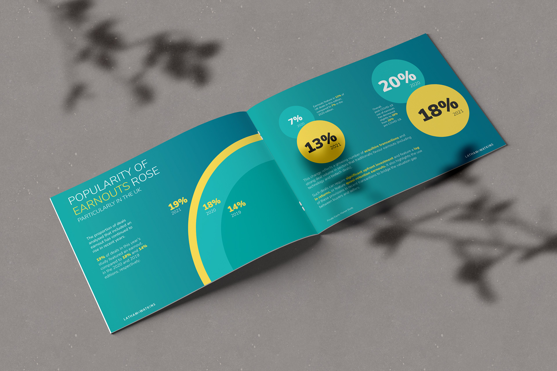
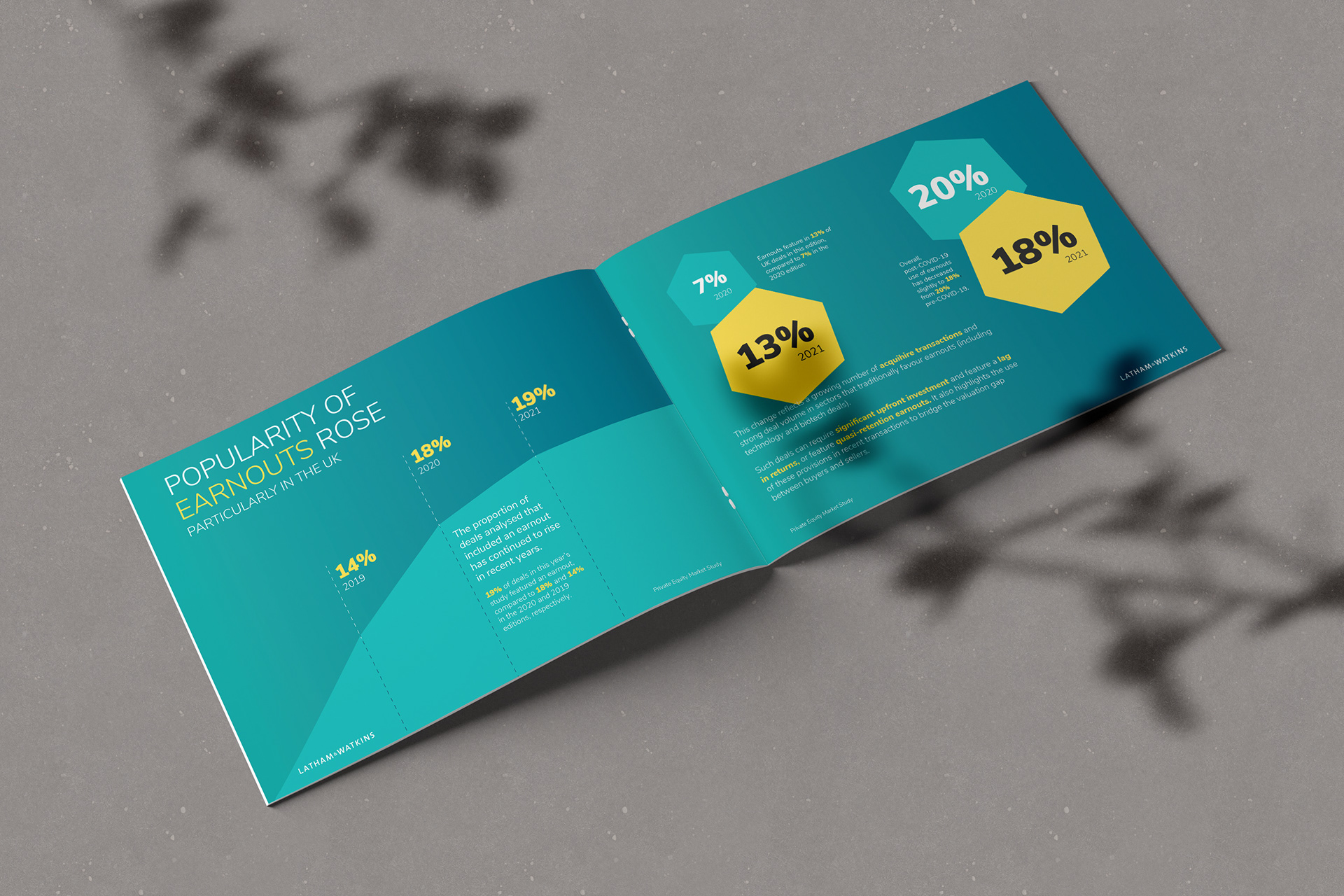
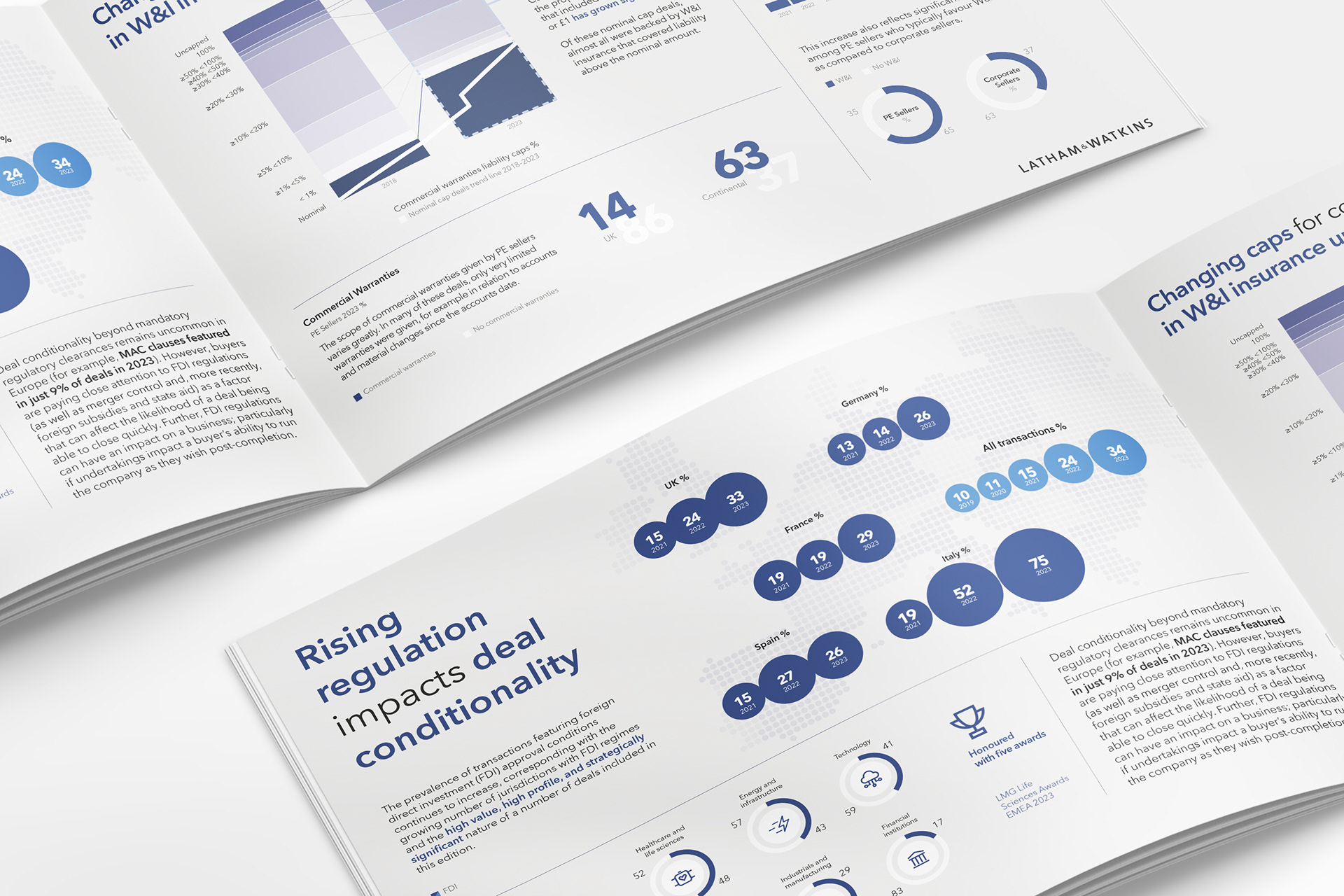
In the second round, we refined the design direction and challenged the constraints of the existing 8-page format. The team explored an expanded layout of 12 to 16 pages—opening up new possibilities for pacing, storytelling, and emphasis. The goal was to create space for key narratives to breathe, allowing critical data points to land with greater clarity and intent.
Our concepts illustrated the power of dedicating full spreads to standout insights—transforming them from supporting details into focal moments. The expanded structure not only elevated the visual rhythm of the report but enabled a more thoughtful, layered exploration of the market. It was a shift from dense summary to considered narrative—enhancing both the form and function of the publication.

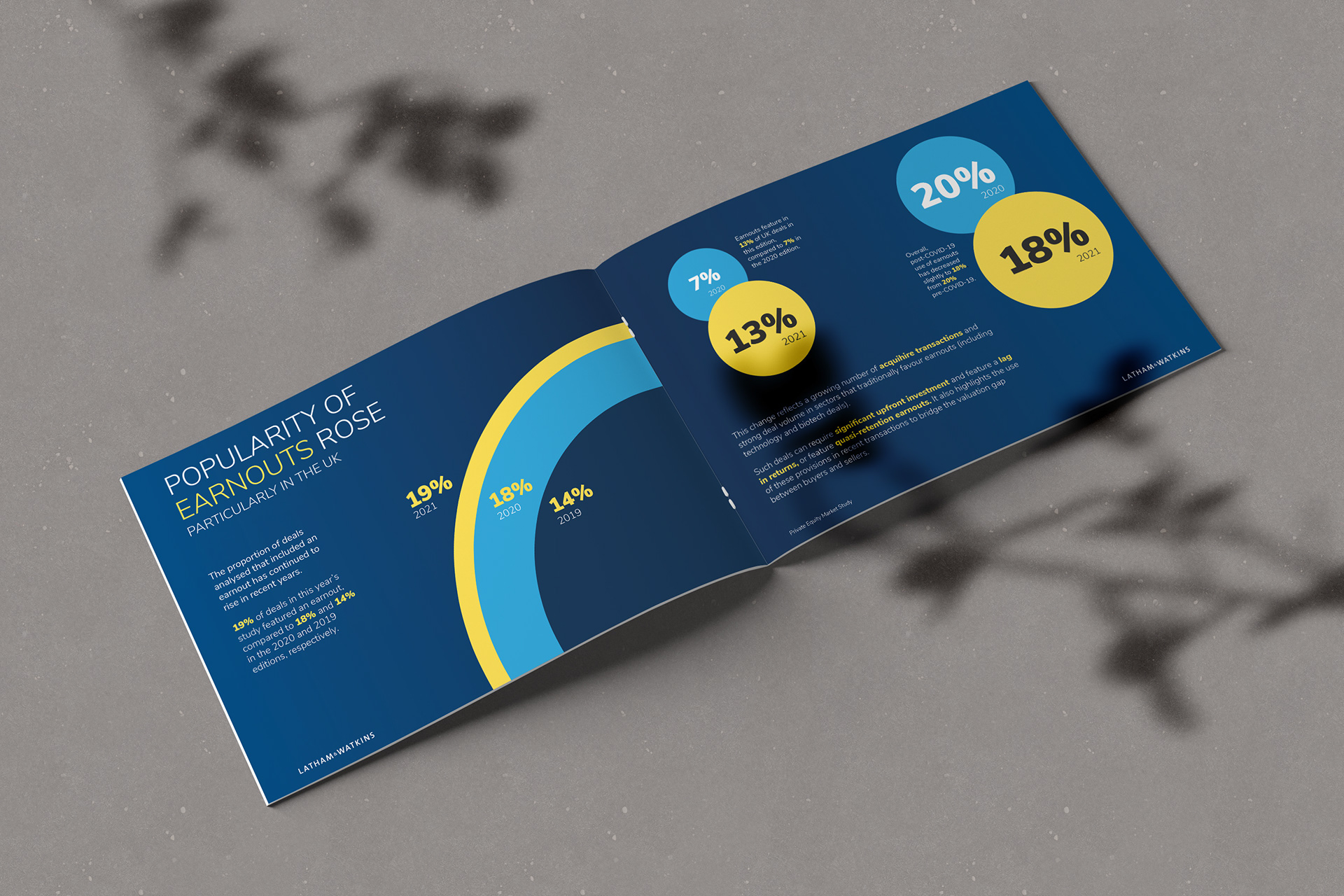
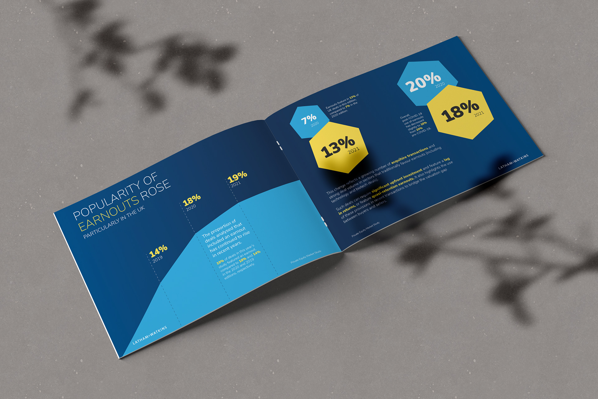
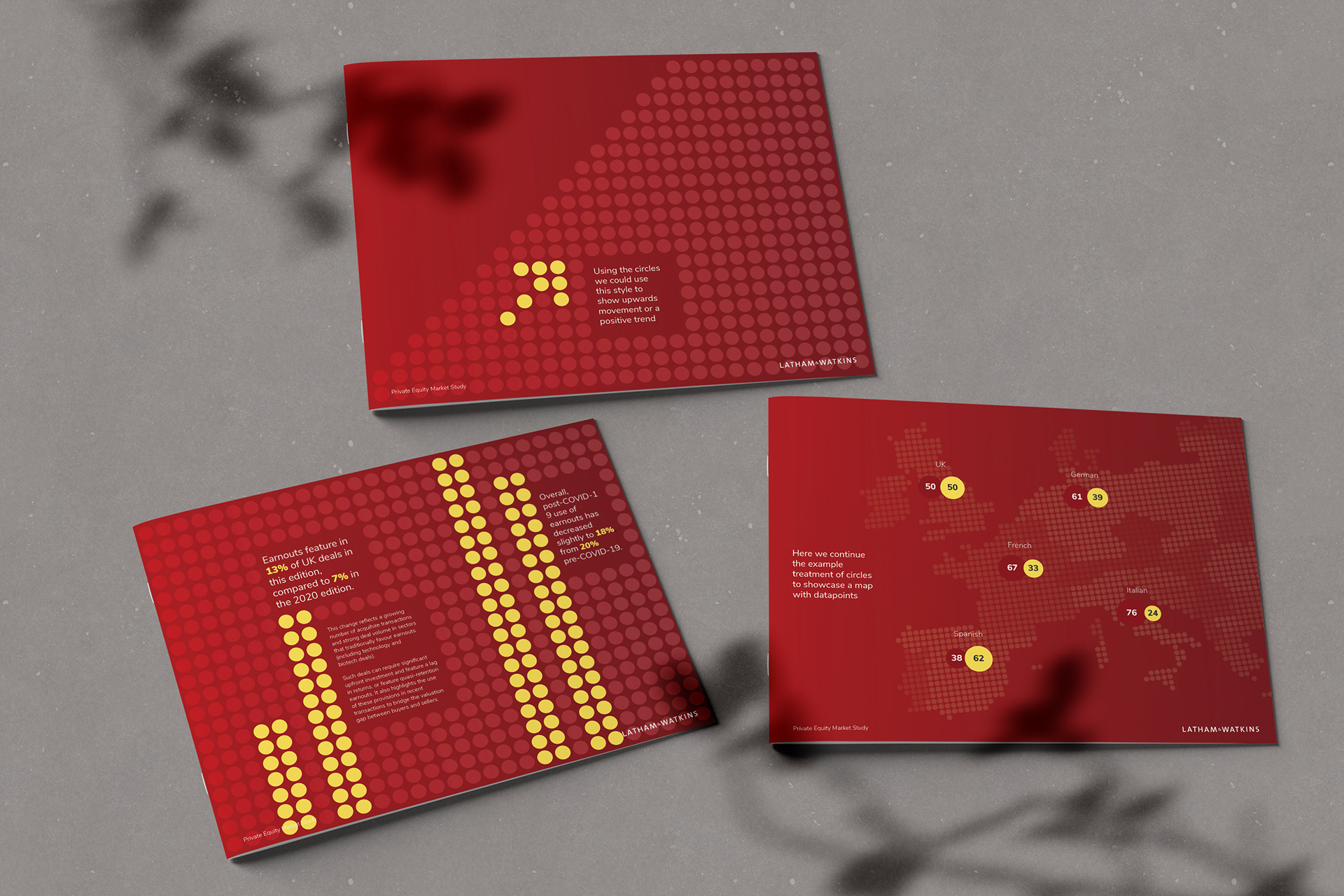

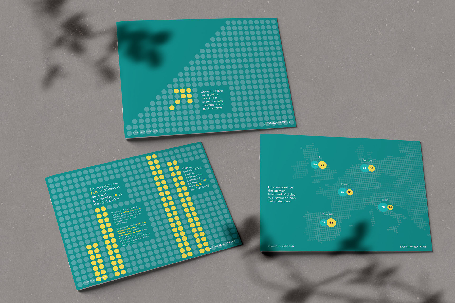
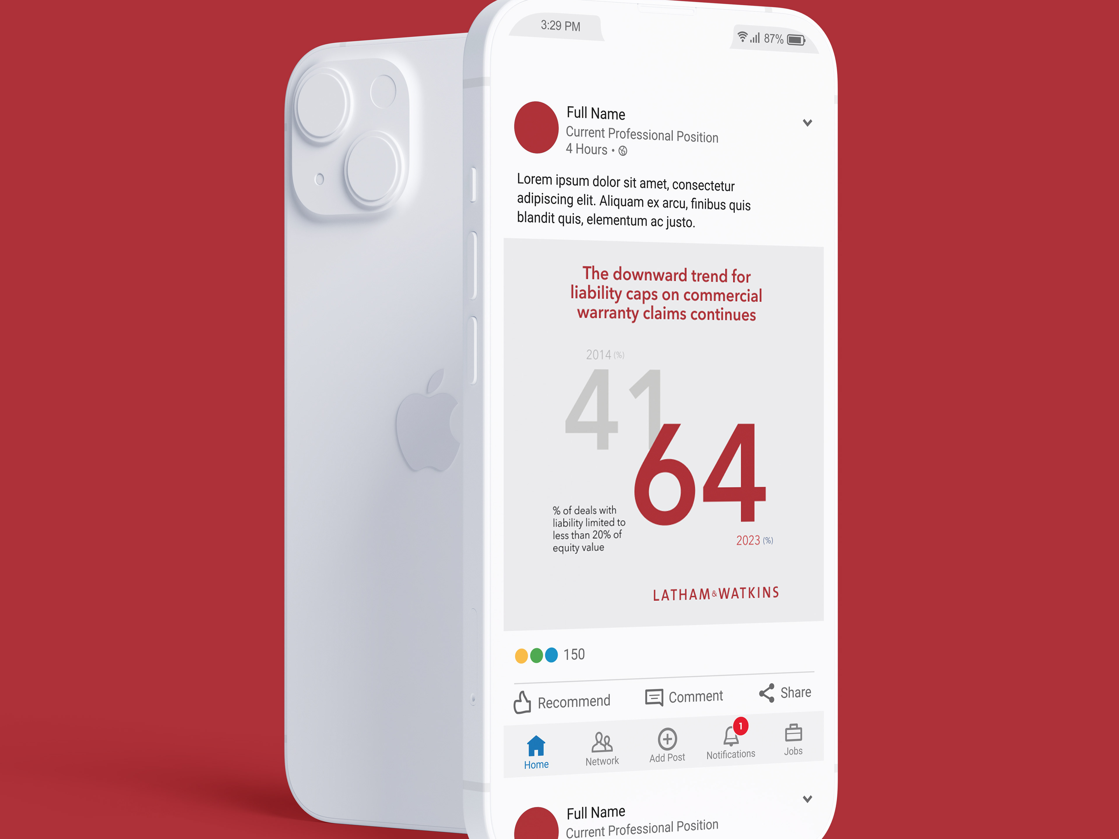
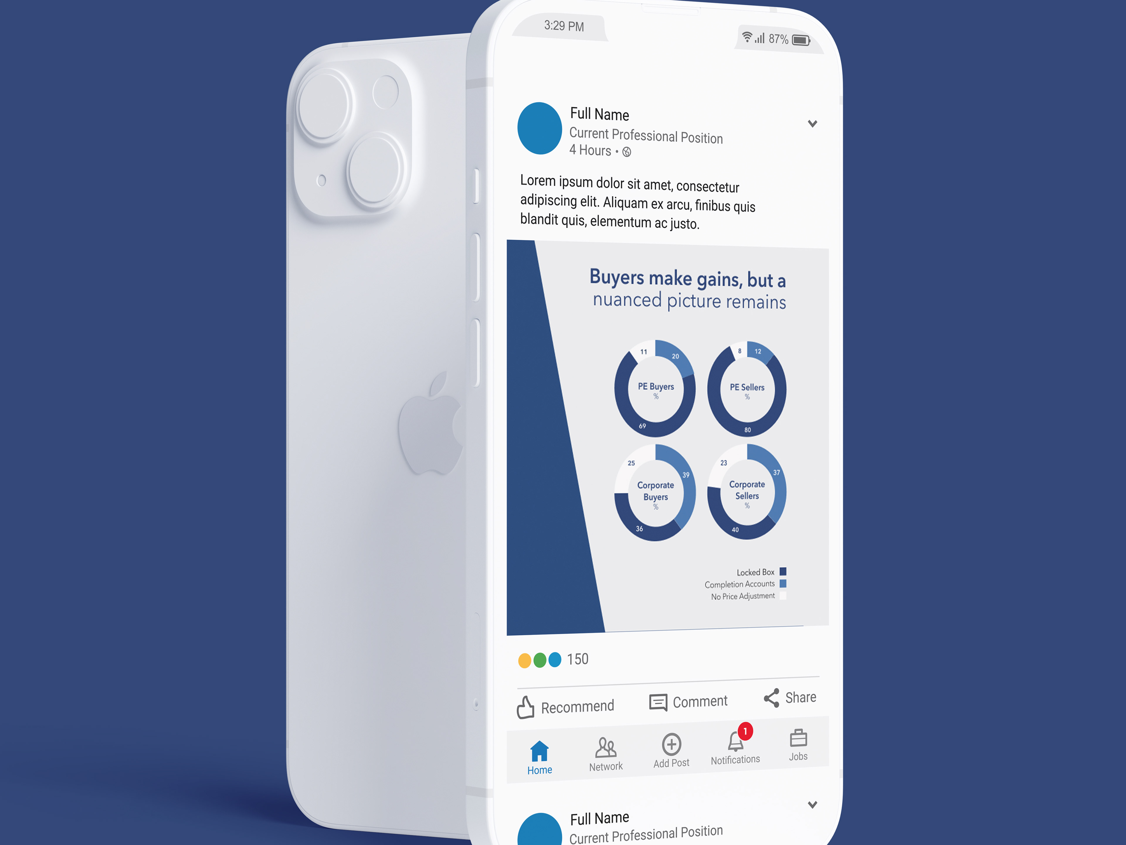
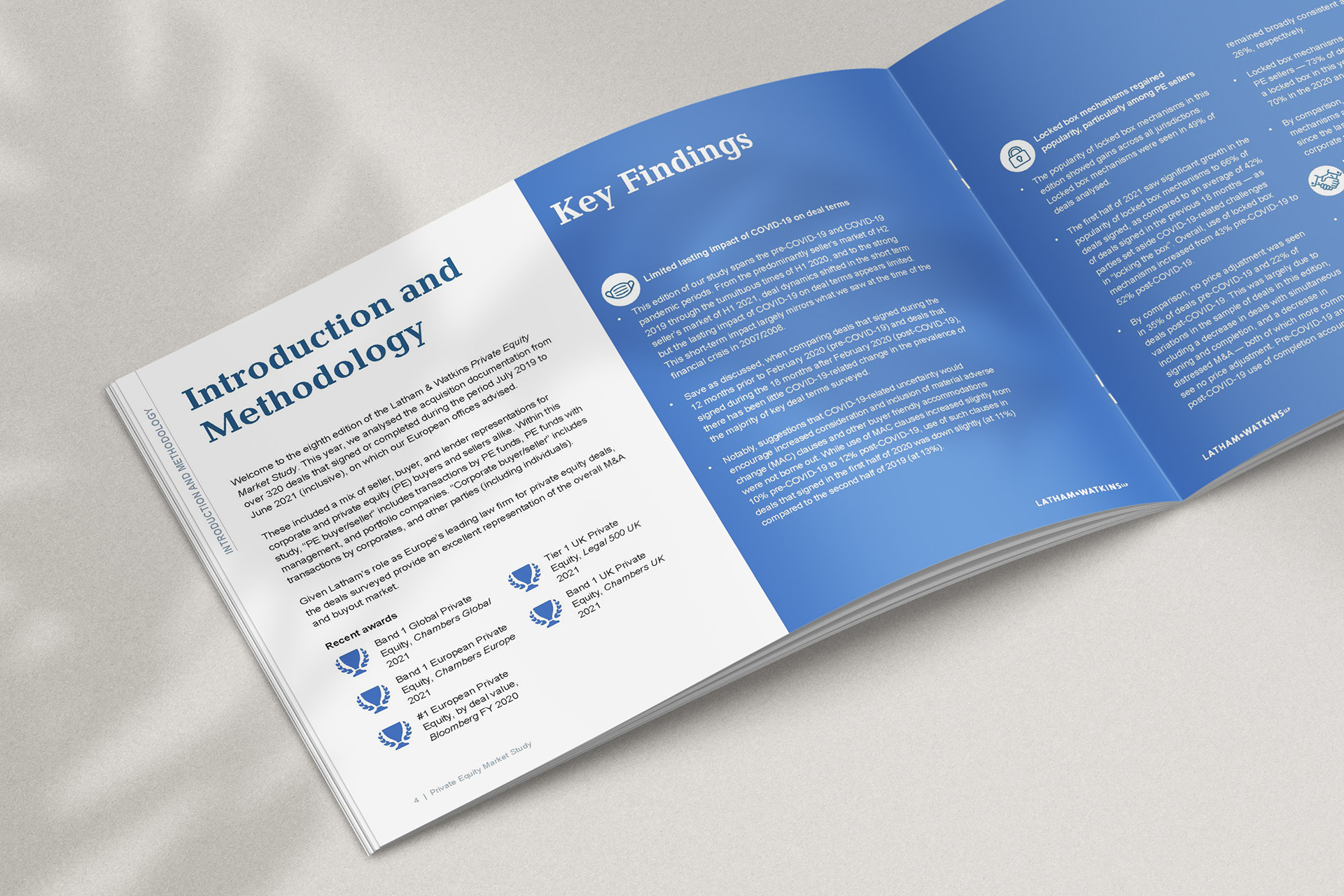
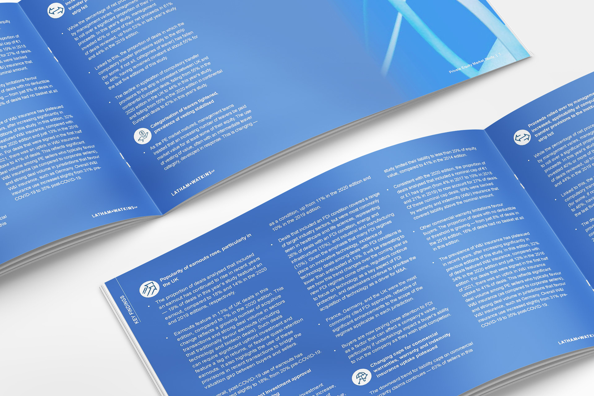
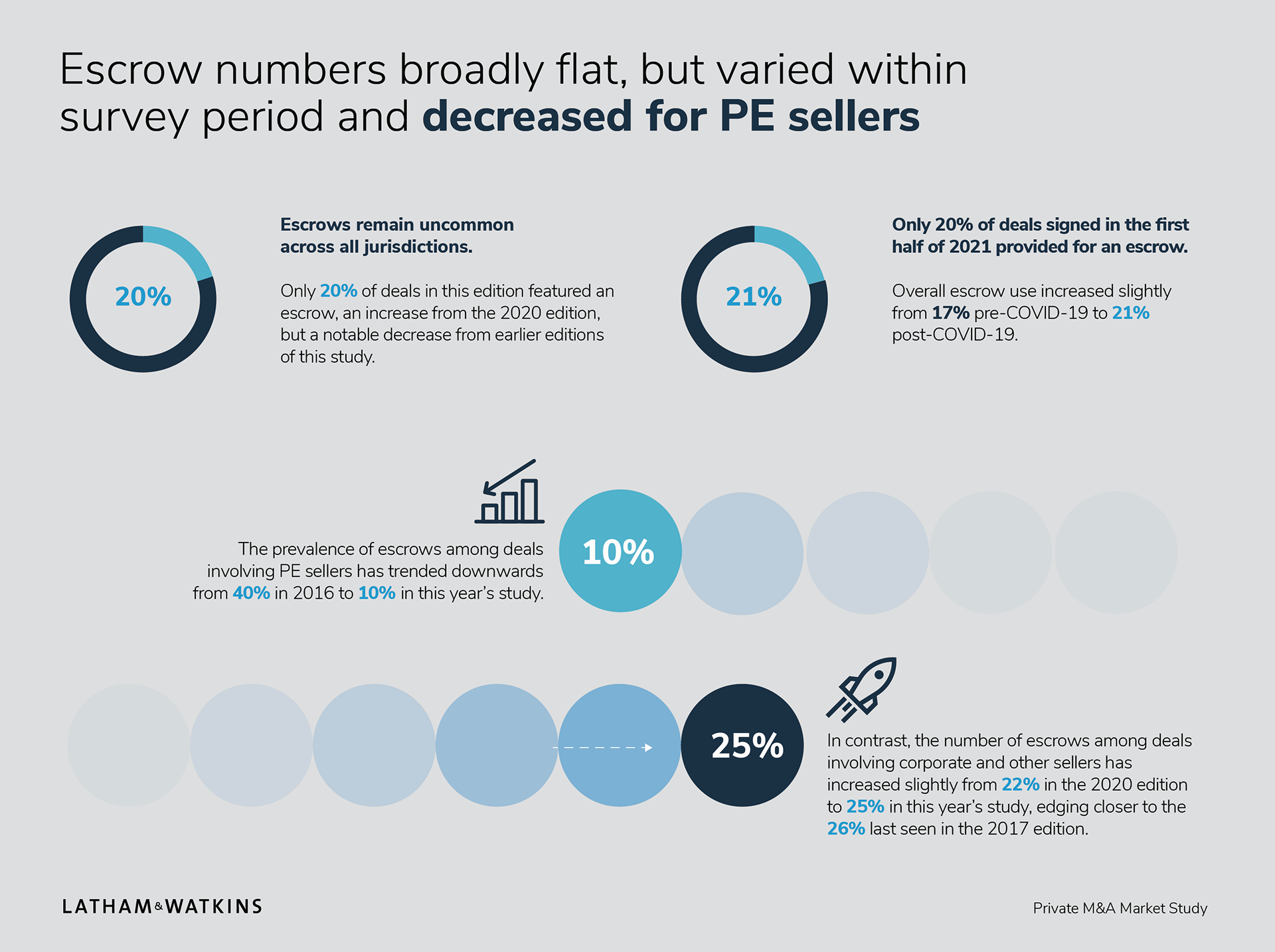
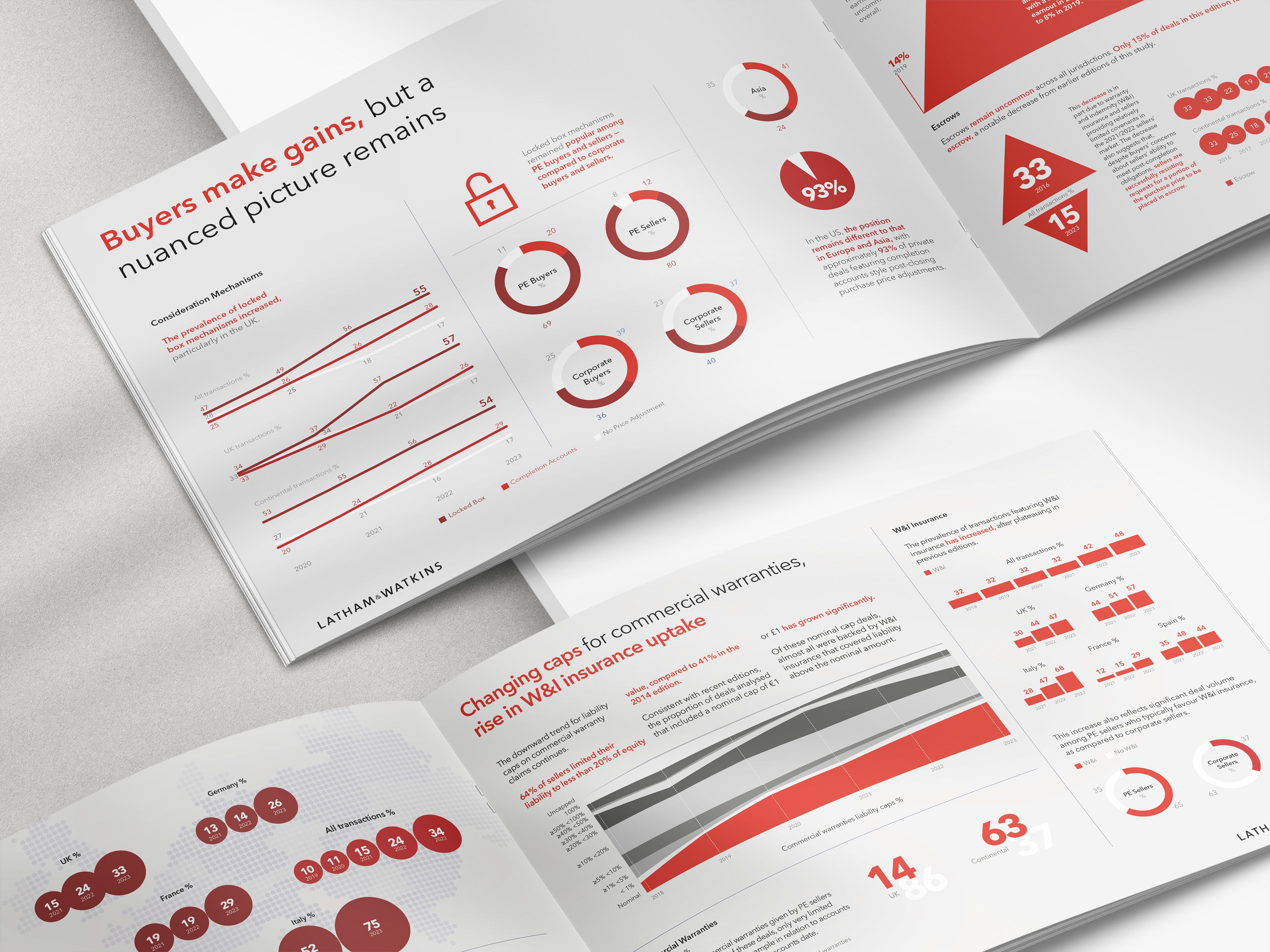
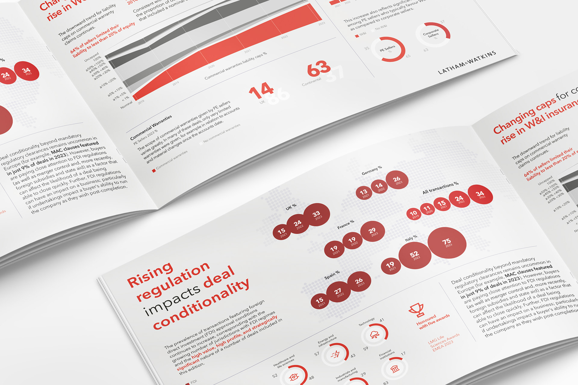
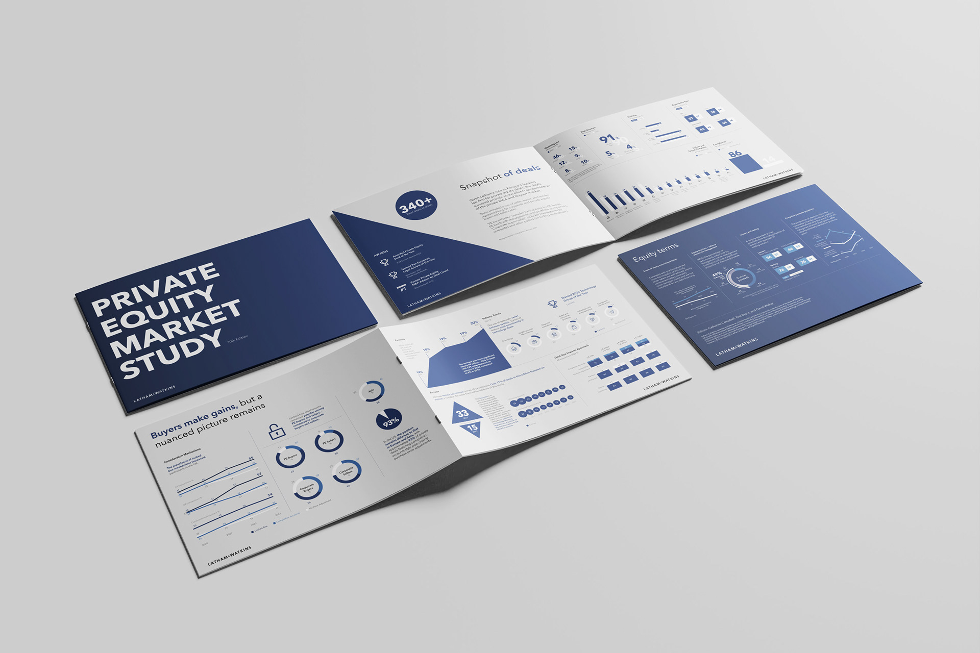
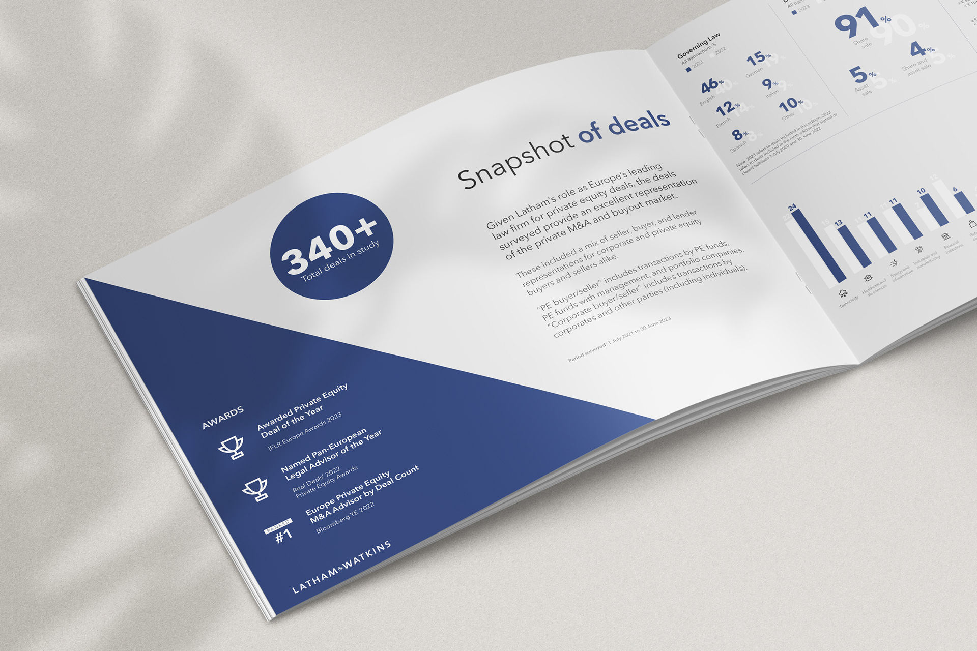
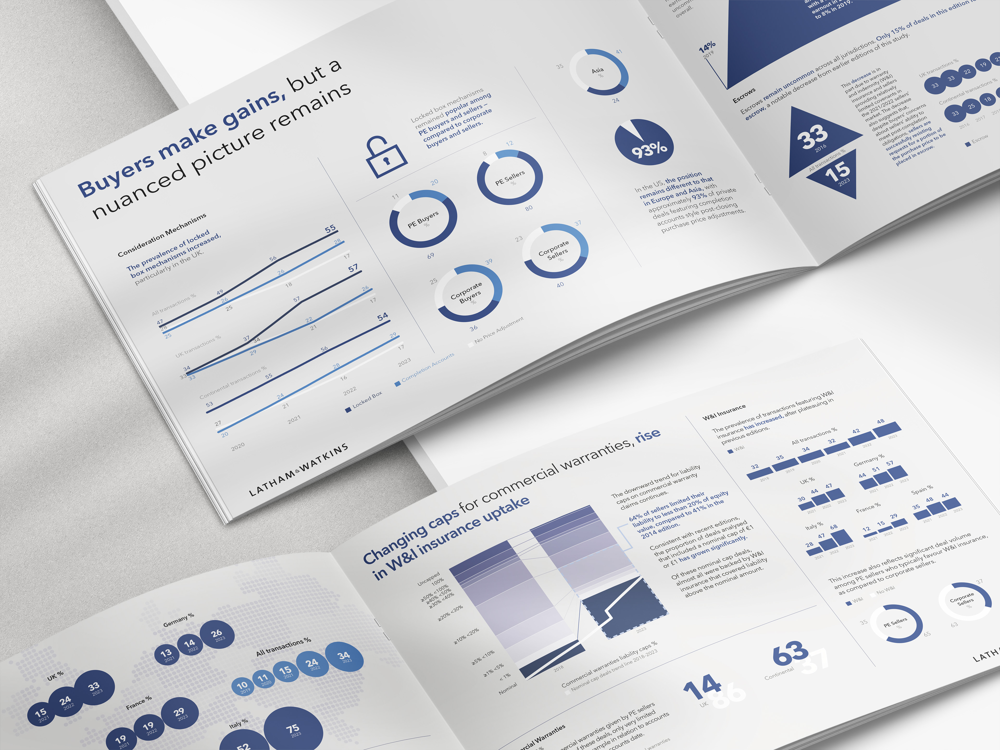
In the third round, we refined the colour strategy to support clearer visual signposting across the report’s key themes. A lighter grey was introduced for inner pages—creating a neutral foundation that allowed blue (representing Private Equity) to take on a more prominent role, moving from background accent to a leading visual cue. This brought added structure and emphasis to data relating to that sector.
We also elevated red, used to denote M&A content, ensuring each area of focus had a distinct presence within the palette. White was used strategically throughout to provide contrast, clarity, and a sense of space—enhancing both the visual rhythm and the sophistication of the report. The result was a cleaner, more intuitive reading experience that supported both aesthetic quality and functional hierarchy.
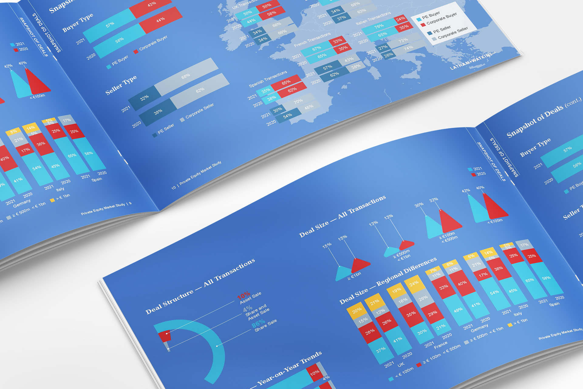
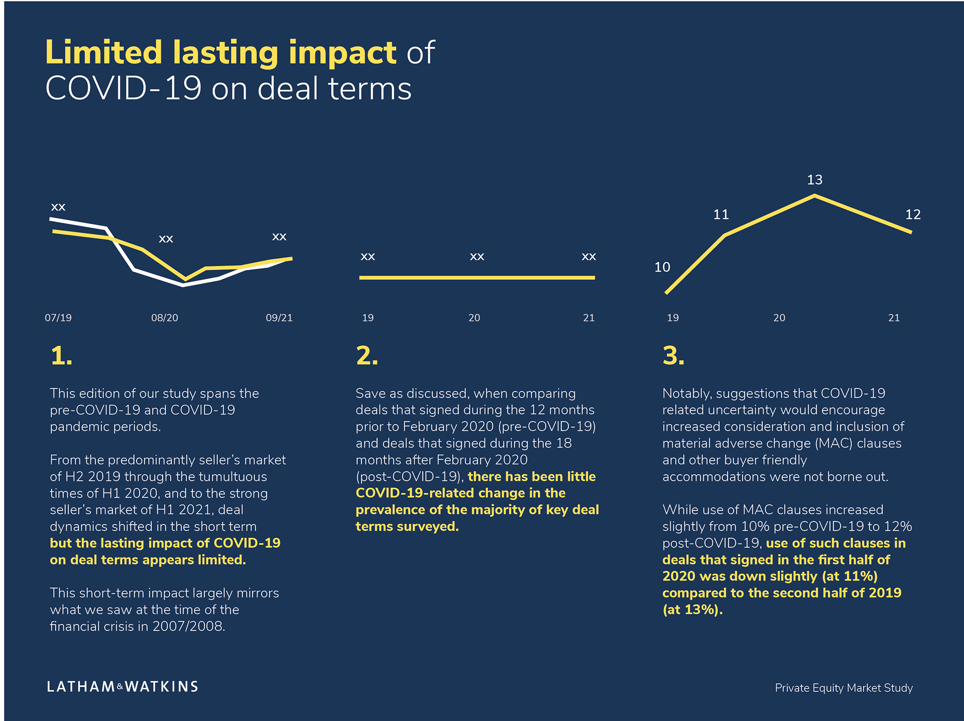
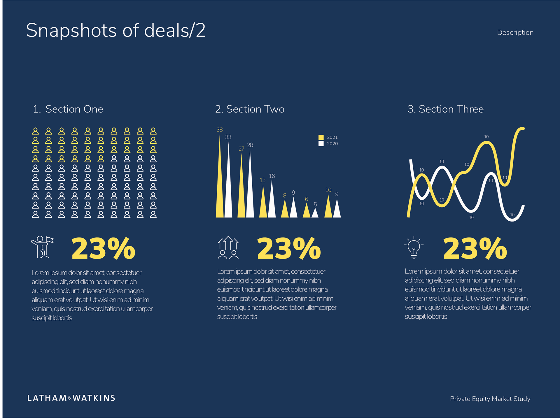
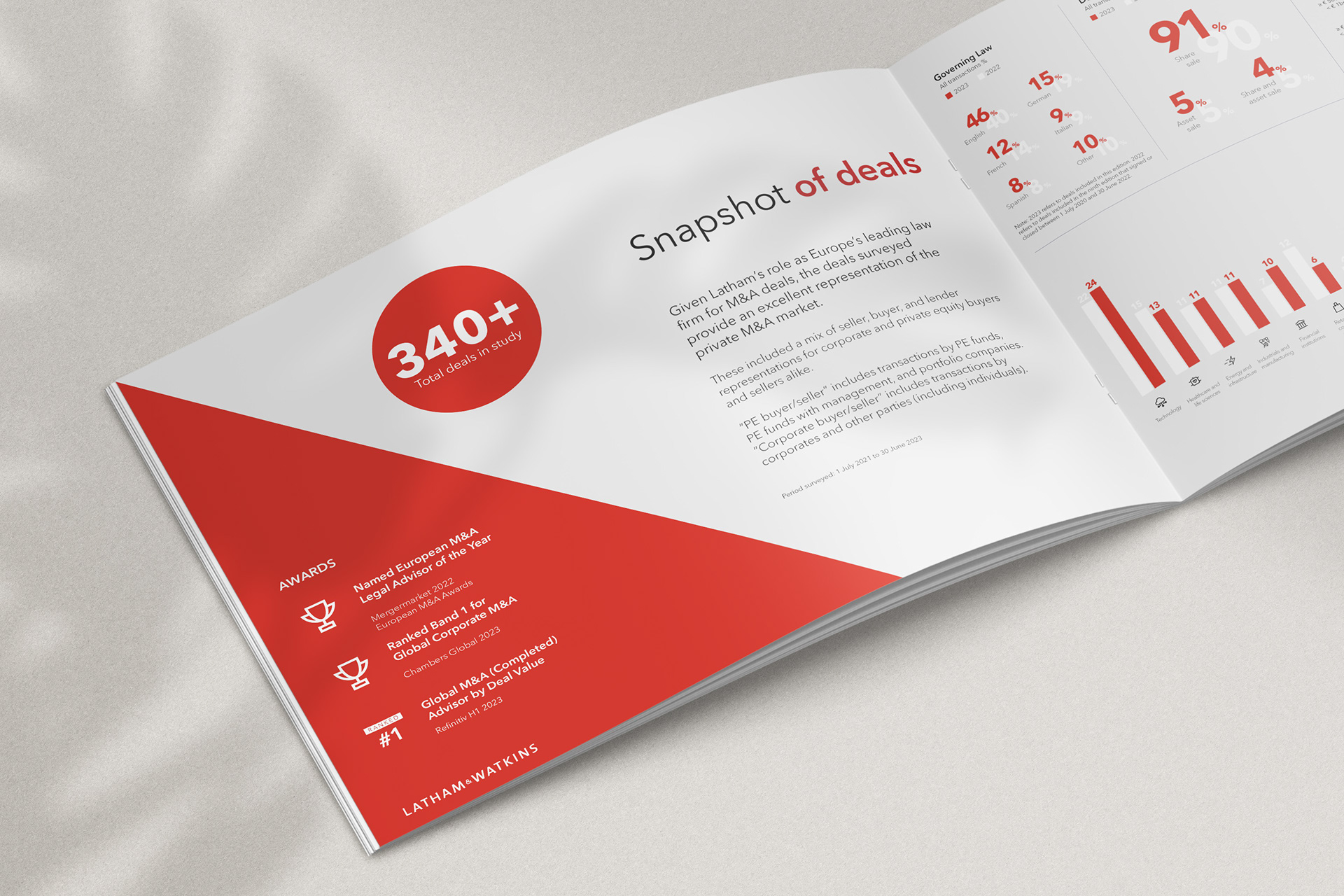
For the final version, we had full access to the report data—and with it, a clear mandate from stakeholders to surface as many of the year’s key findings as possible. With the format locked at just eight pages, the challenge became one of precision and creativity: how to present a dense volume of insight without overwhelming the reader.
Through smart hierarchy, modular layouts, and tight editorial structure, I introduced several new ways to visualise the data—bringing clarity, variety, and rhythm to each spread. These approaches marked a step-change from previous editions, allowing complex findings to be communicated with impact, even within a condensed format. The result was a visually rich, insight-led report that delivered both depth and restraint.
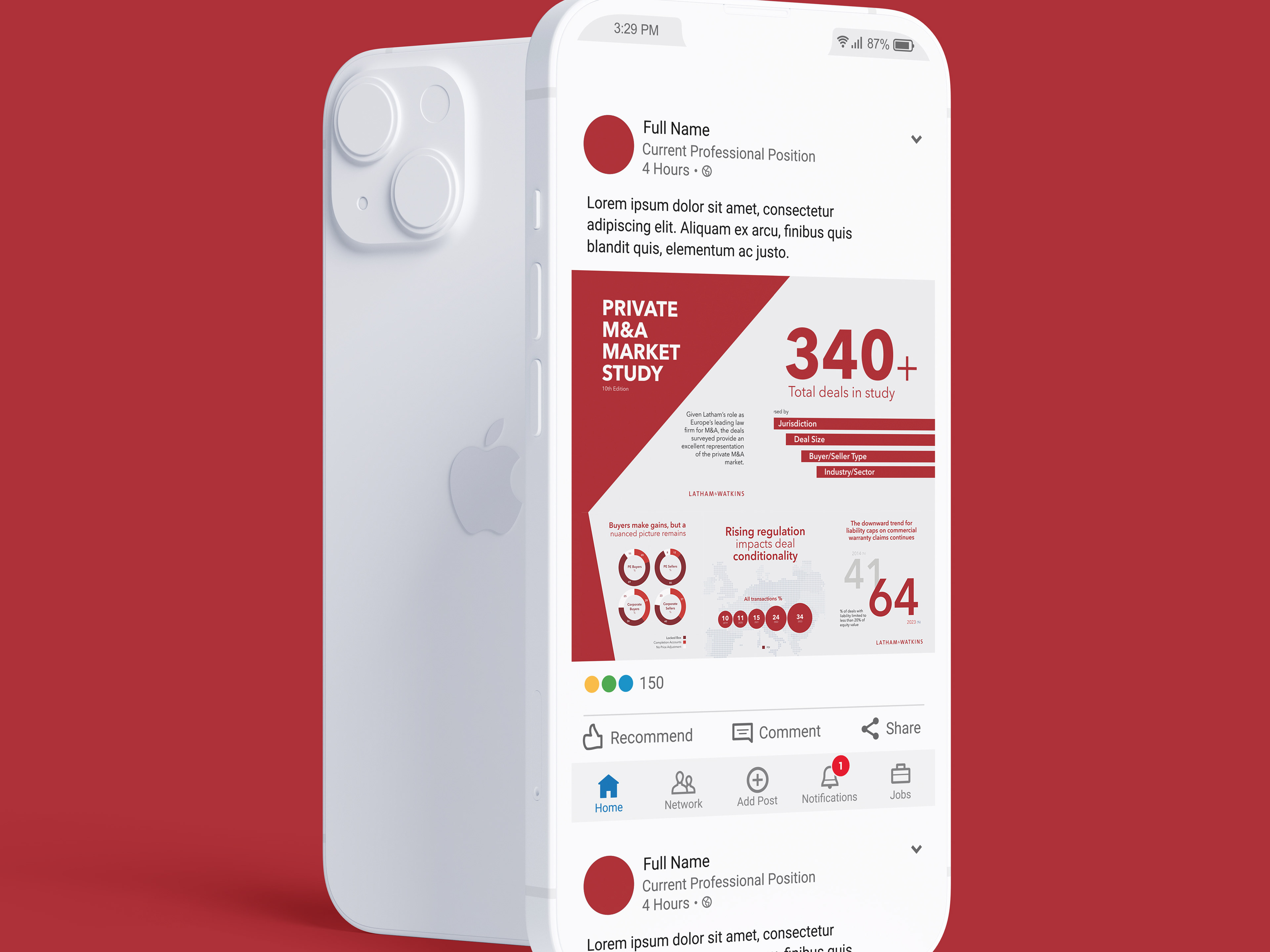
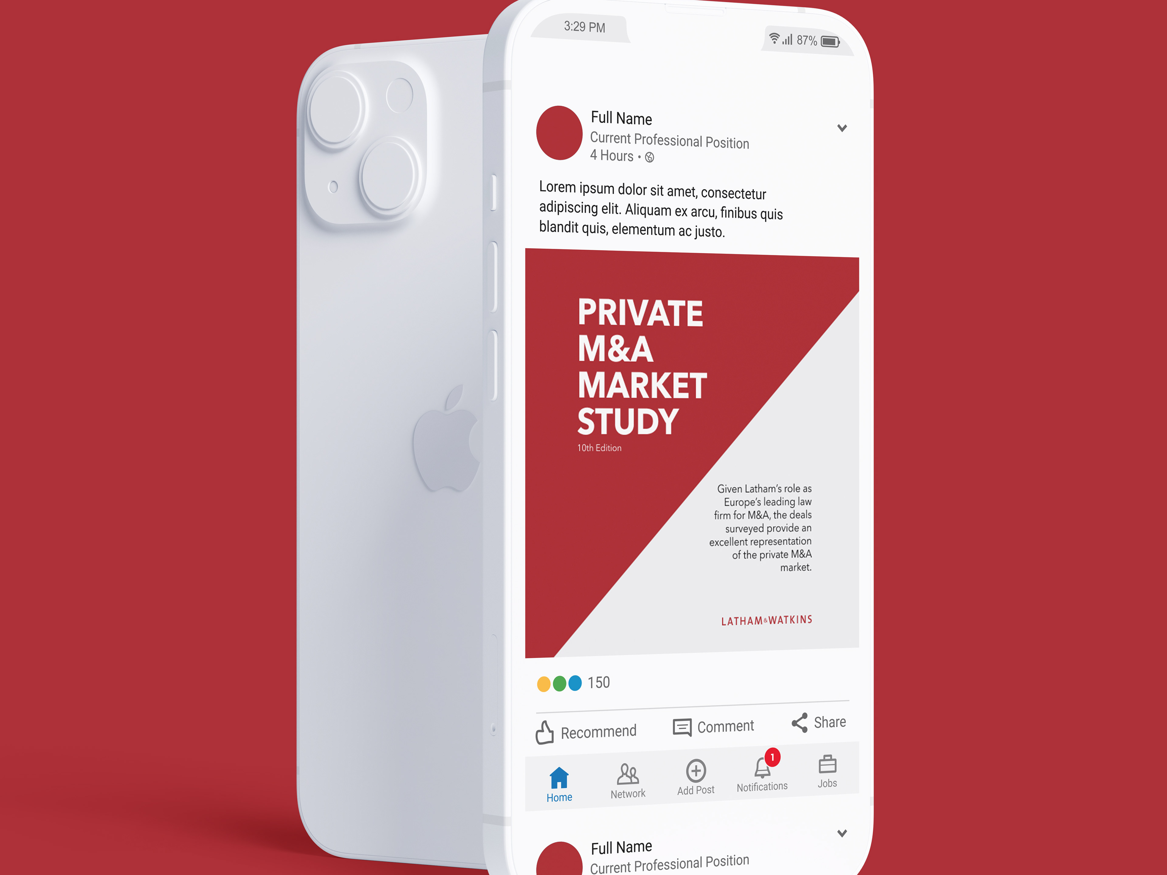
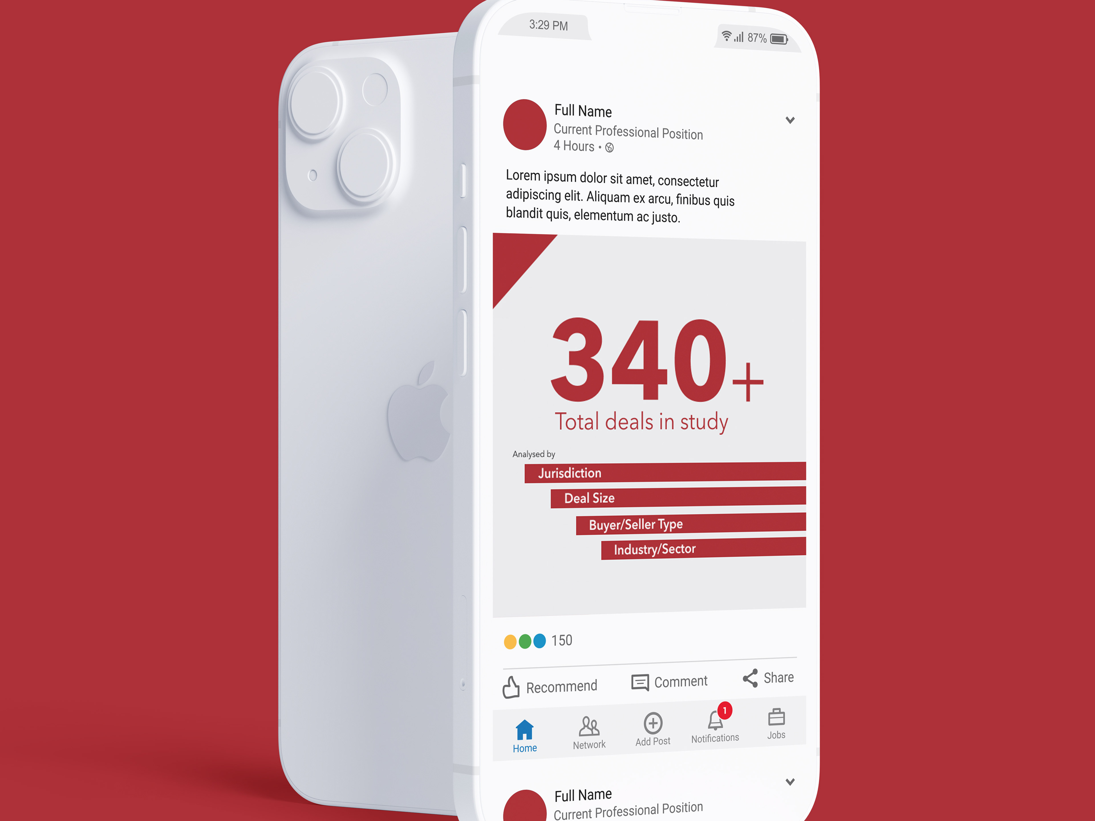
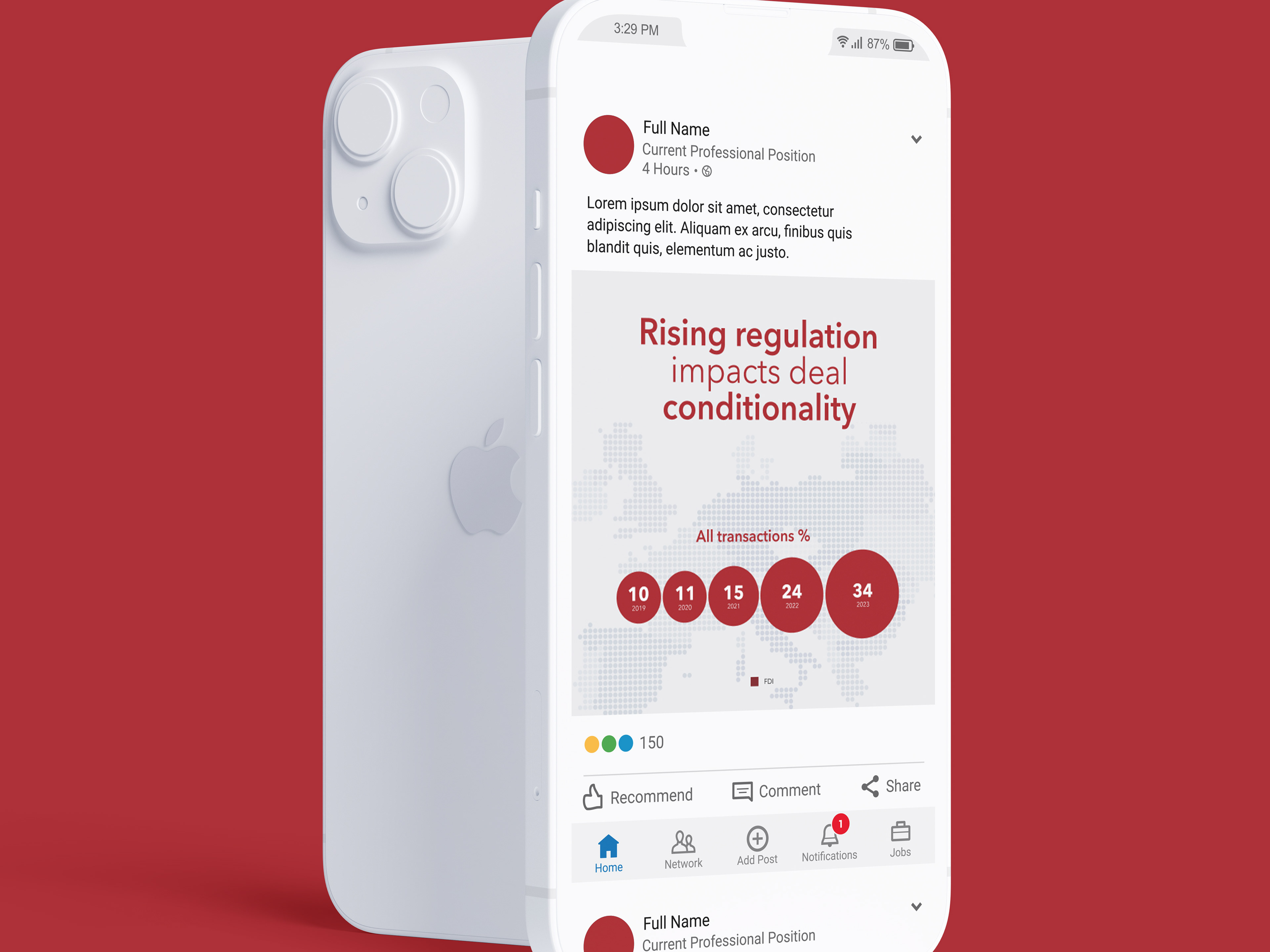
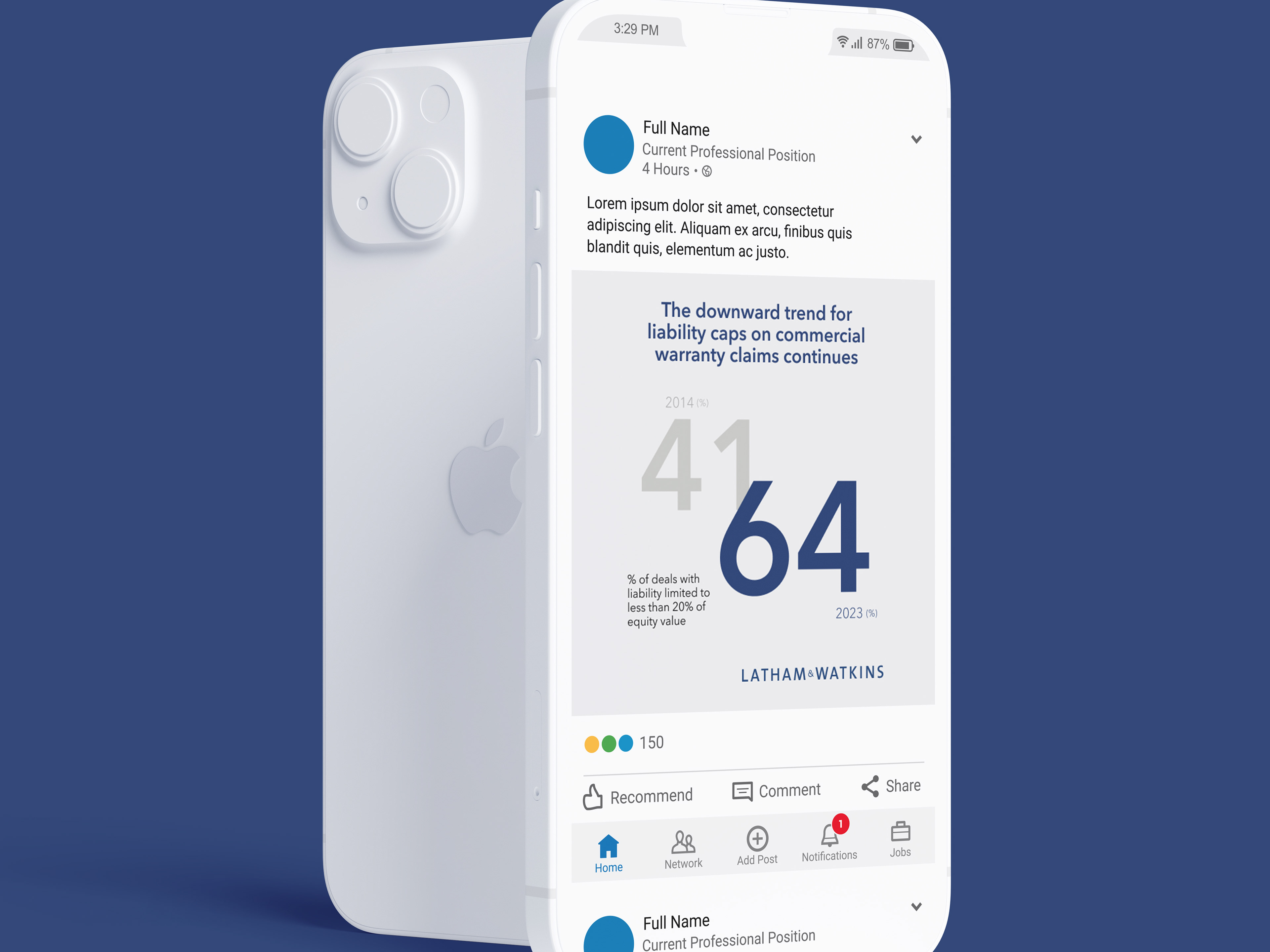
SOCIAL MEDIA ASSETS
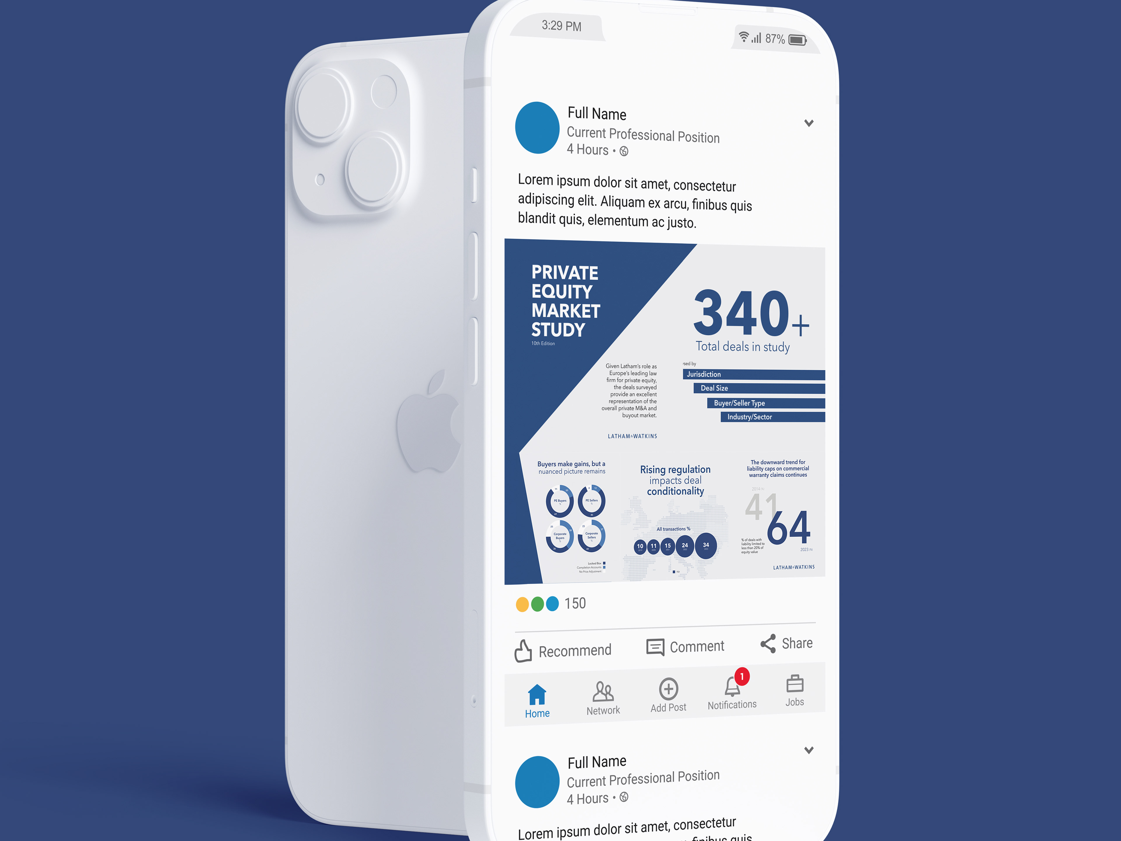
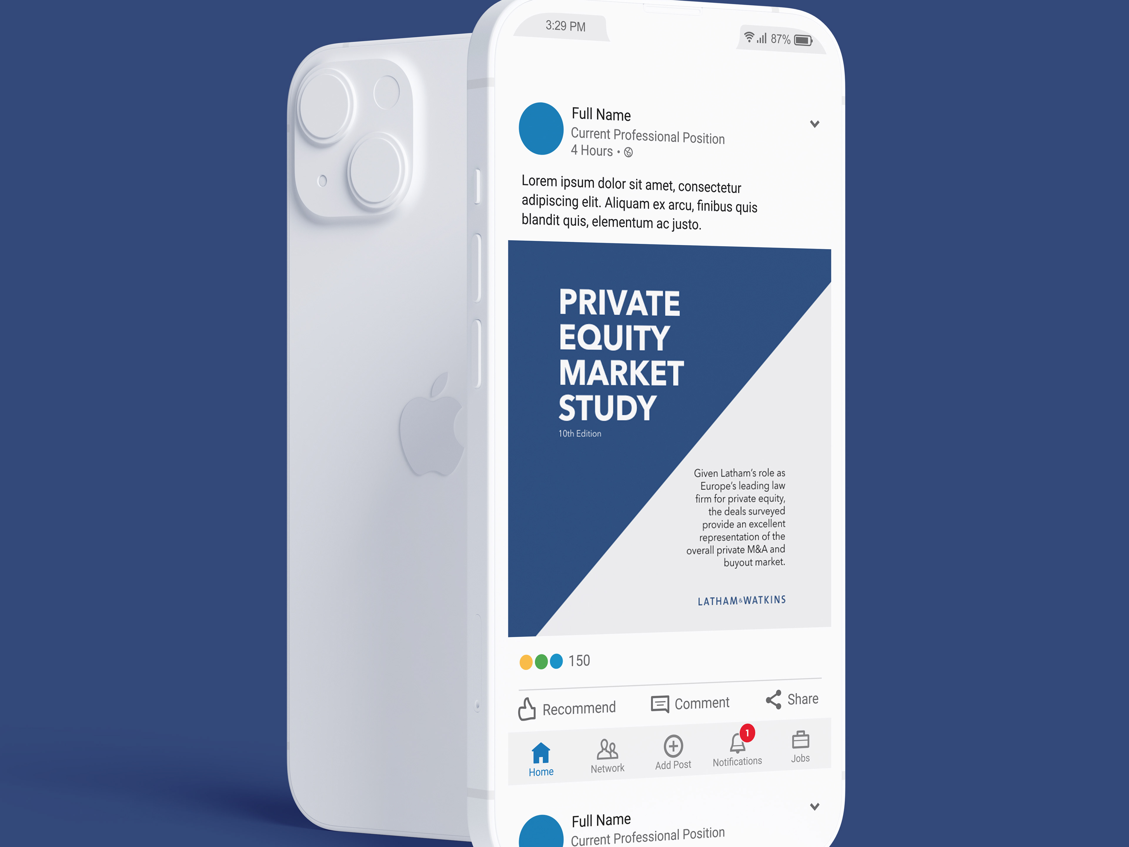
To support the report’s launch, I collaborated with the Latham & Watkins social media team to develop a suite of promotional assets tailored for LinkedIn. We designed a custom carousel layout, structured as a 2x3 grid—where each tile could function independently, while also contributing to a cohesive visual when viewed as a set.
One of the key challenges was accommodating LinkedIn’s preview behaviour, particularly on the second row, where overlapping elements needed to be scaled down by 33% to ensure legibility and alignment. Through careful planning and typographic adjustments, we created a flexible system that maintained visual impact across the entire carousel, maximising engagement while staying true to the report’s refined design language.