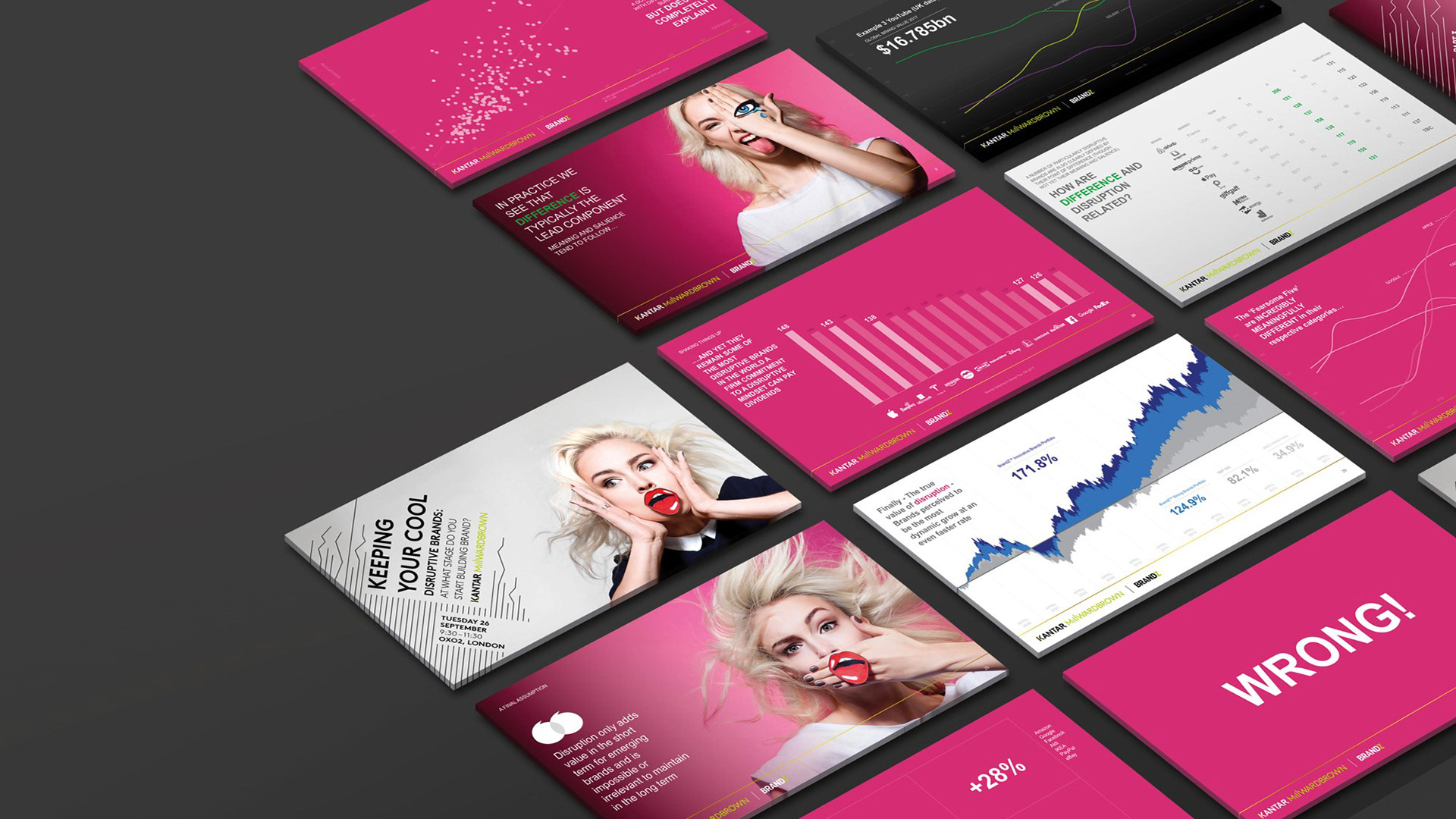
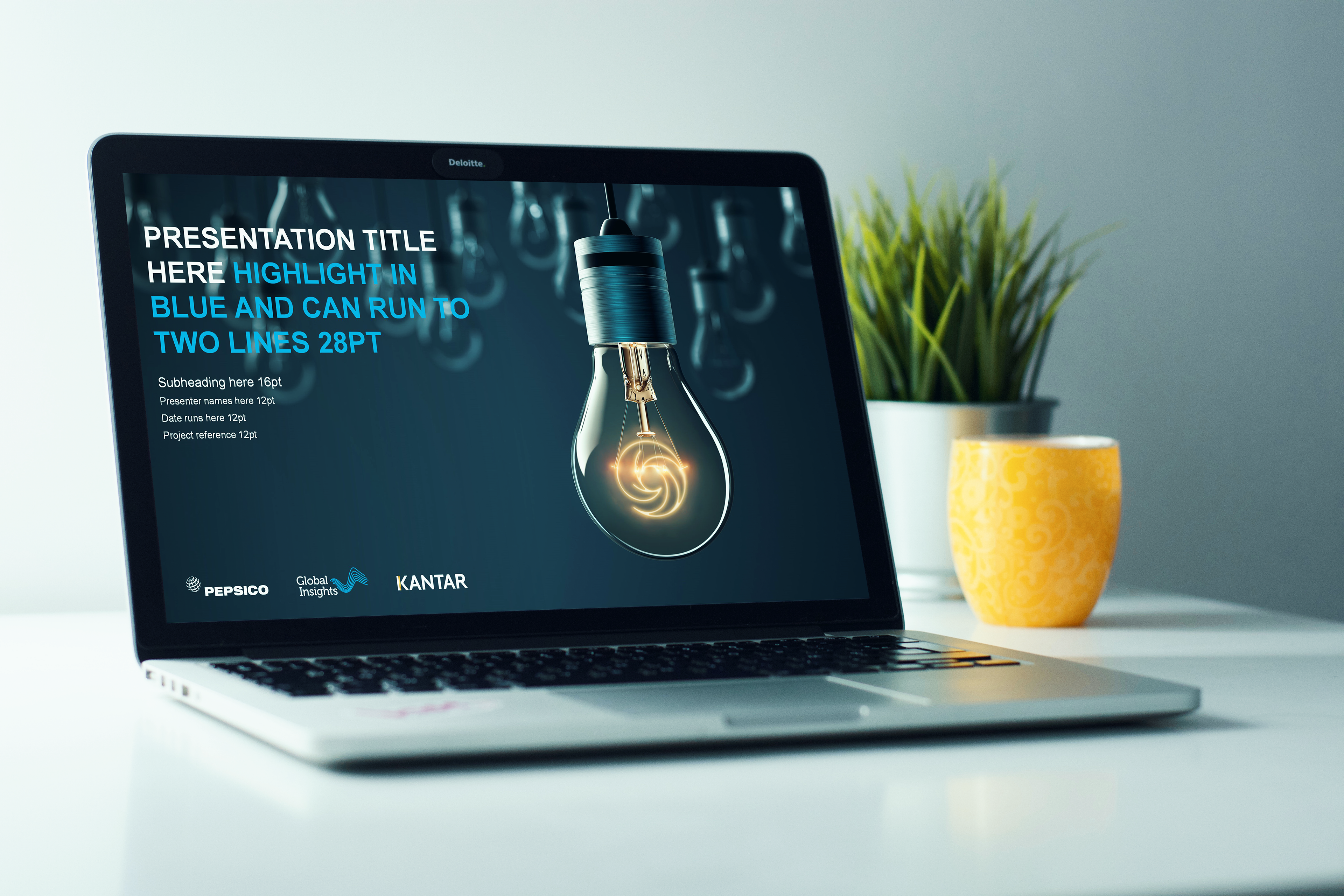
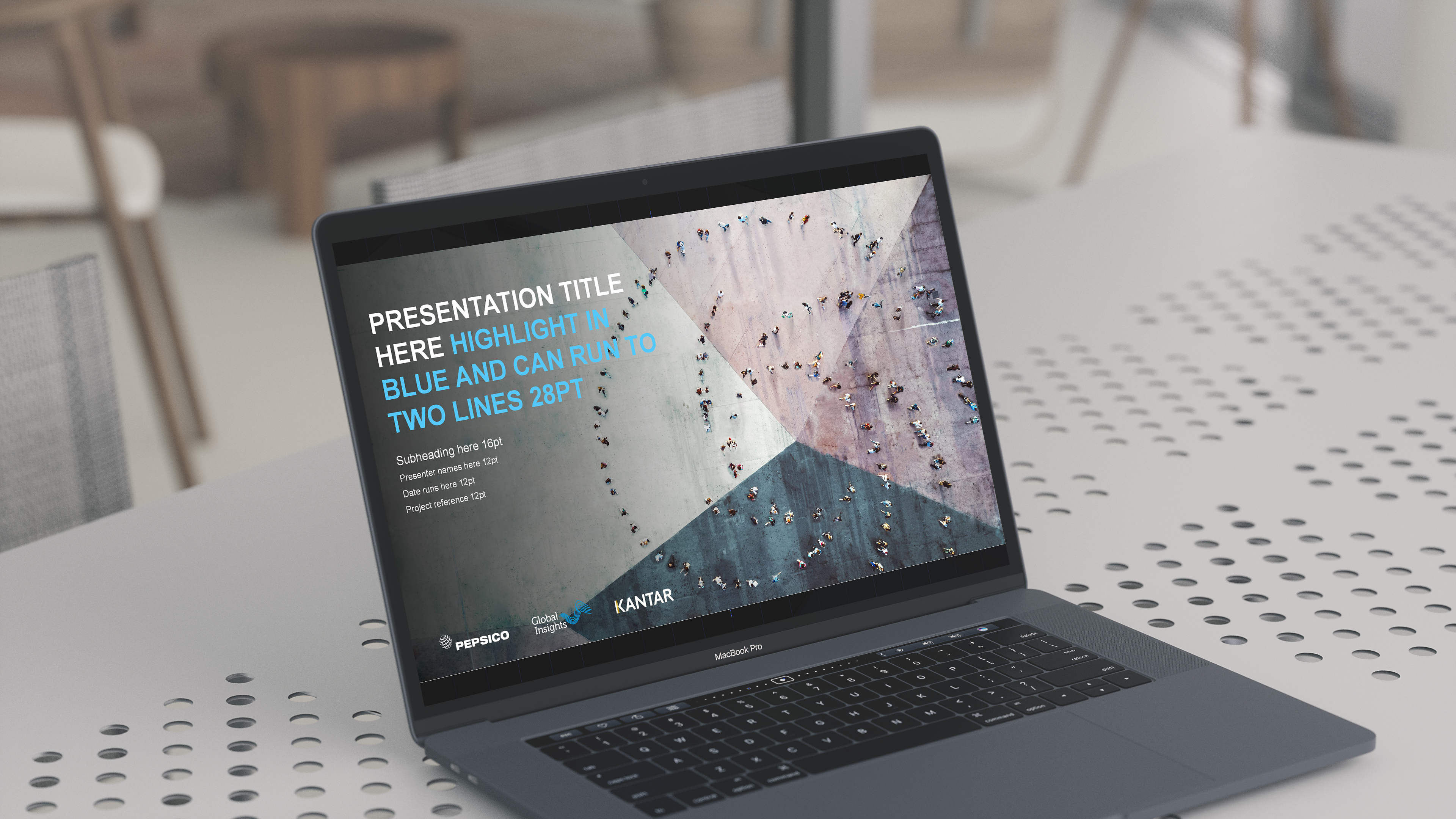
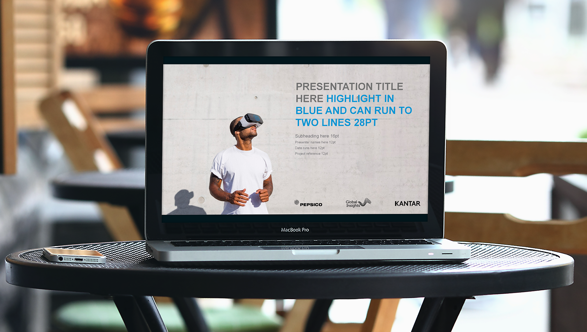
Pepsico approached me in 2018 to redesign their internal global deliverables. The existing designs were very outdated and had competing design ideas and lots of campaign or domain logos.
Working with the client I suggested a unified approach and a new visualisation identity that would incorporate one key domain logo into the photography. I also evaluated and redesigned all their data visualisation outputs, helping them simplify the data outputs to make them easier to digest across their many markets.
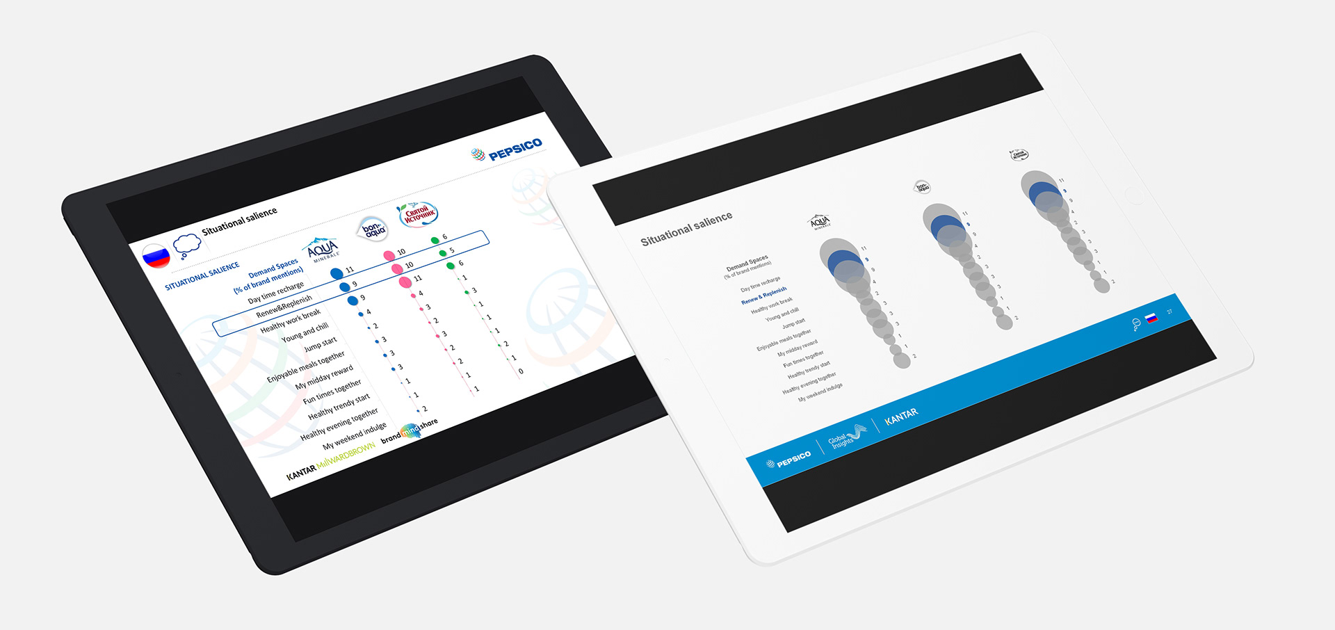
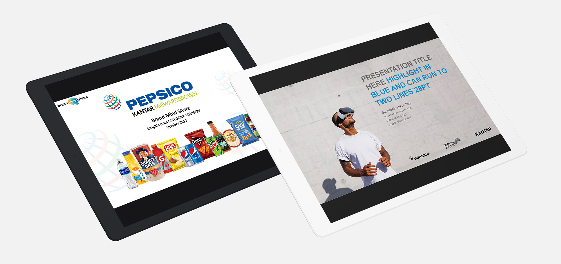
Before and After
The lead slide showcased the new look as well as bringing together two disjointed areas and branding that were working against each other under Global Insights.
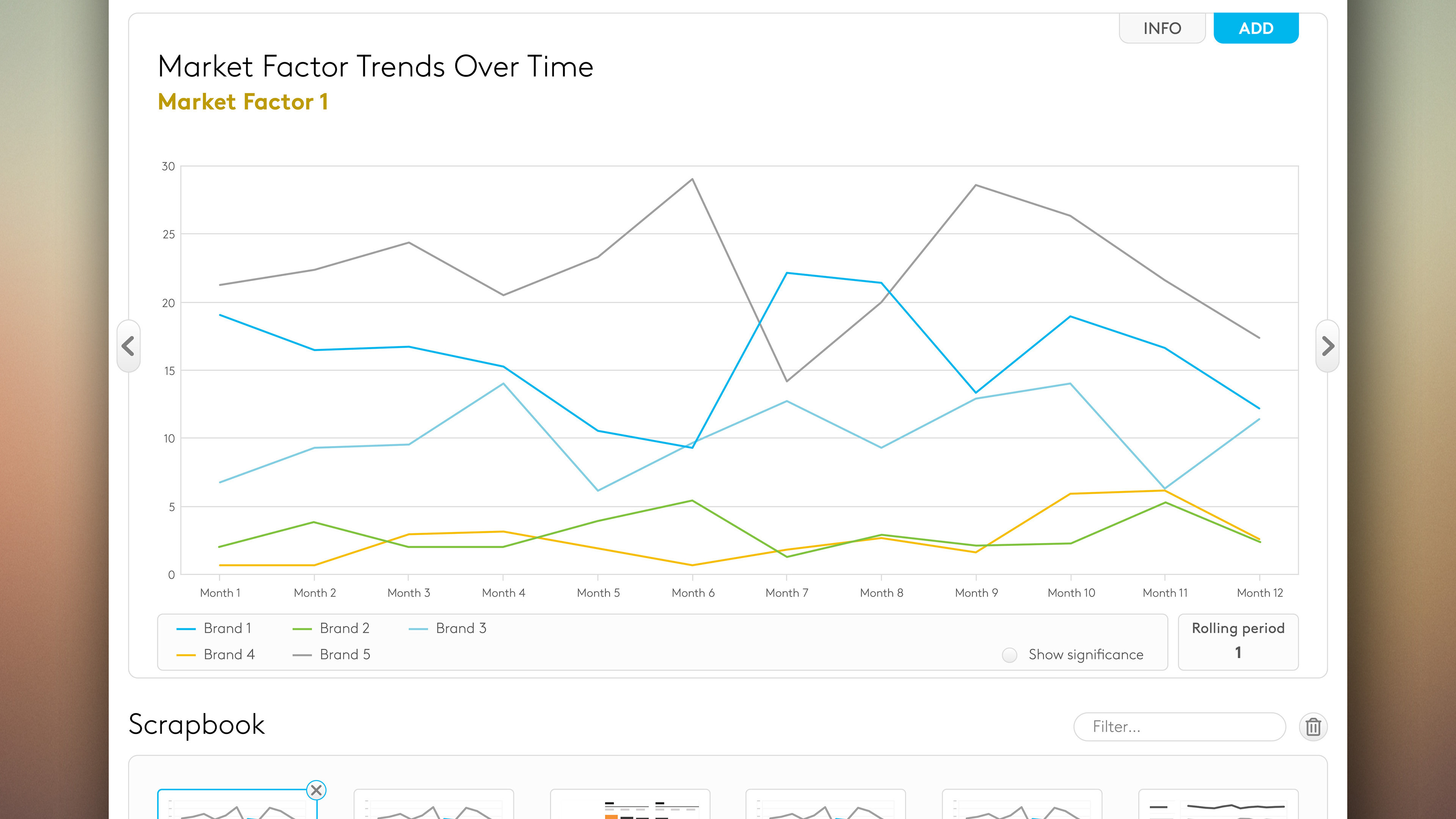
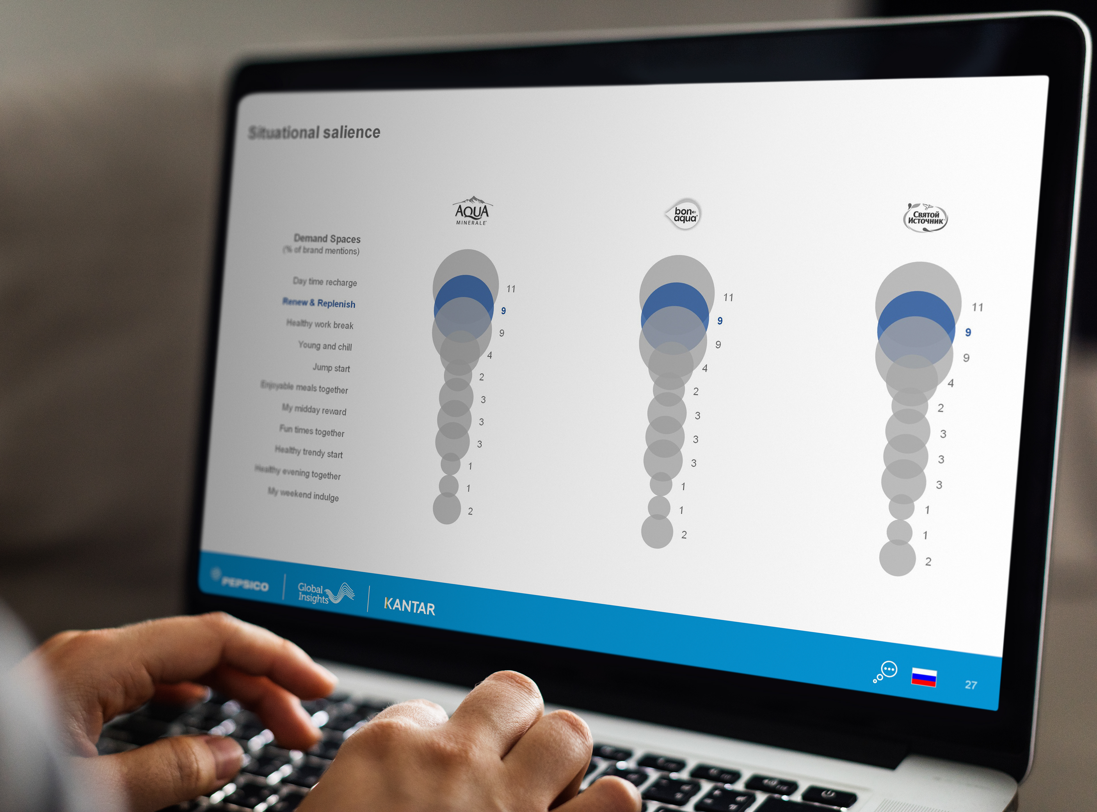
The data visualisation slides were also simplified by removing colour and using it sparingly to help tell the story.
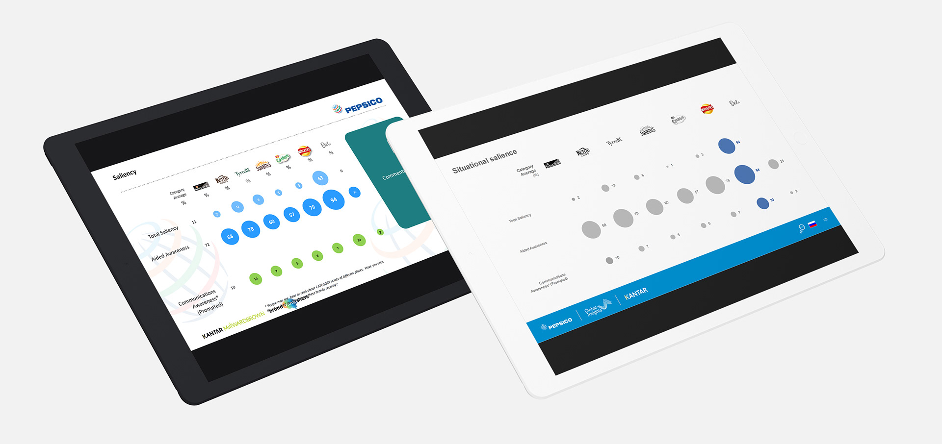
Further work was done to increase the amount of white space and give existing copy more room to breathe. This makes it much easier for the audience to take it the data and the story on the page.
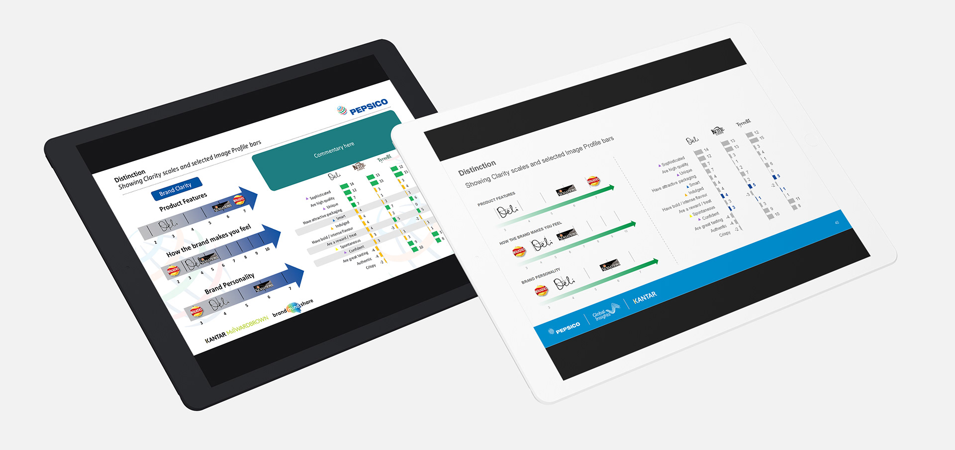
And again colour was removed and only used where it was absolutely necessary. This even includes removing colour from logos. White space was also introduced around the chart area to create a cleaner look.