Journey is a flagship event for founders and future thinkers, exploring the intersection of innovation, creativity, and technology. For the 2023 edition, the creative brief called for a visual identity that felt elevated and modern—something that captured ambition without leaning too corporate or predictable.
I began by exploring visual metaphors around movement, scale, and transformation. Early directions tested layered gradients, blurred motion, and abstract waypoints—but the concept that resonated most was a series of horizon-inspired forms. These became the backbone of the system, suggesting forward momentum and open possibility while remaining visually simple and flexible.
The final identity used a refined colour palette, oversized typography, and soft radial forms to create an atmosphere that felt expansive and calm. Applied across digital signage, keynote presentations, and social media, the brand language offered a confident, unhurried tone—setting the stage for meaningful conversation and big ideas.
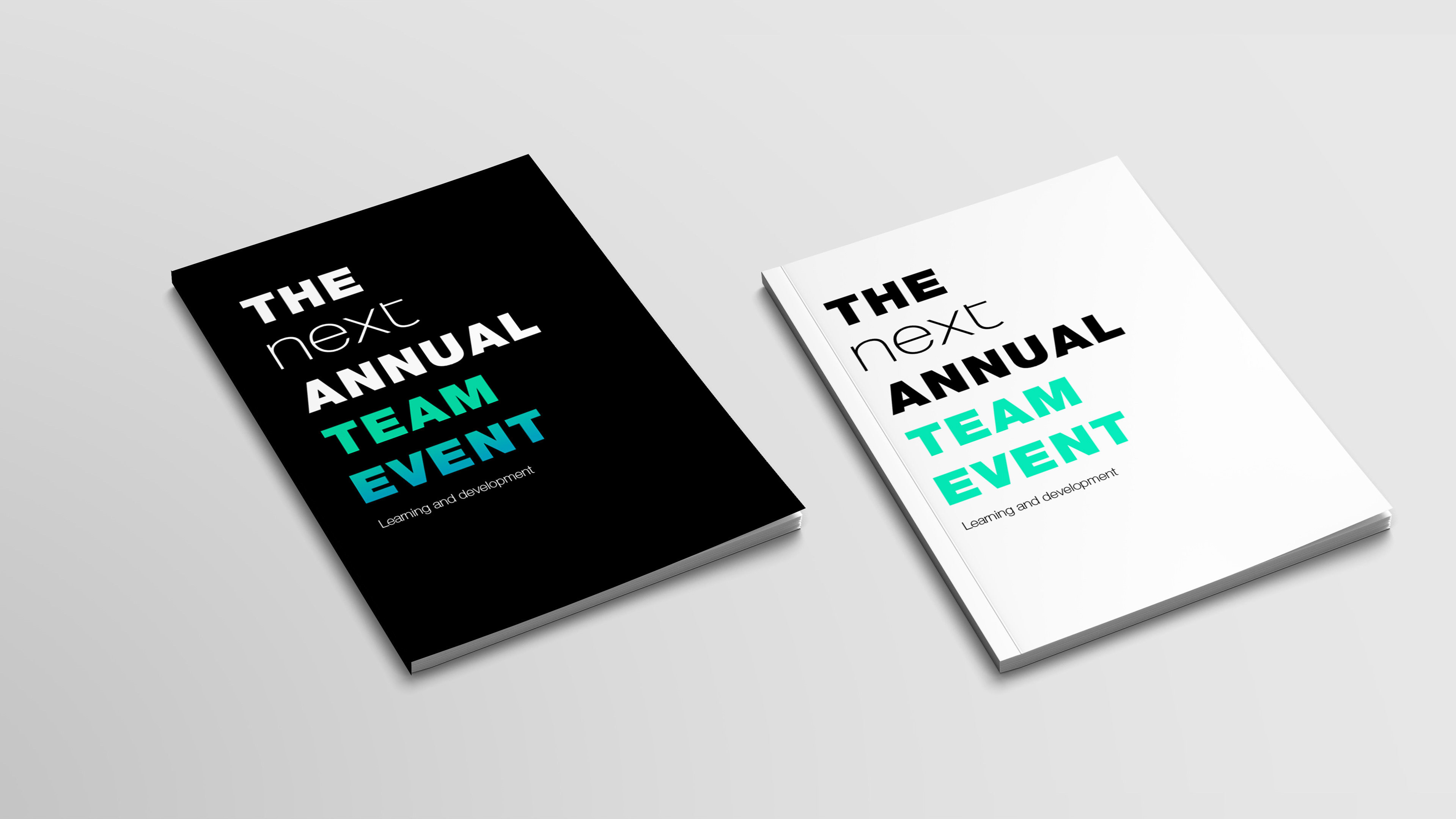
Design V1
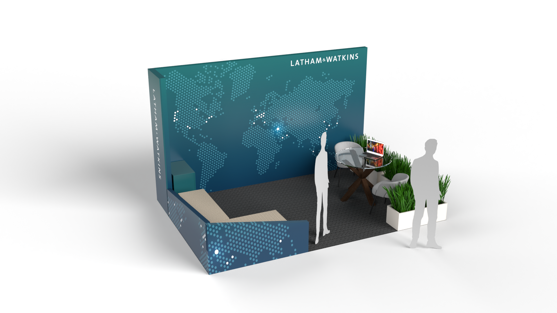
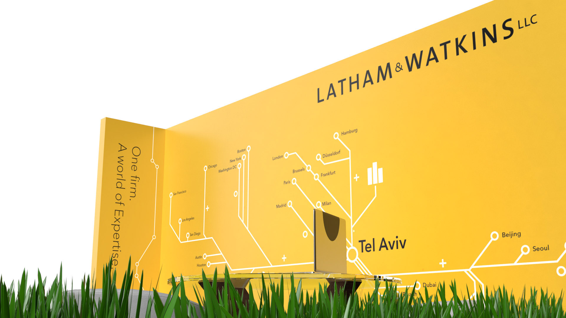
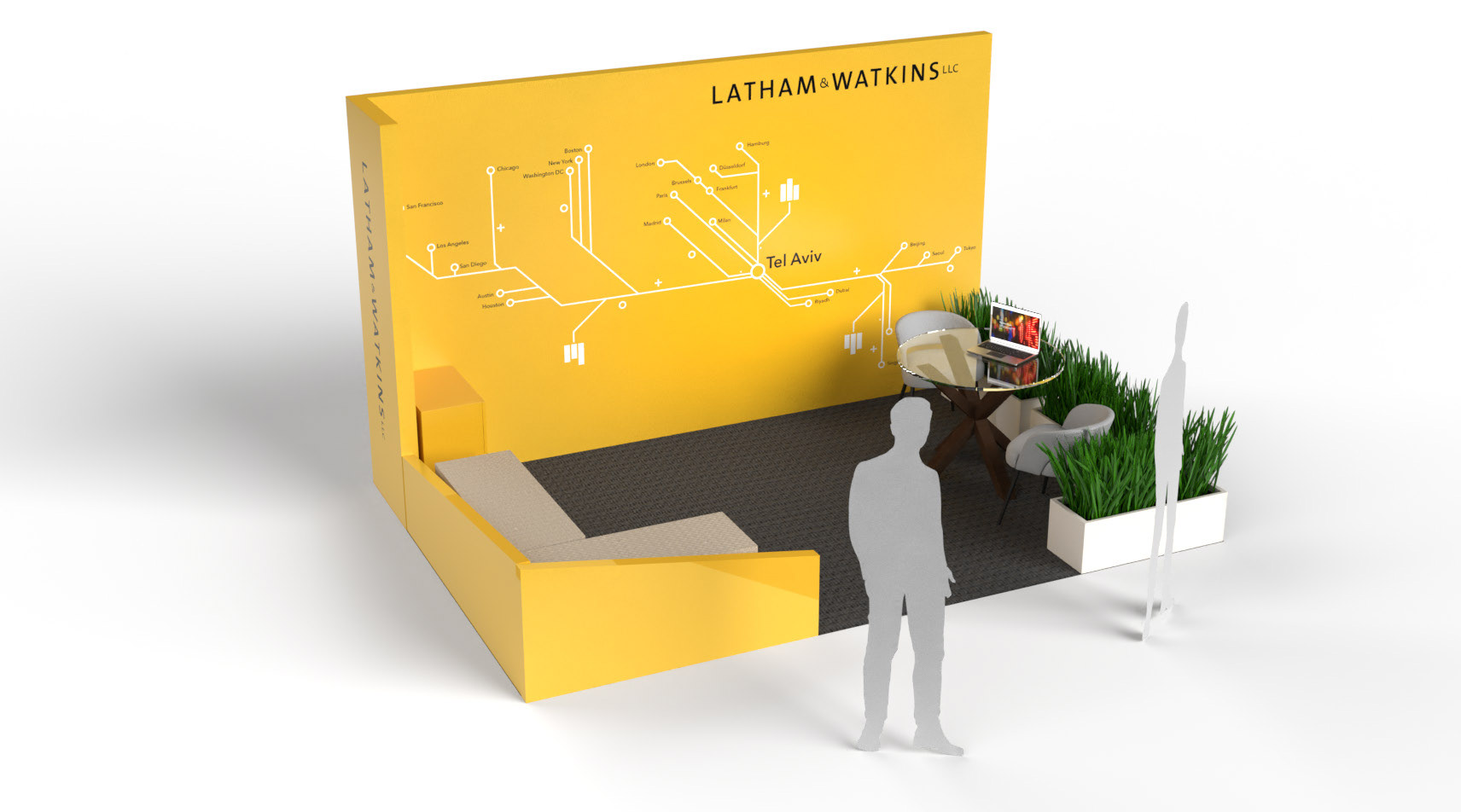
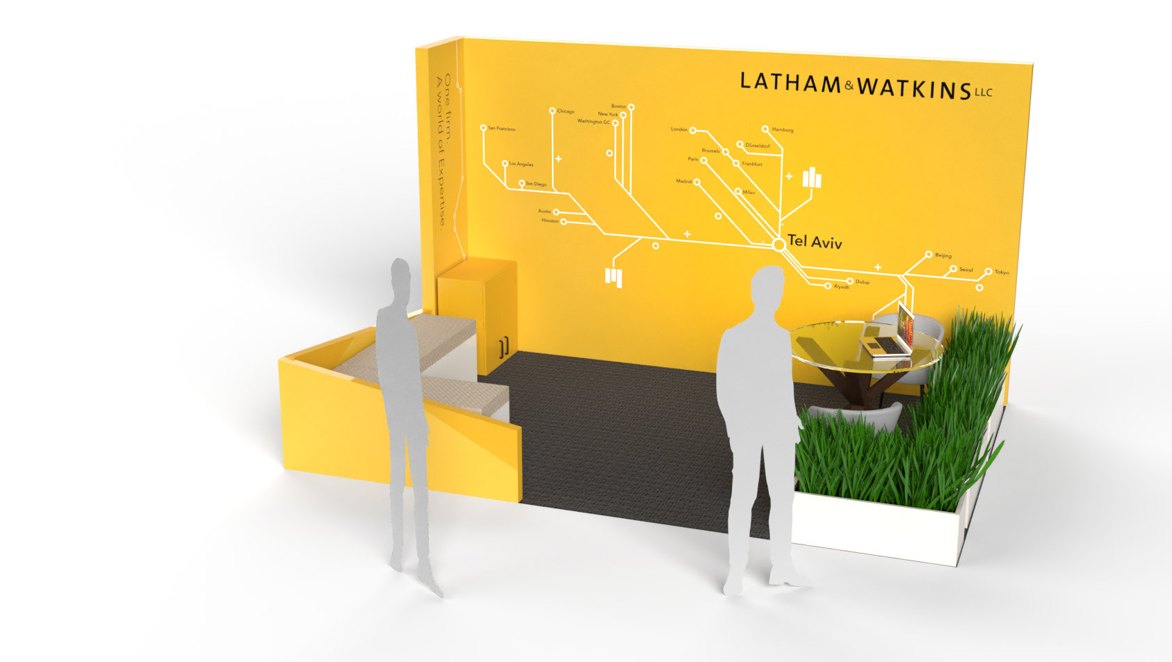
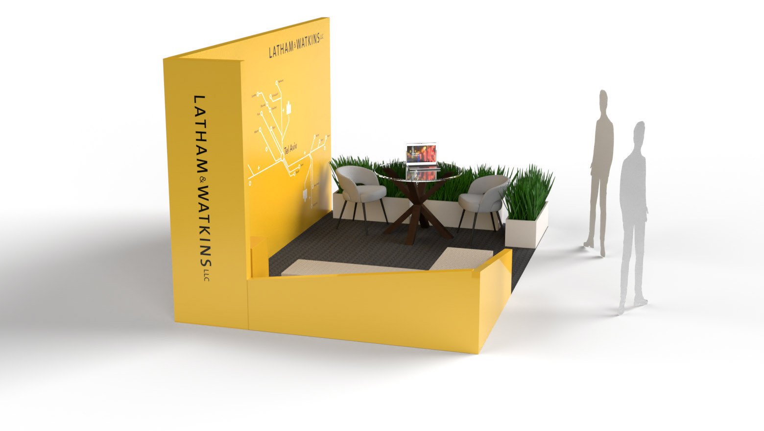
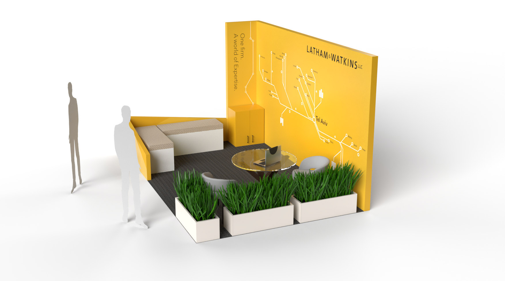
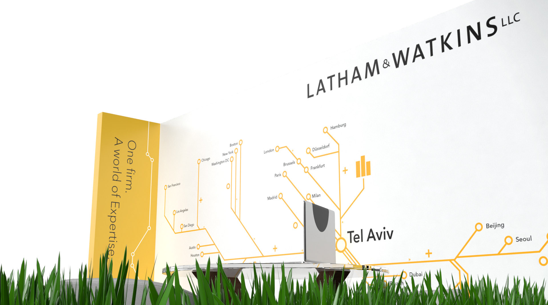
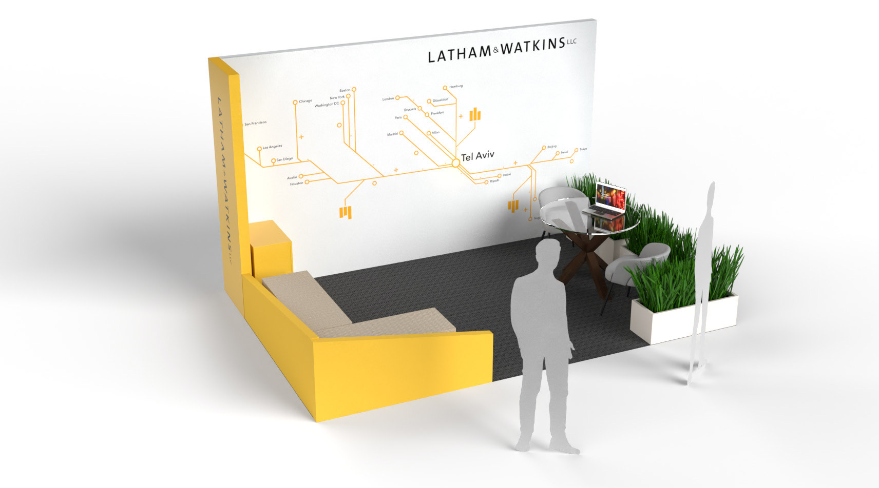
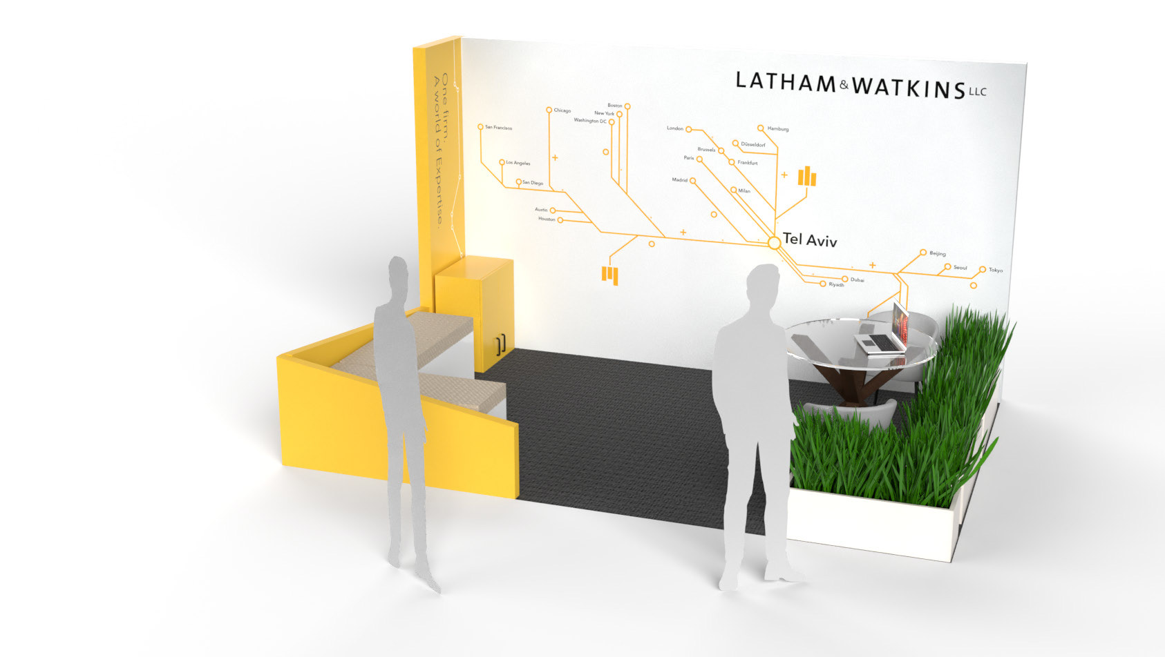
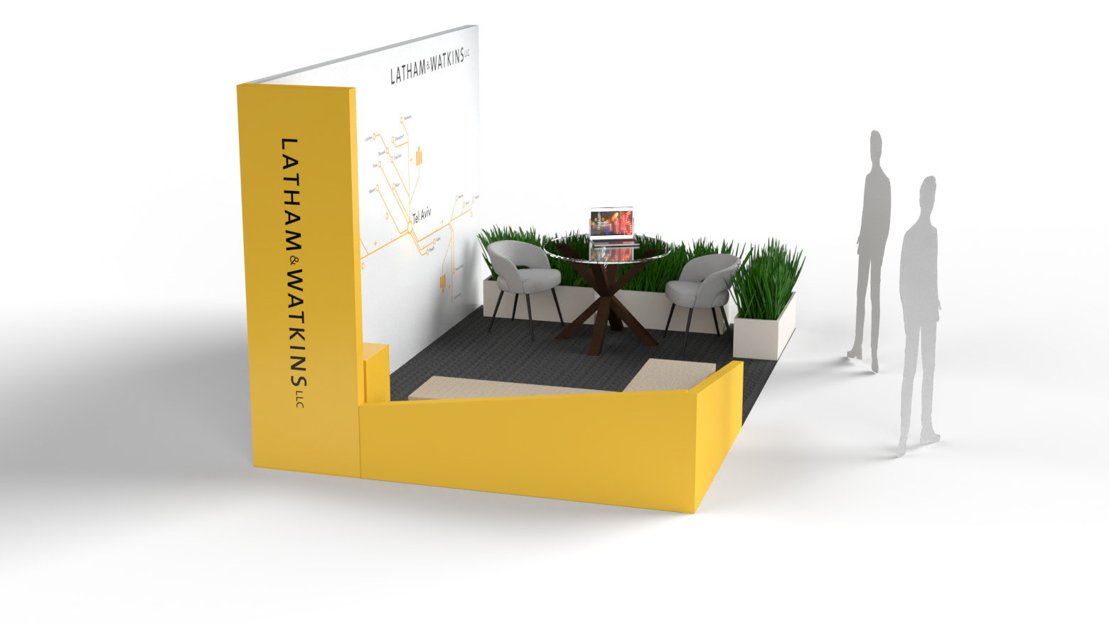
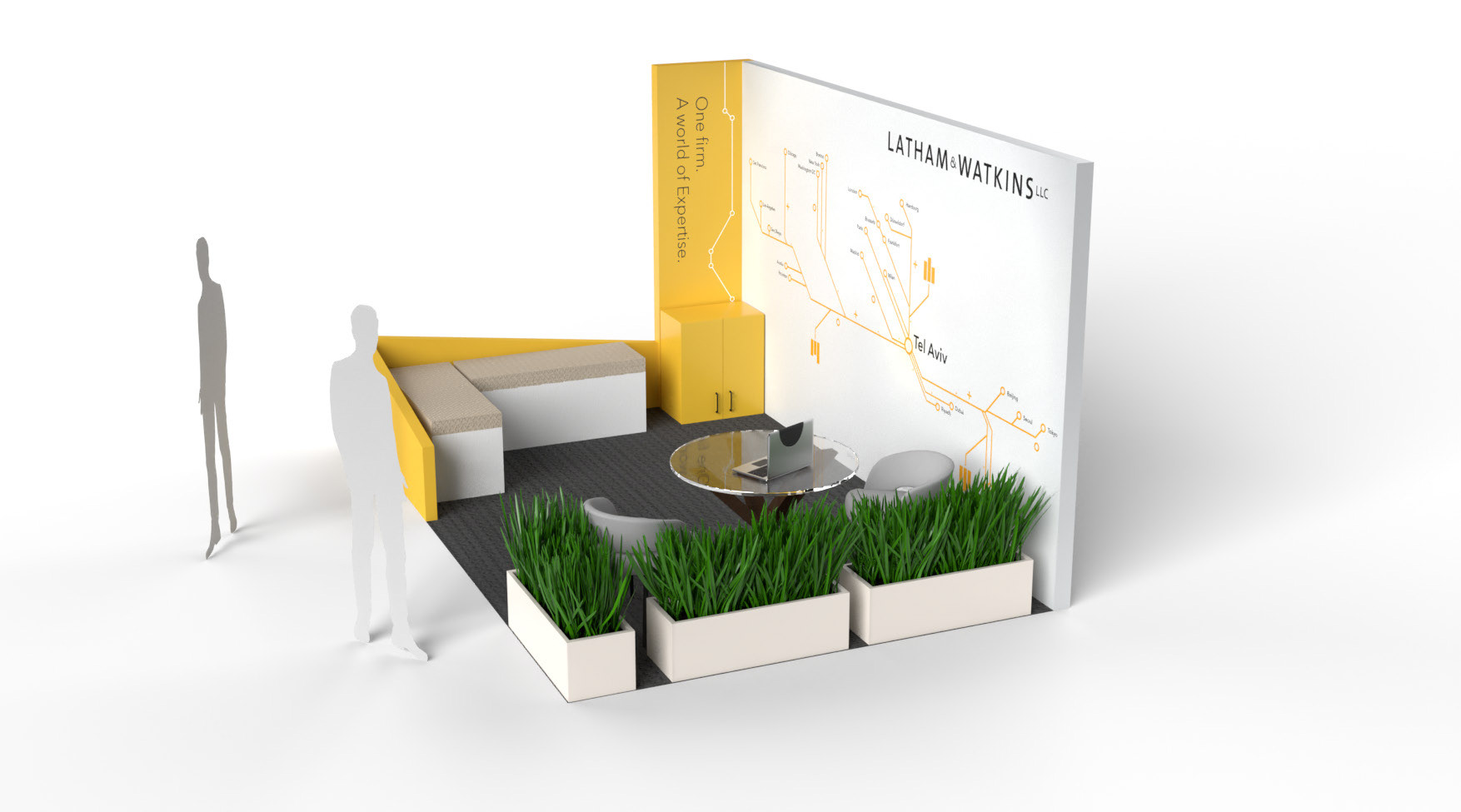
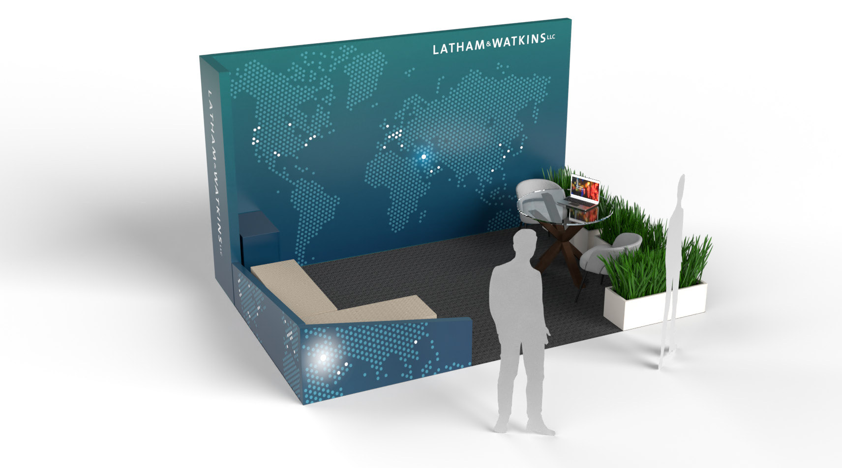
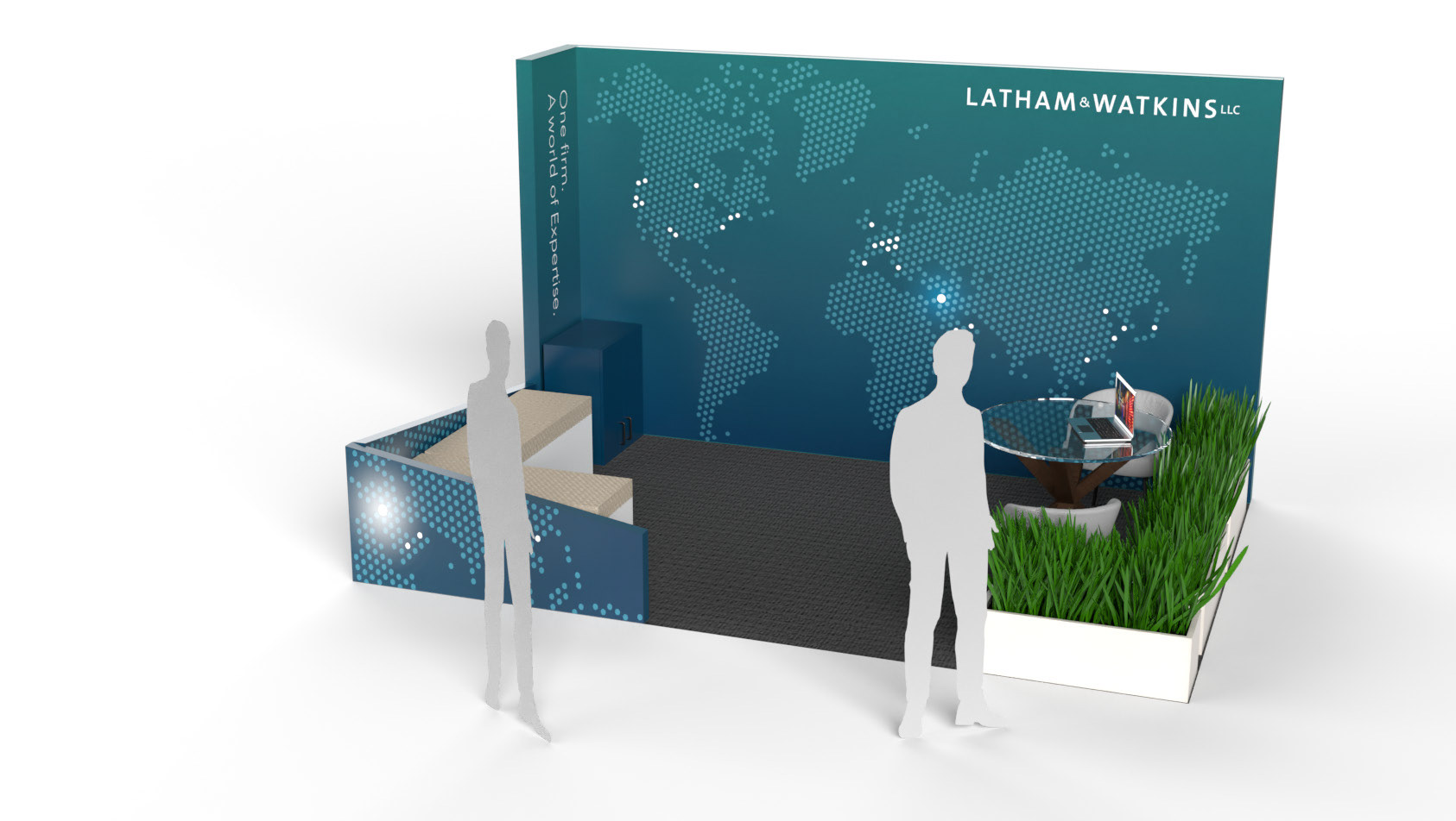
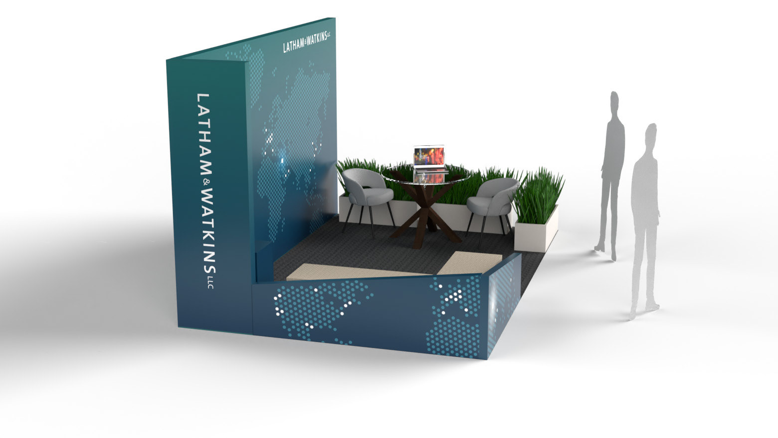
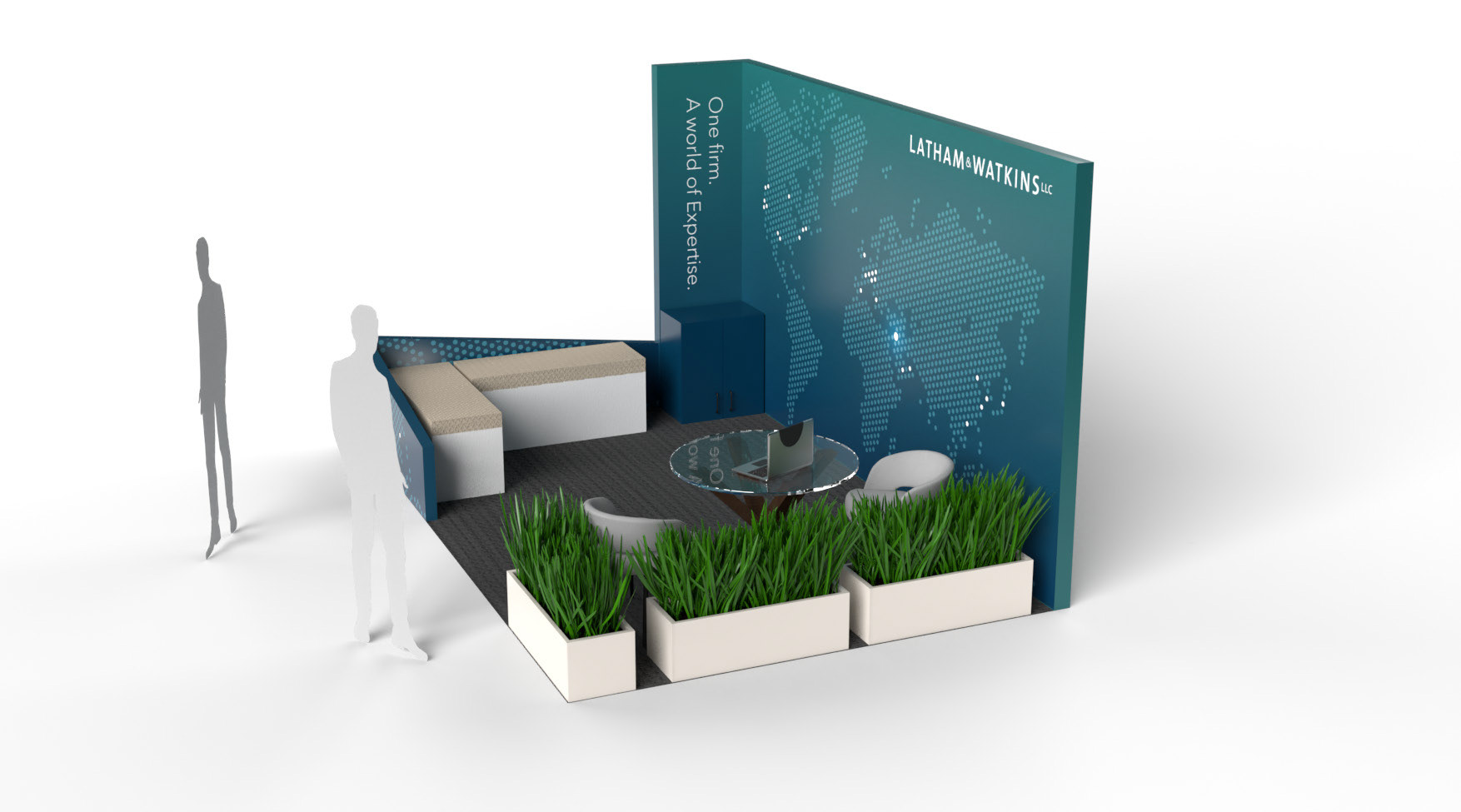
The first design phase explored a bold, structured approach to positioning the event as a global nexus of thought leadership. Two distinct visual routes were proposed at this stage: one used a bright yellow palette with a transit-inspired network map, while the other took a cooler, more ambient route—using a dotted global map to suggest scale, reach, and digital connectivity.
Both directions delivered clarity and presence, helping kick off valuable conversations with stakeholders about tone and message. While the client appreciated the professionalism and polish, the feedback highlighted a desire for something more emotionally engaging and less corporate. These early explorations helped establish clear creative guardrails and opened the door to a more expressive, human-centred direction in the next phase.
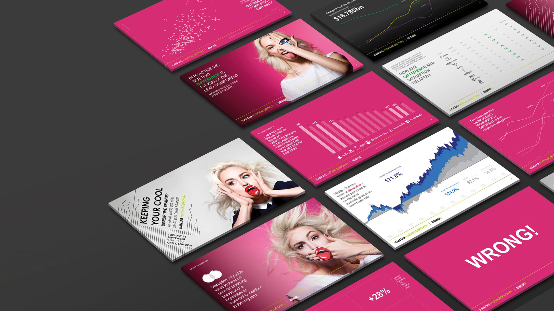
Design V2
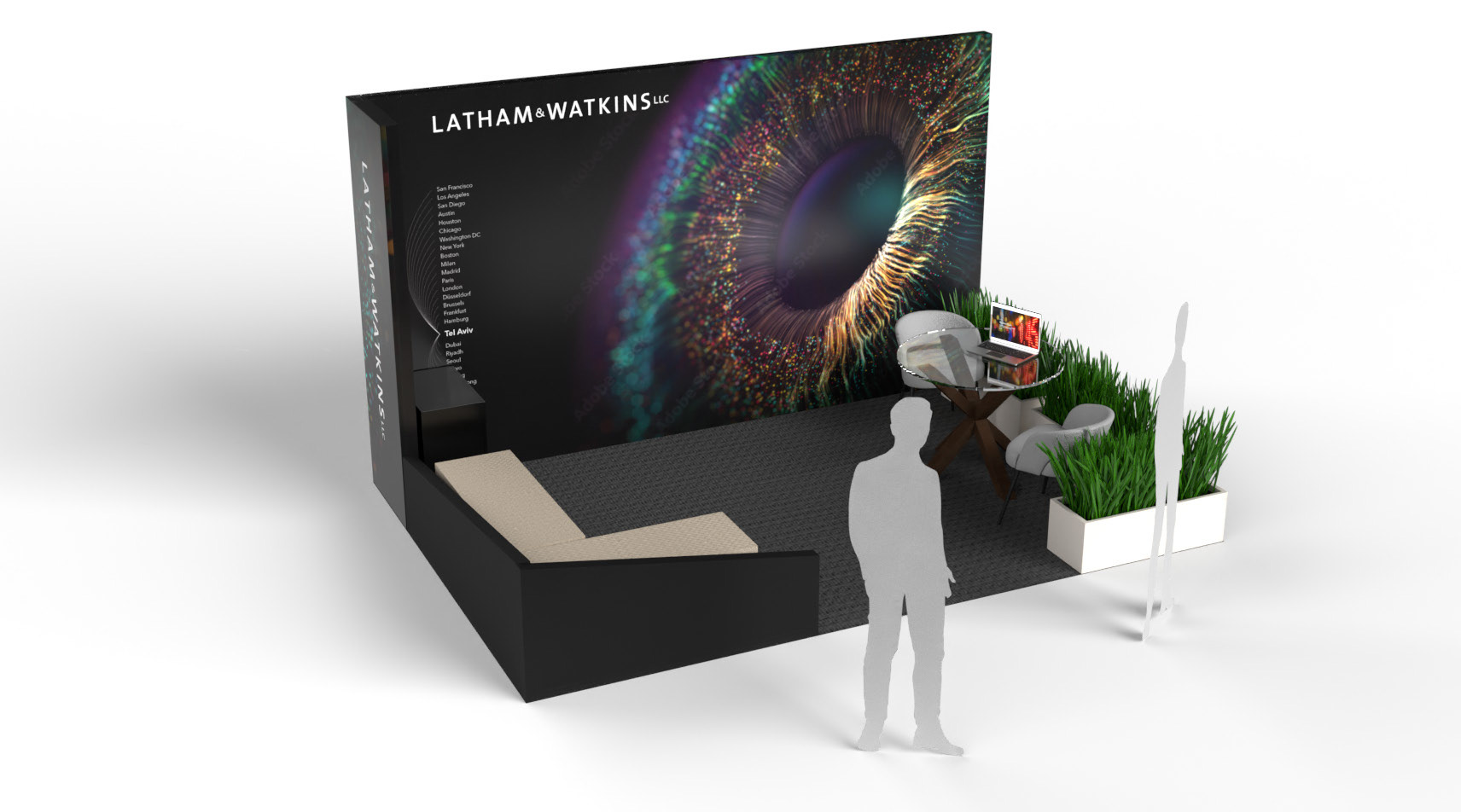
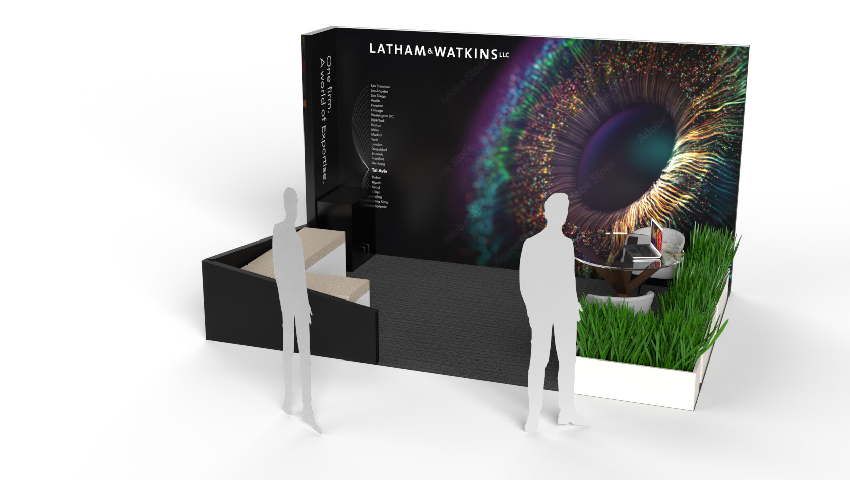
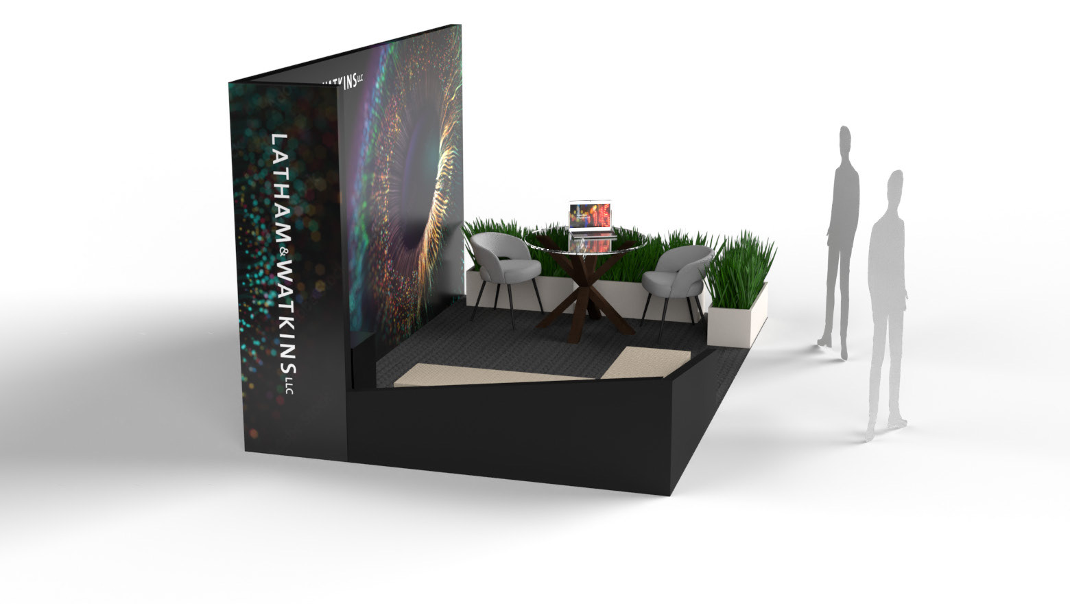
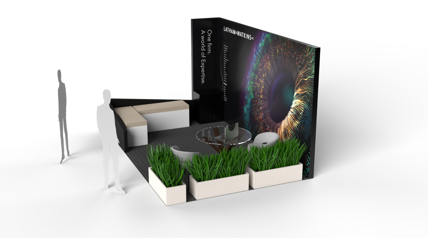
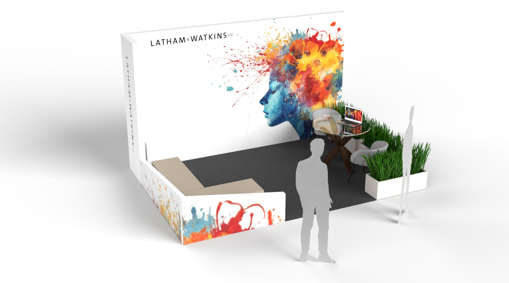
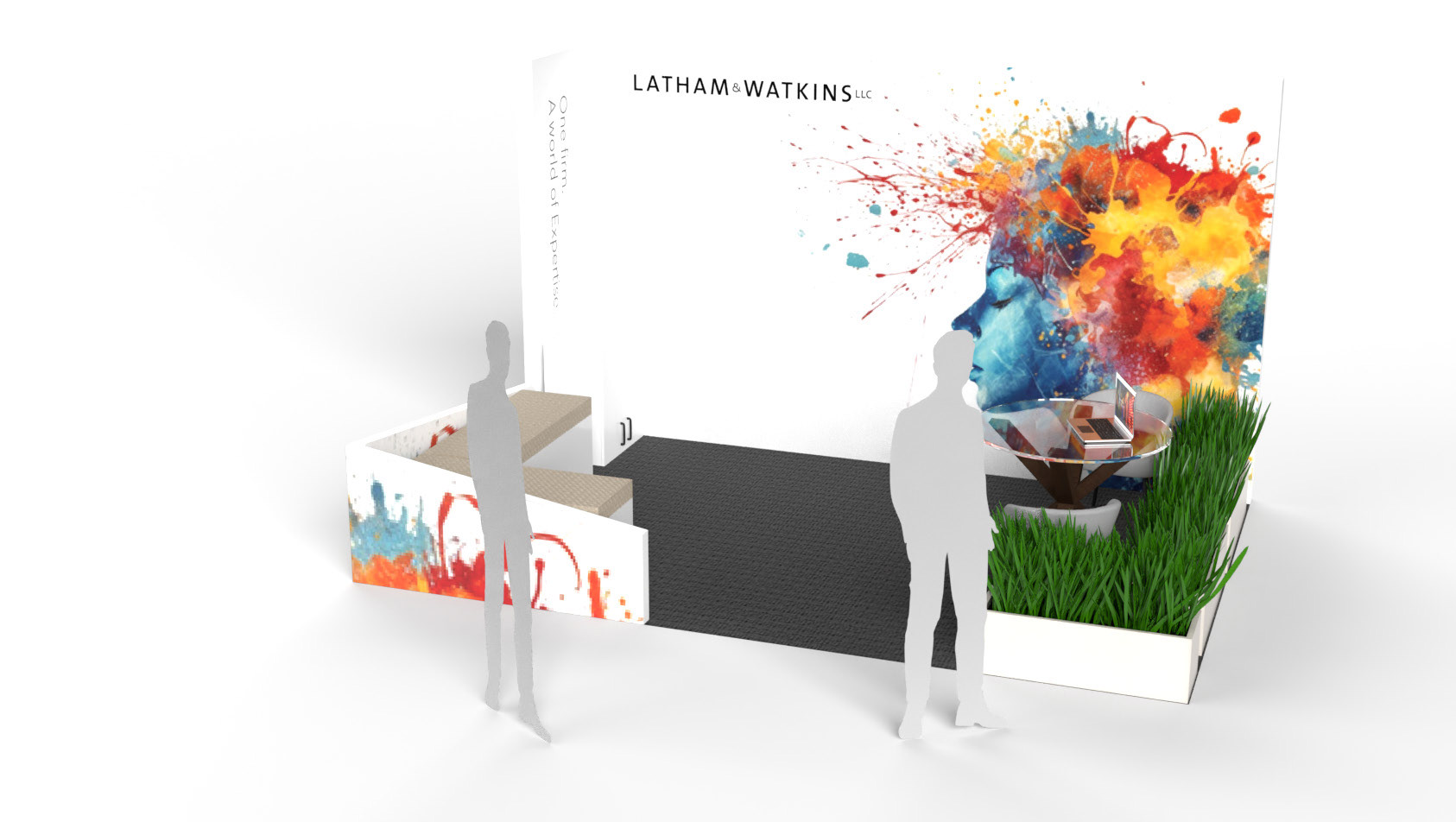
In response to feedback from the first round, this phase leaned into more expressive, emotionally resonant visuals—moving away from structured maps and toward storytelling through imagery. Two distinct creative routes were explored: one using a vibrant macro shot of an iris to suggest clarity, focus, and insight; the other, a painterly portrait bursting with colour to evoke creativity, humanity, and dynamic thinking.
Both routes aimed to reframe the tone of the environment—shifting from corporate to conversational, while still retaining a sense of authority and polish. Through ongoing dialogue with stakeholders, these concepts helped surface key insights around the brand’s personality and how the event experience should feel: confident, but never cold.
This round played a pivotal role in aligning the broader team on emotional tone, audience perception, and the kind of impact they wanted the space to create. It also demonstrated flexibility in exploring divergent visual expressions—each rooted in strategic intent.
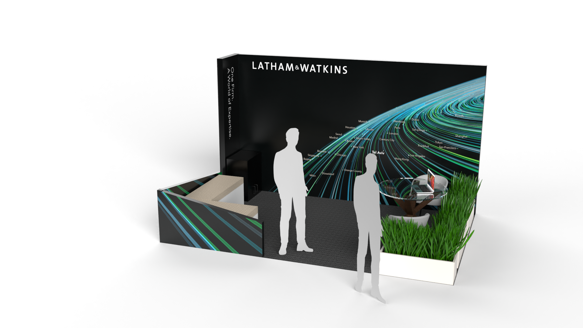
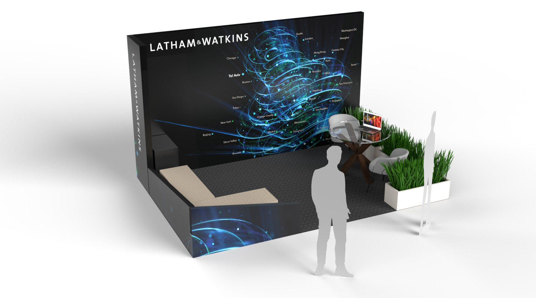
Design V3
At this stage, the client expressed a desire for a more “atomic” concept—something that could convey global connectivity on a micro level, with a visual language rooted in precision, energy, and flow. I interpreted this as a move towards more dynamic, data-informed imagery that felt intelligent and in motion.
Two distinct routes emerged: one with sweeping vector lines creating a sense of acceleration and directional flow, the other with layered particle fields forming a kind of digital nebula. Both visualised movement through space—suggesting complexity, interconnectivity, and the invisible networks that underpin global collaboration.
These options marked a creative turning point. The language was abstract but grounded, confident but fluid—finally striking the right balance between high-tech sophistication and a human touch. The “atomic” brief became a springboard for creative clarity, setting the foundation for the final direction.


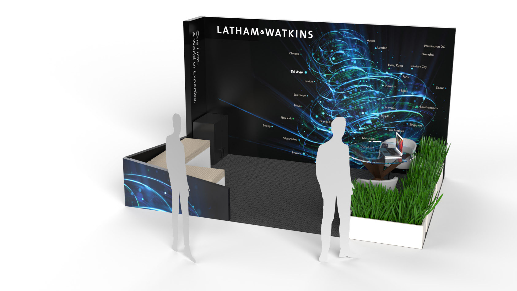
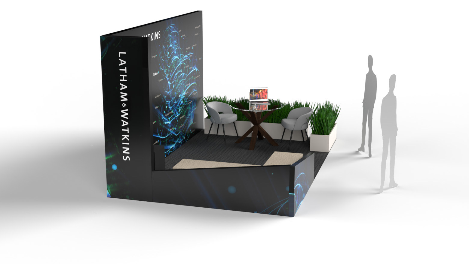
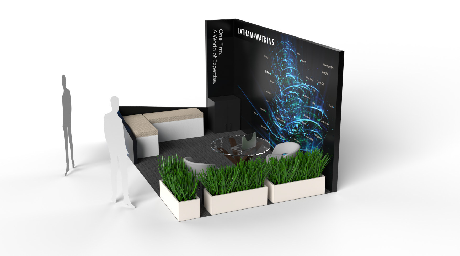
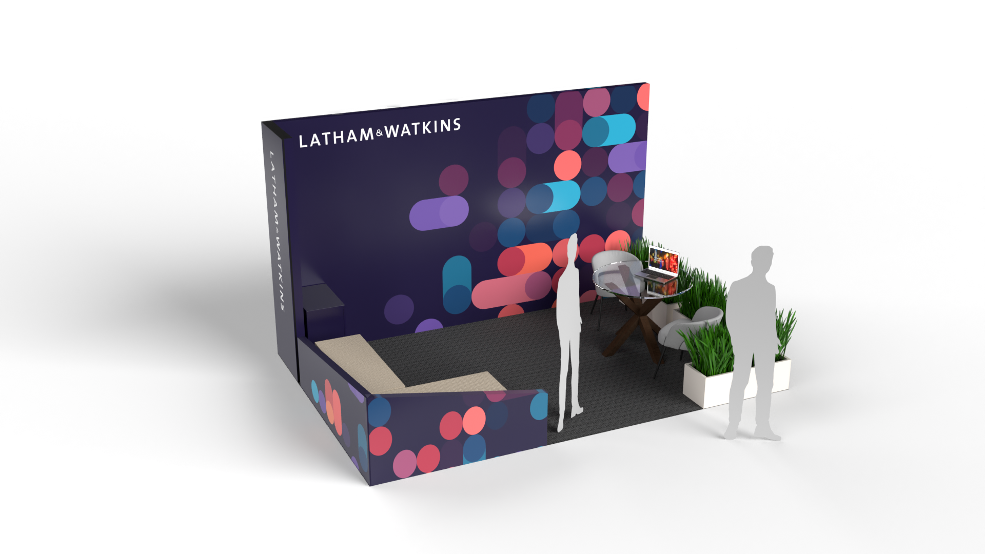
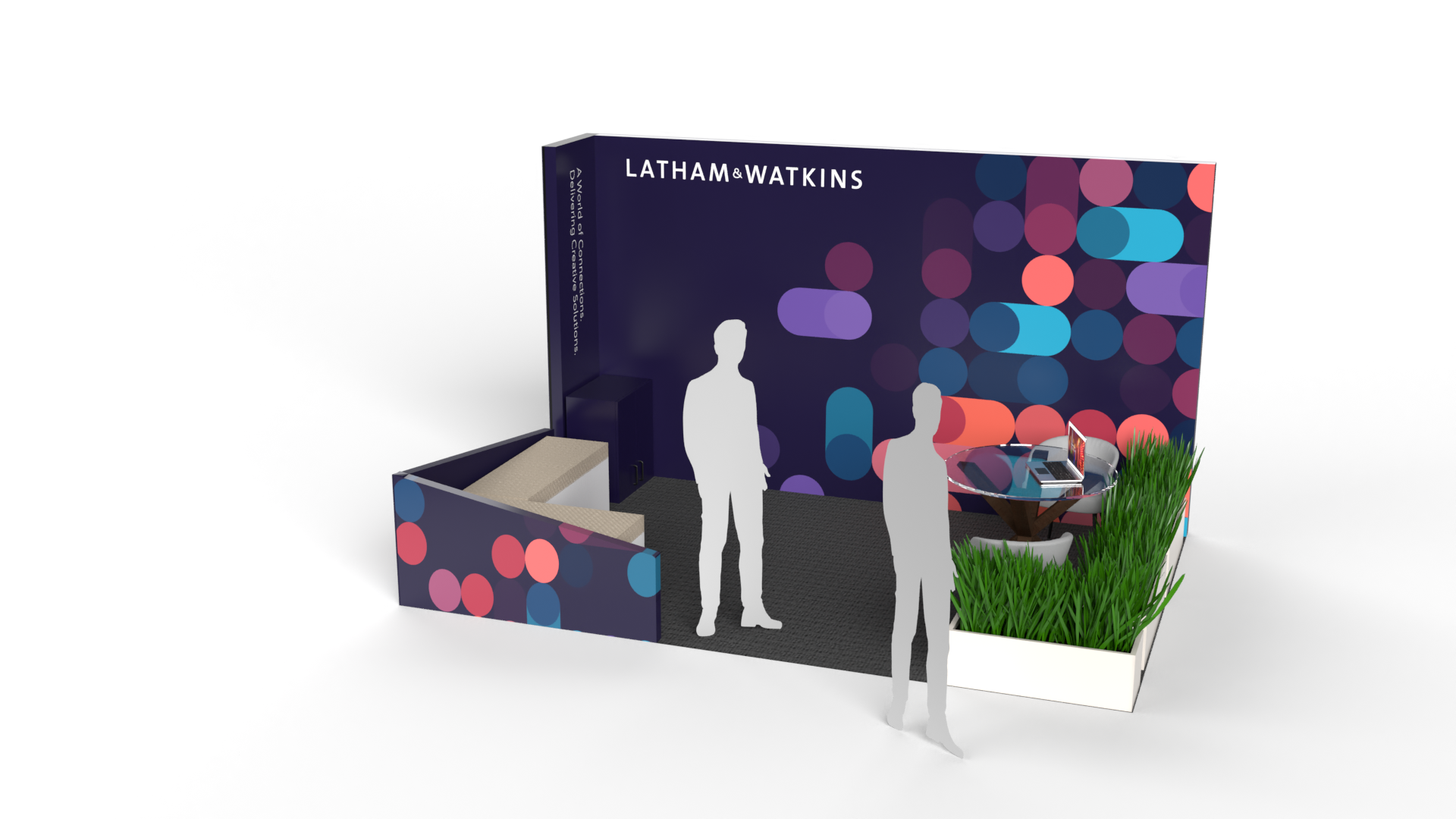
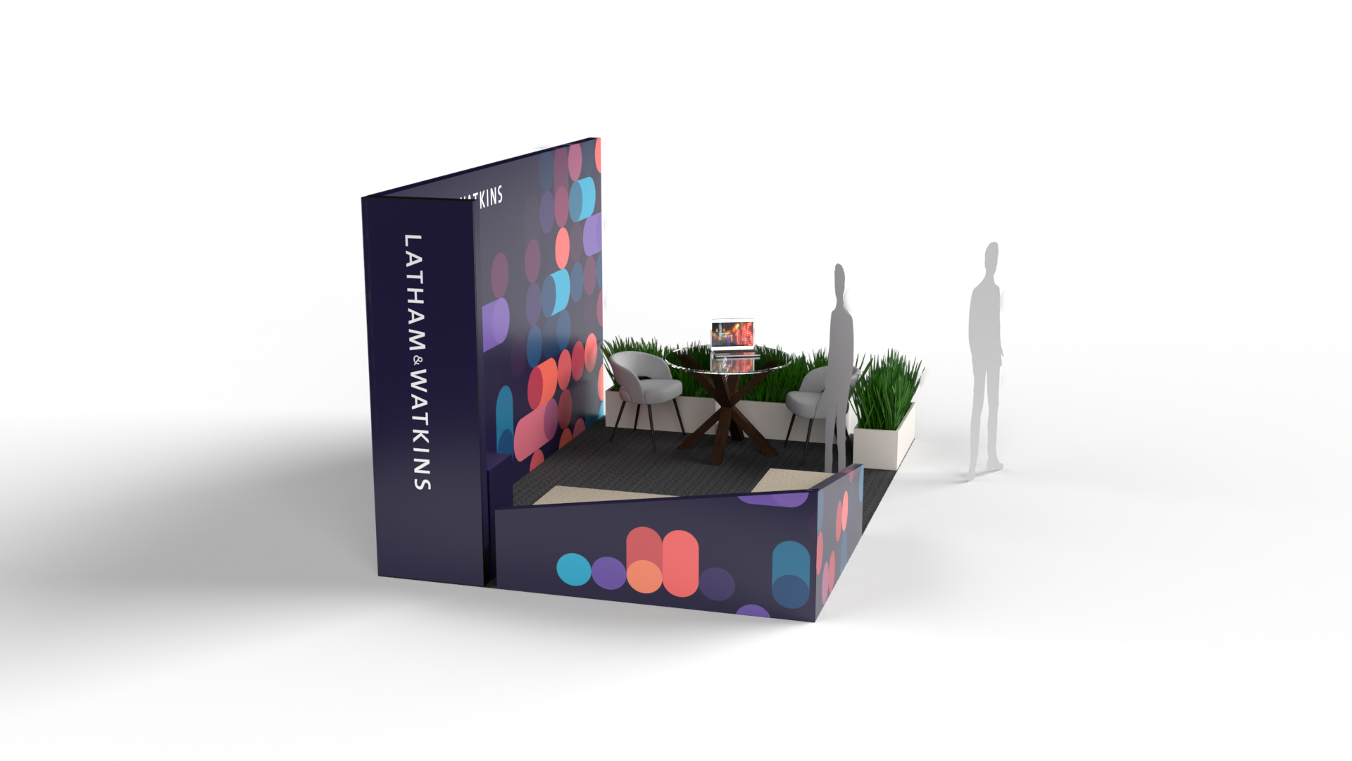
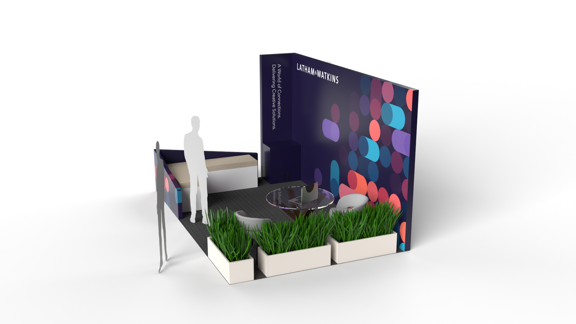
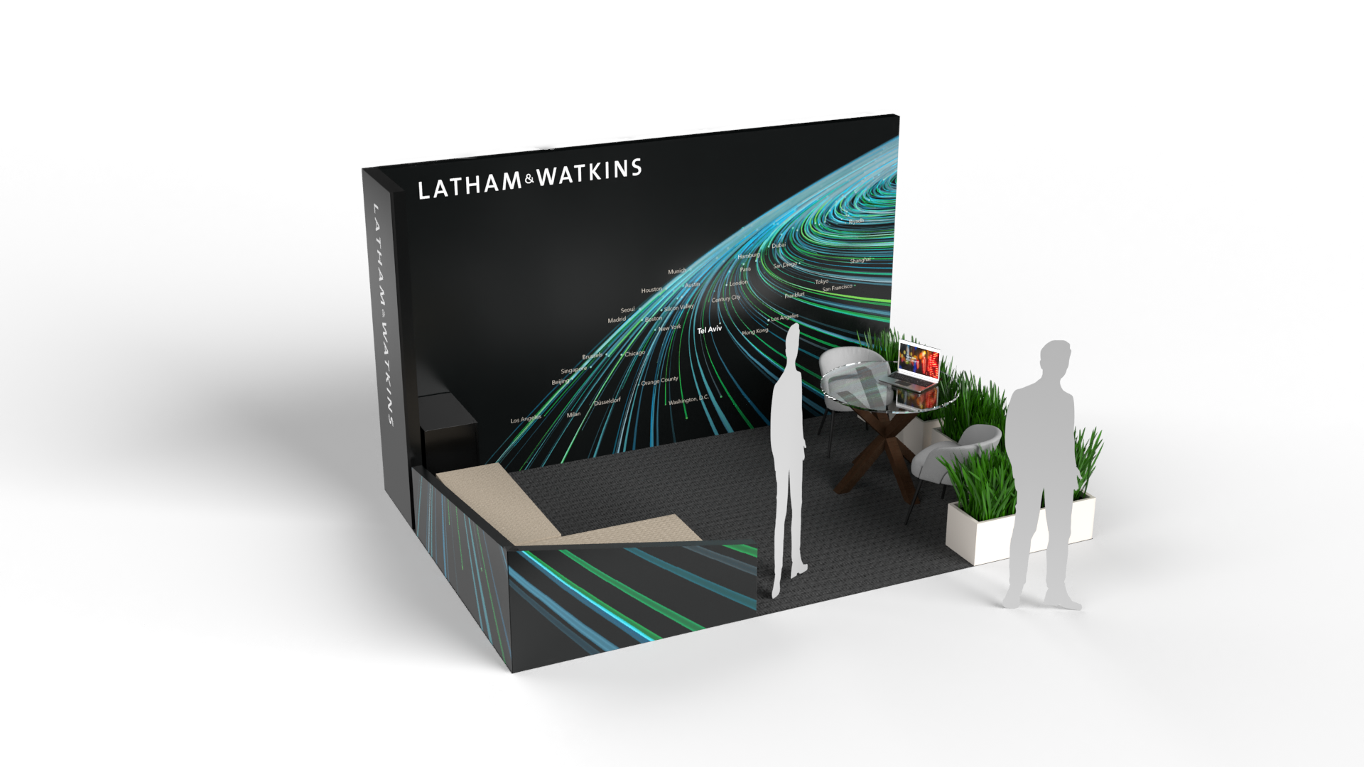
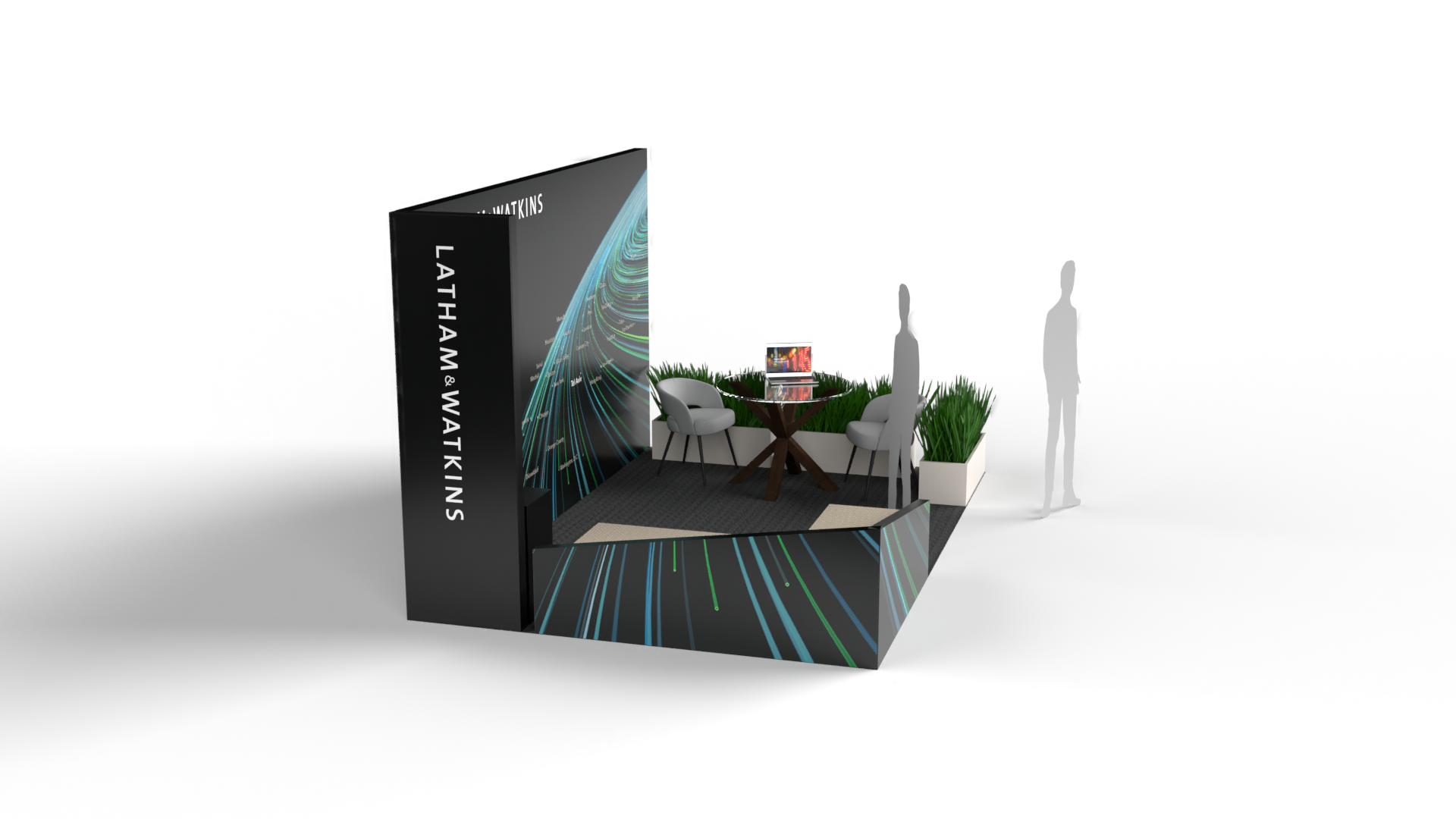
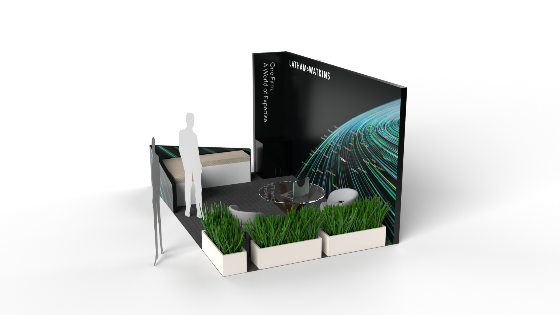
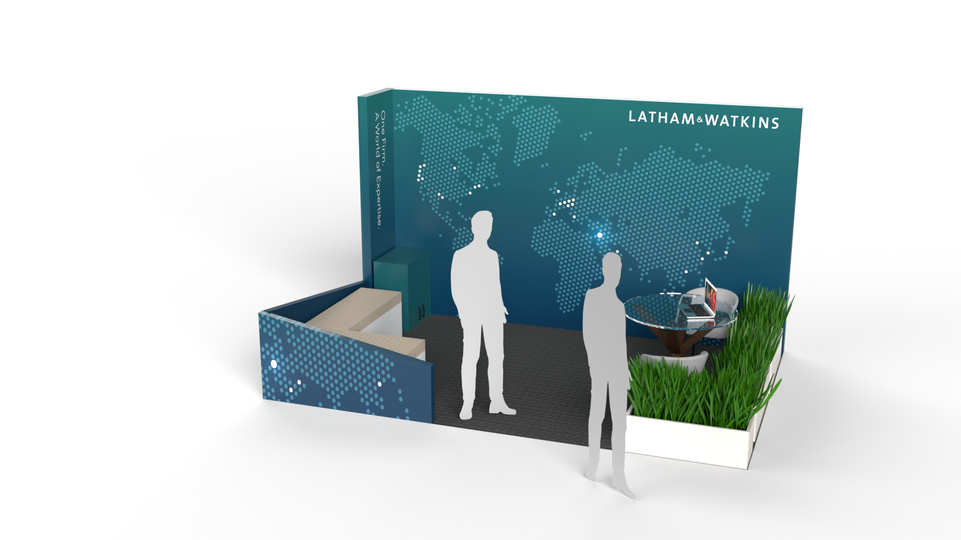
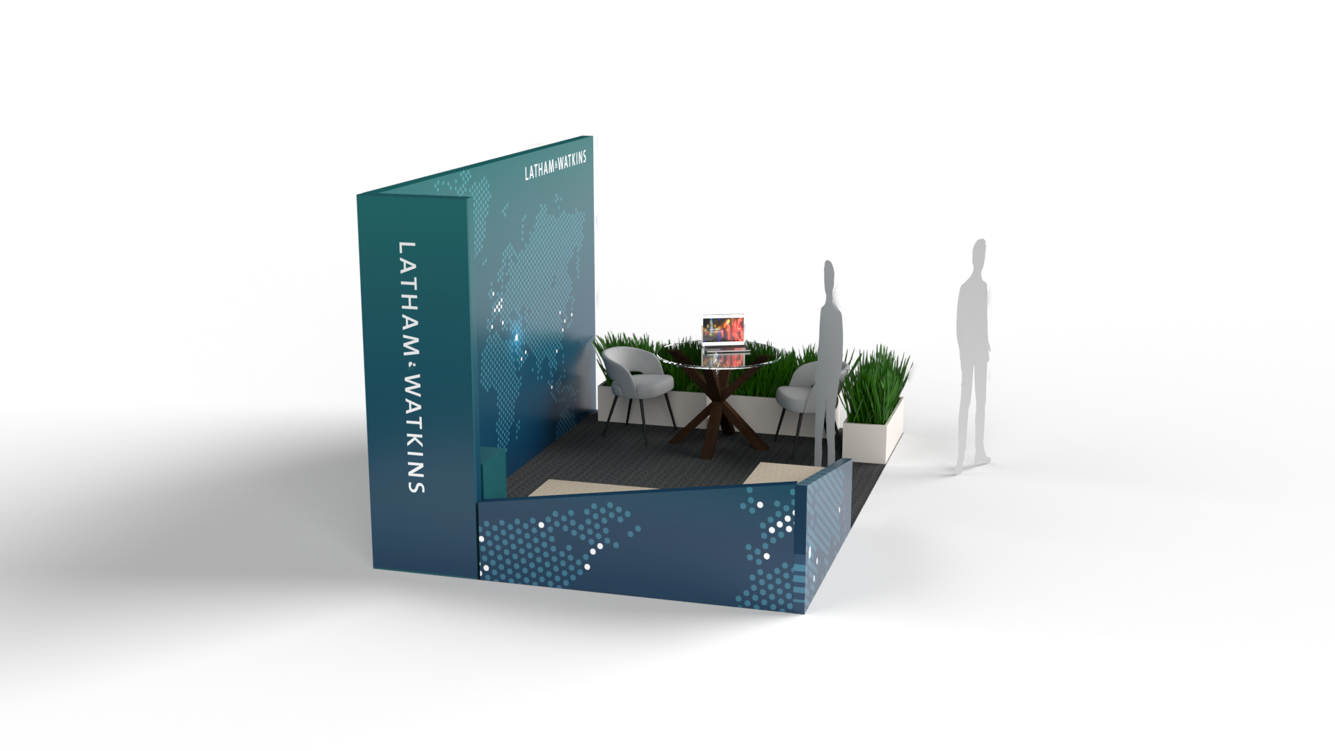
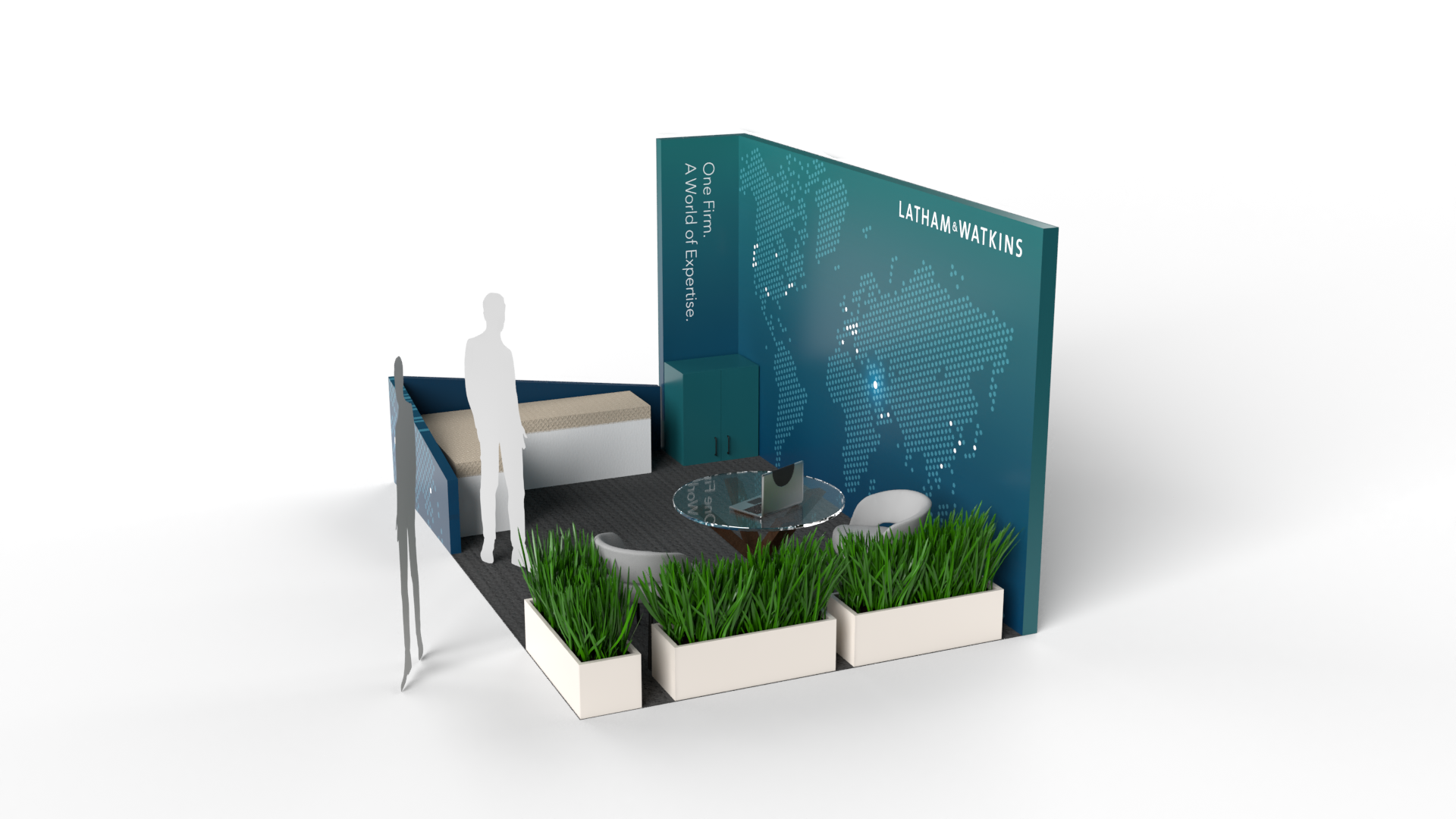
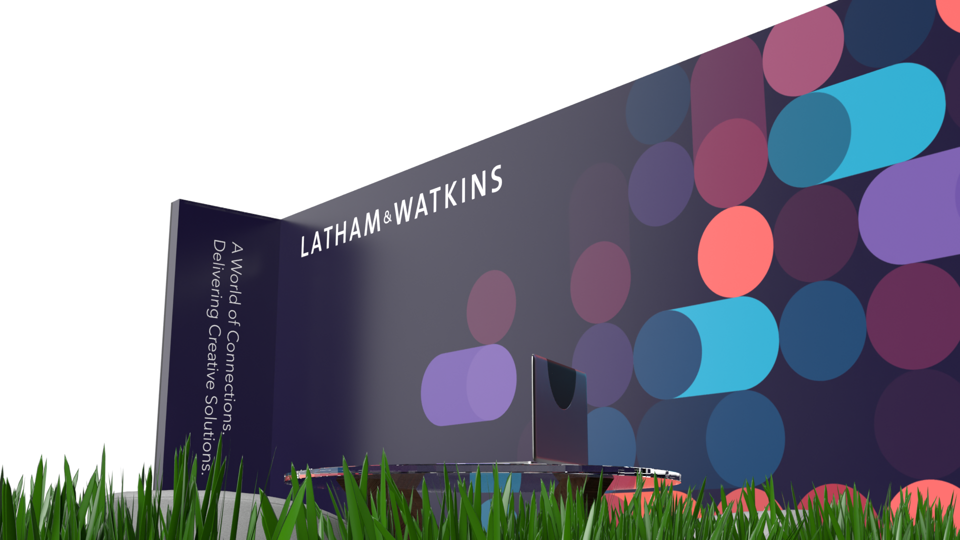
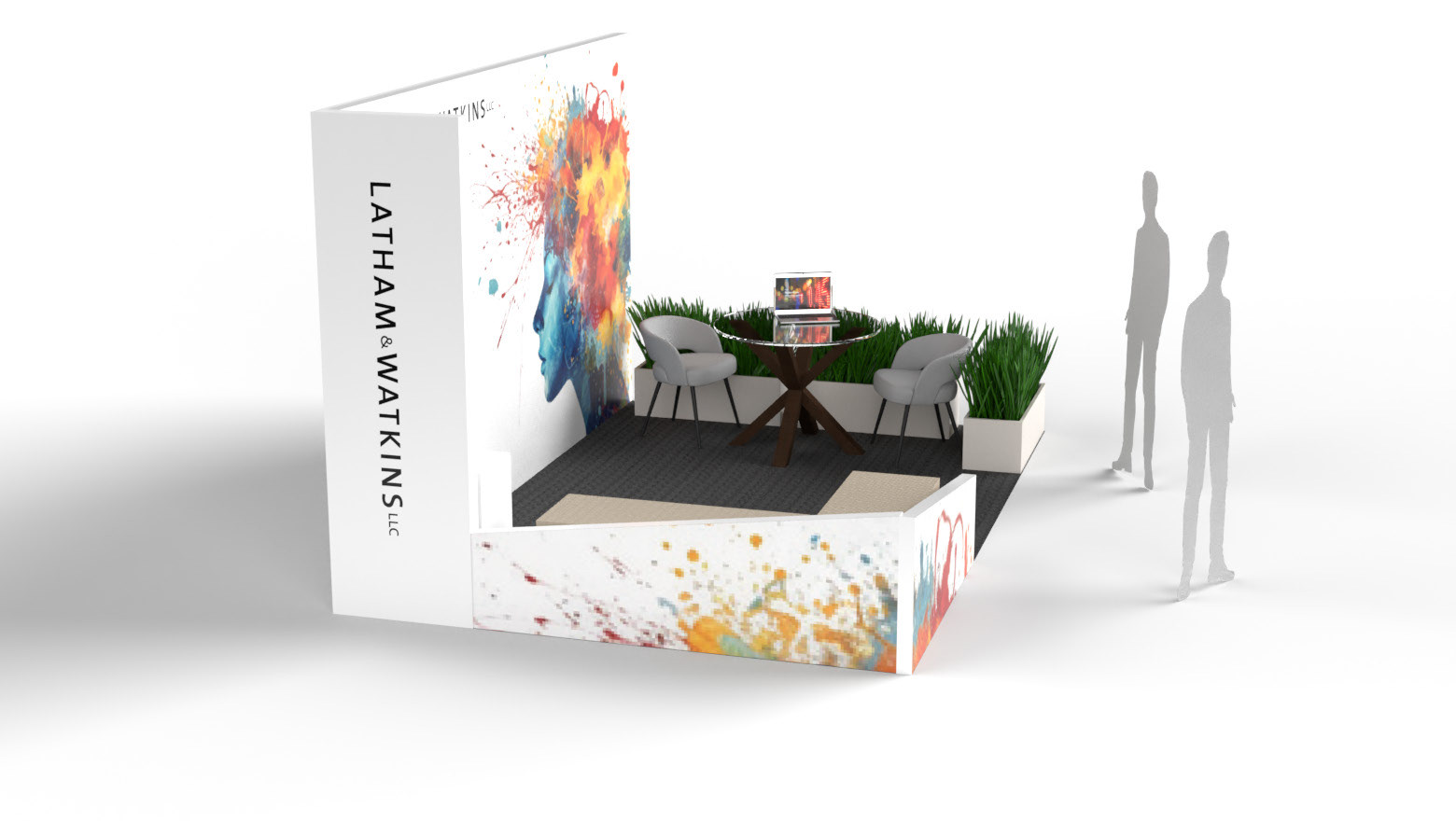
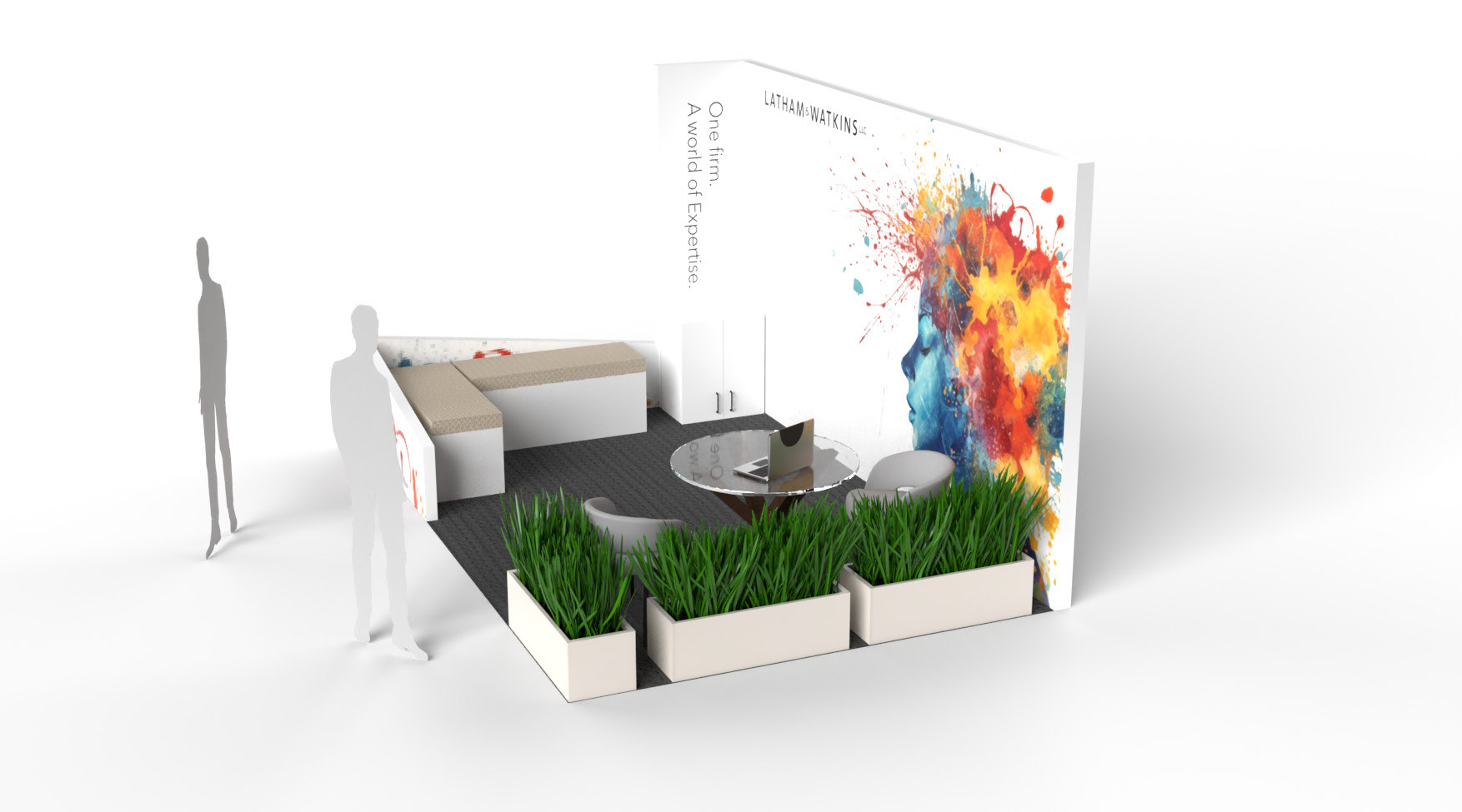
Final Designs
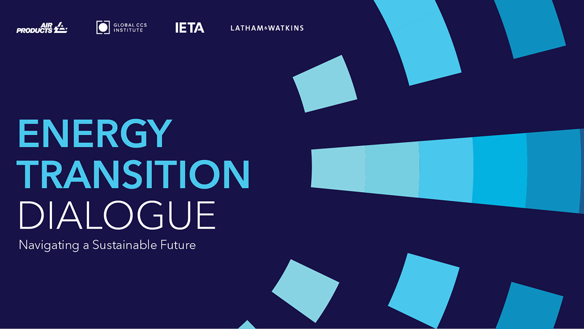
After a rich creative process exploring multiple directions—from global systems to abstract data and expressive imagery—the final approved design struck the right balance between distinctiveness and brand alignment. The chosen concept featured bold geometric forms in a vibrant, modern palette—evoking themes of innovation, diversity, and flow, while staying firmly grounded in Latham & Watkins’ global presence.
The design’s simplicity and colour confidence offered a fresh take on corporate spatial branding. It created a welcoming, visually engaging environment with just the right energy for international audiences. The repeating modular shapes hinted at networks and collaboration without leaning too heavily on literal references—delivering on the original request for something dynamic and “atomic,” but with broader aesthetic appeal.
This approved direction reflects not just the strength of the creative, but the value of a collaborative, responsive design process. Through open dialogue and iterative development, the final booth experience became a true meeting point of bold design thinking and client clarity.