Sifted Summit brings together some of Europe’s most ambitious founders, investors, and operators—and for the 2023 edition, the team wanted to create something with more personality than the average tech conference. The brief: build a visual direction that felt bold, expressive, and founder-first, while still working within the Sifted brand world.
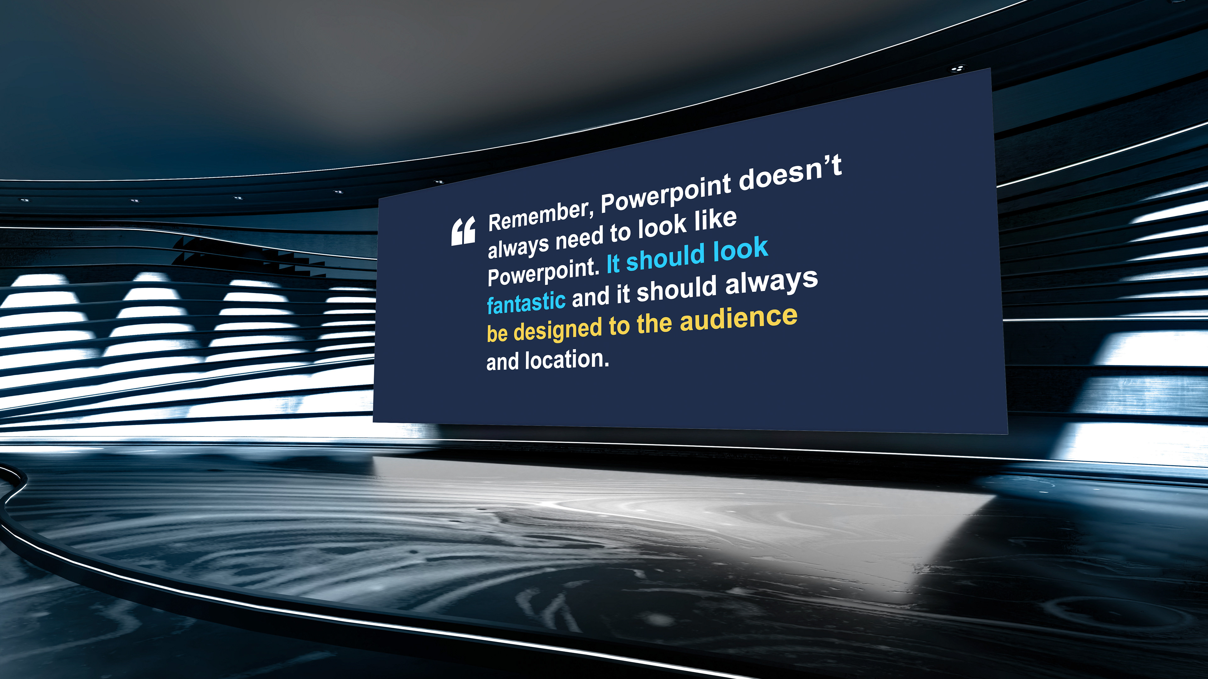
We explored a few early creative routes—ranging from vibrant 3D illustrations to modular poster-style layouts—but landed on a more tactile, cut-out collage style that gave us the most range. It felt editorial, playful, and human. Paired with oversized type, saturated colour, and a looser layout system, it gave us room to be expressive while maintaining clarity across formats.
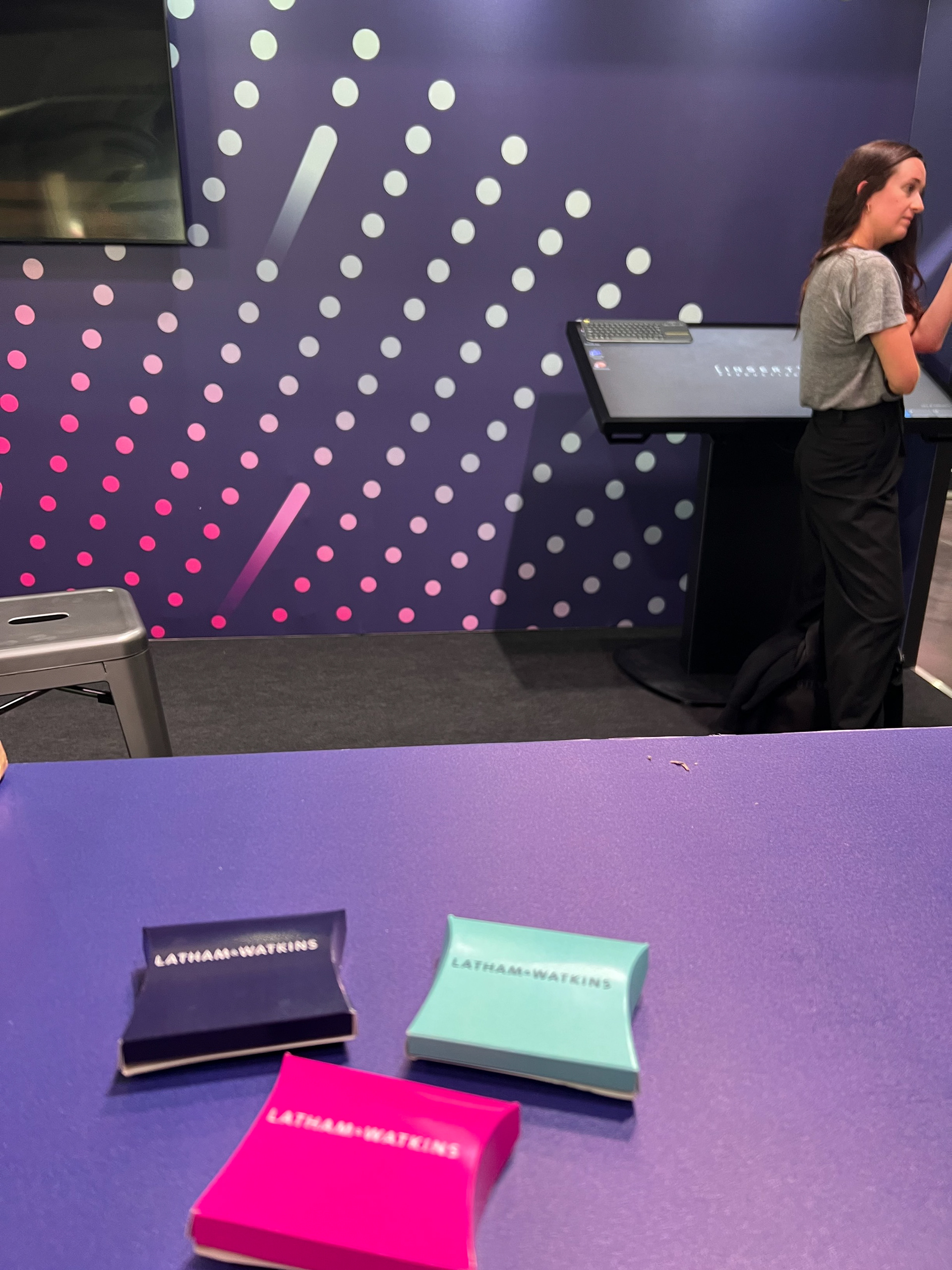
From keynote screens and social assets to wayfinding and printed collateral, the system flexed across the entire event ecosystem. The result was a campaign identity that broke out of the usual grid—capturing the spirit of the community and giving Sifted Summit 2023 a standout, ownable look.
2022 Design
2023 Design Process
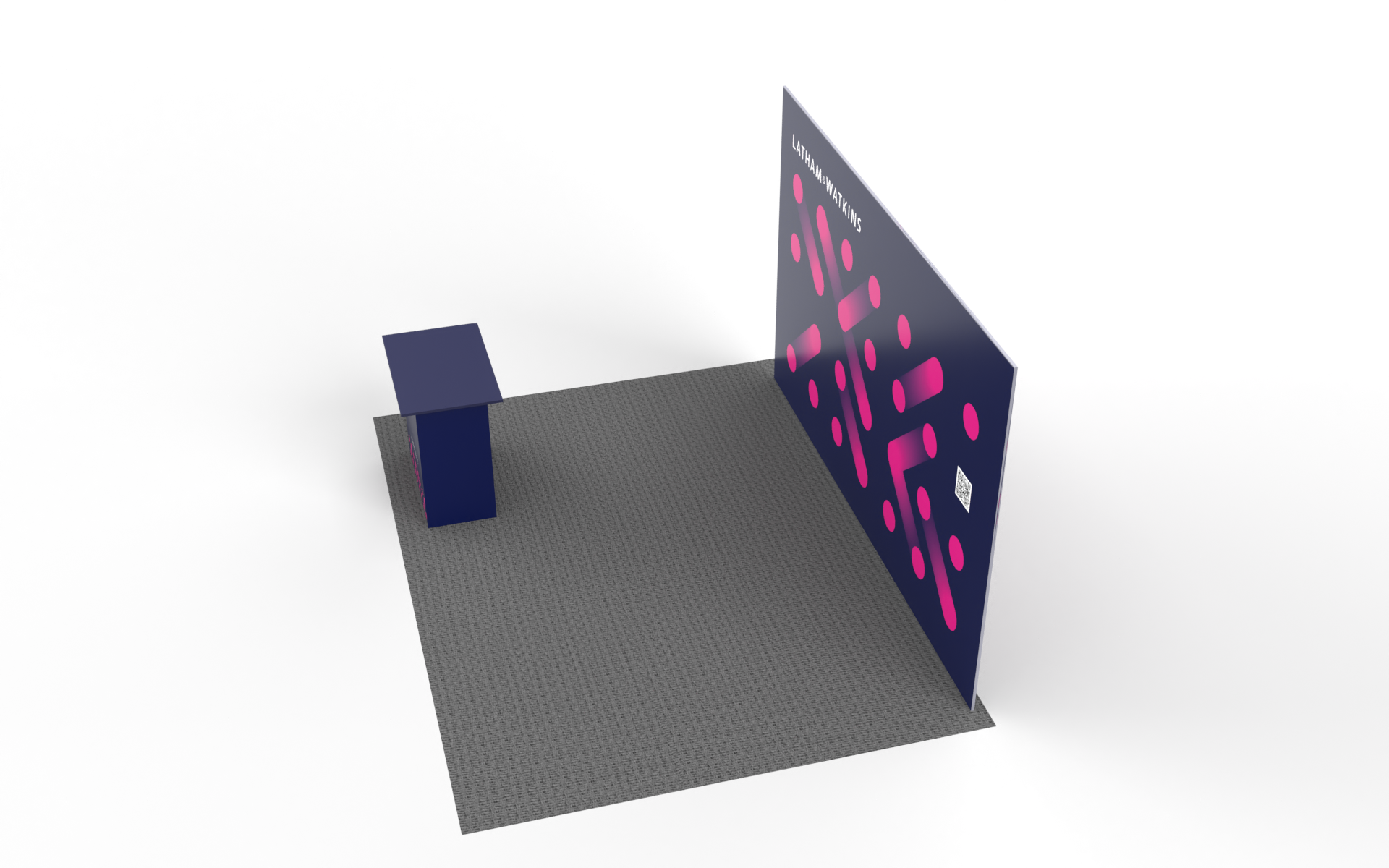
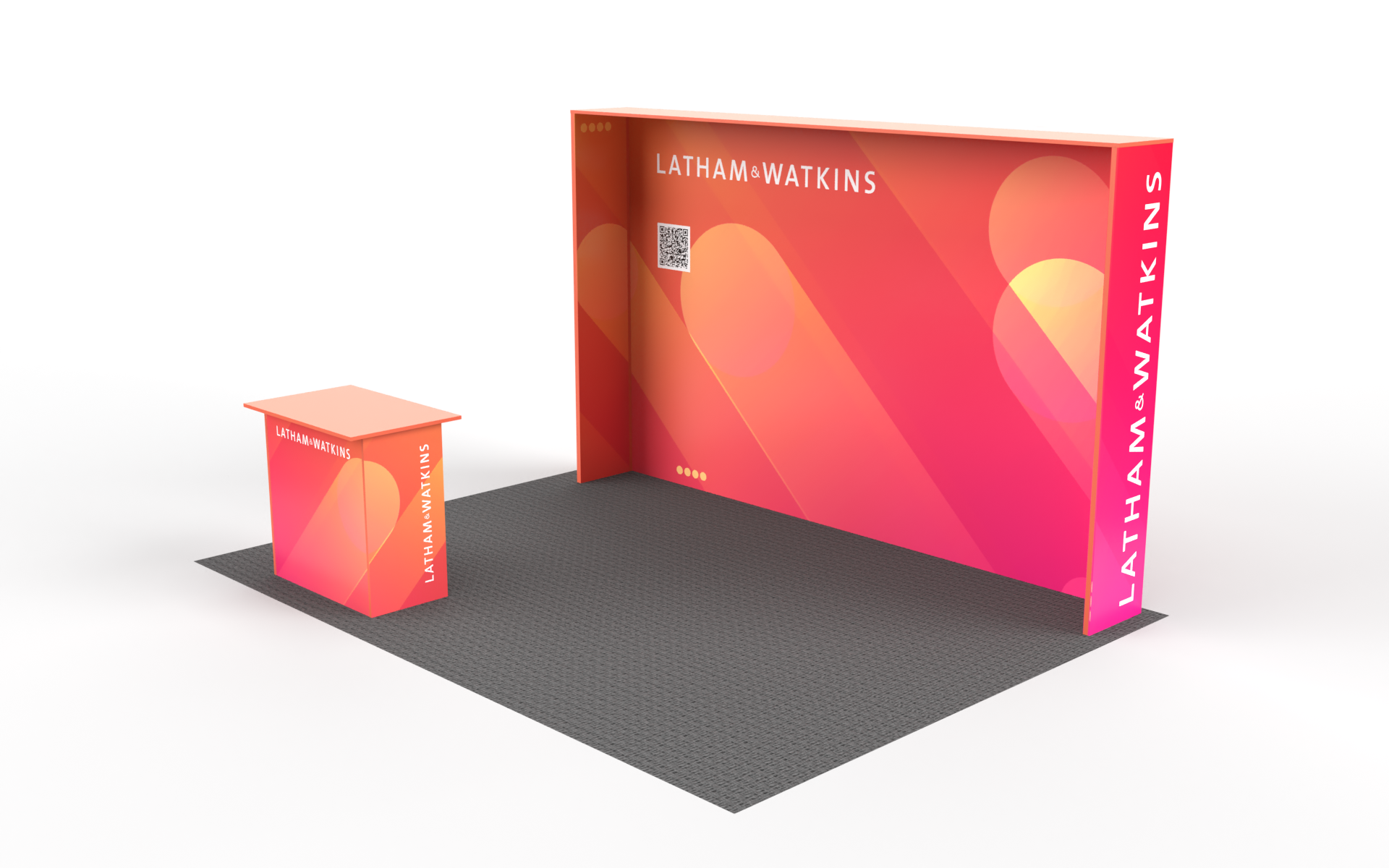
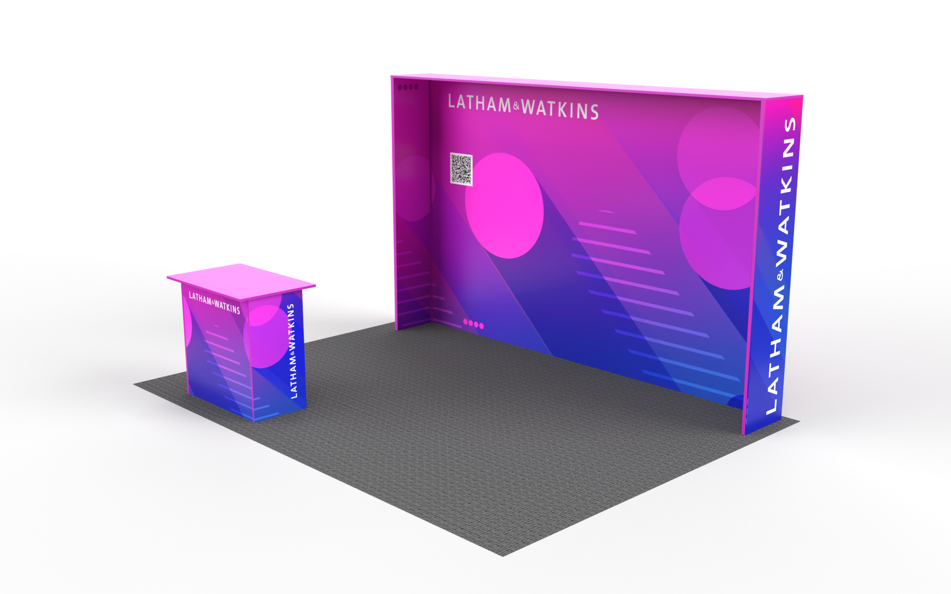
V1
2023 Design Process
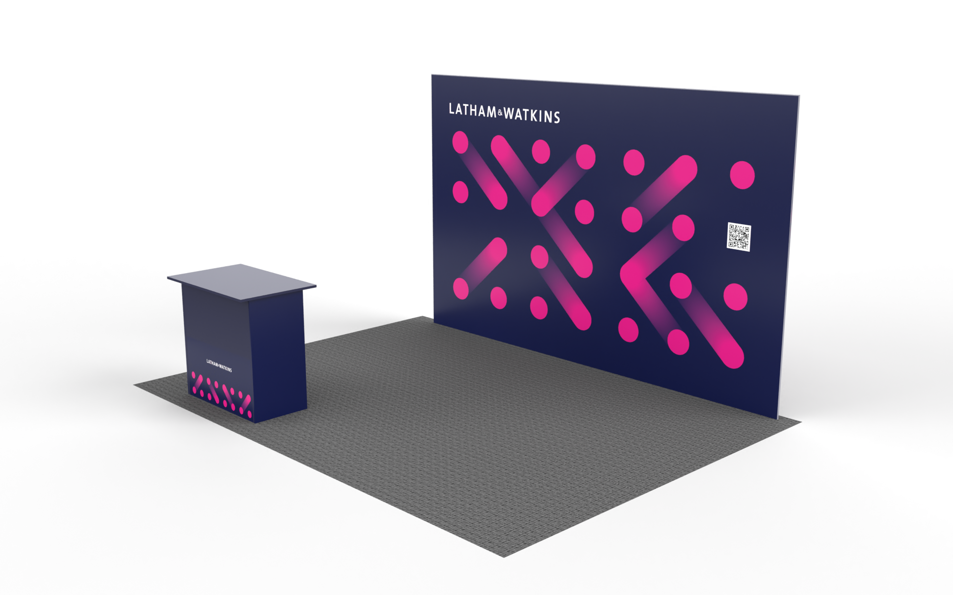
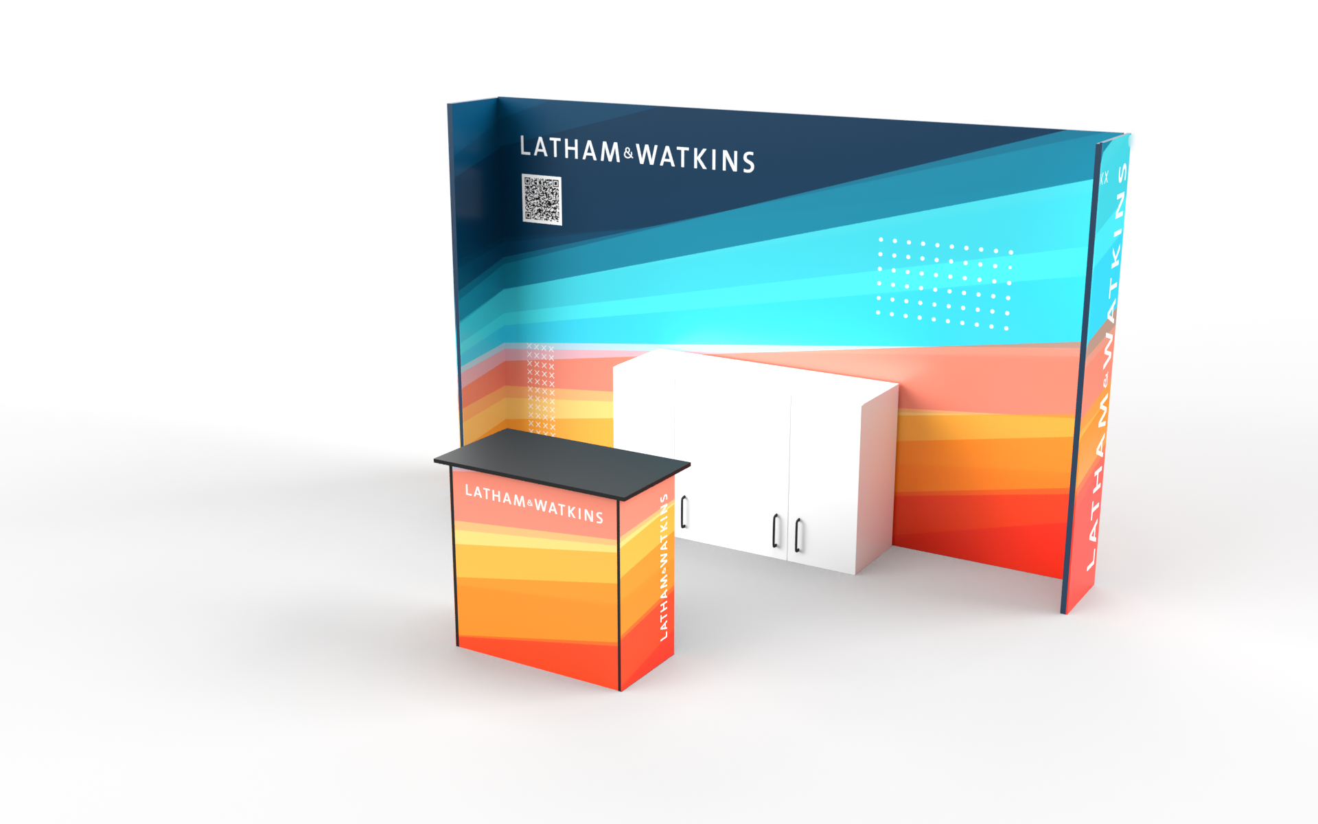
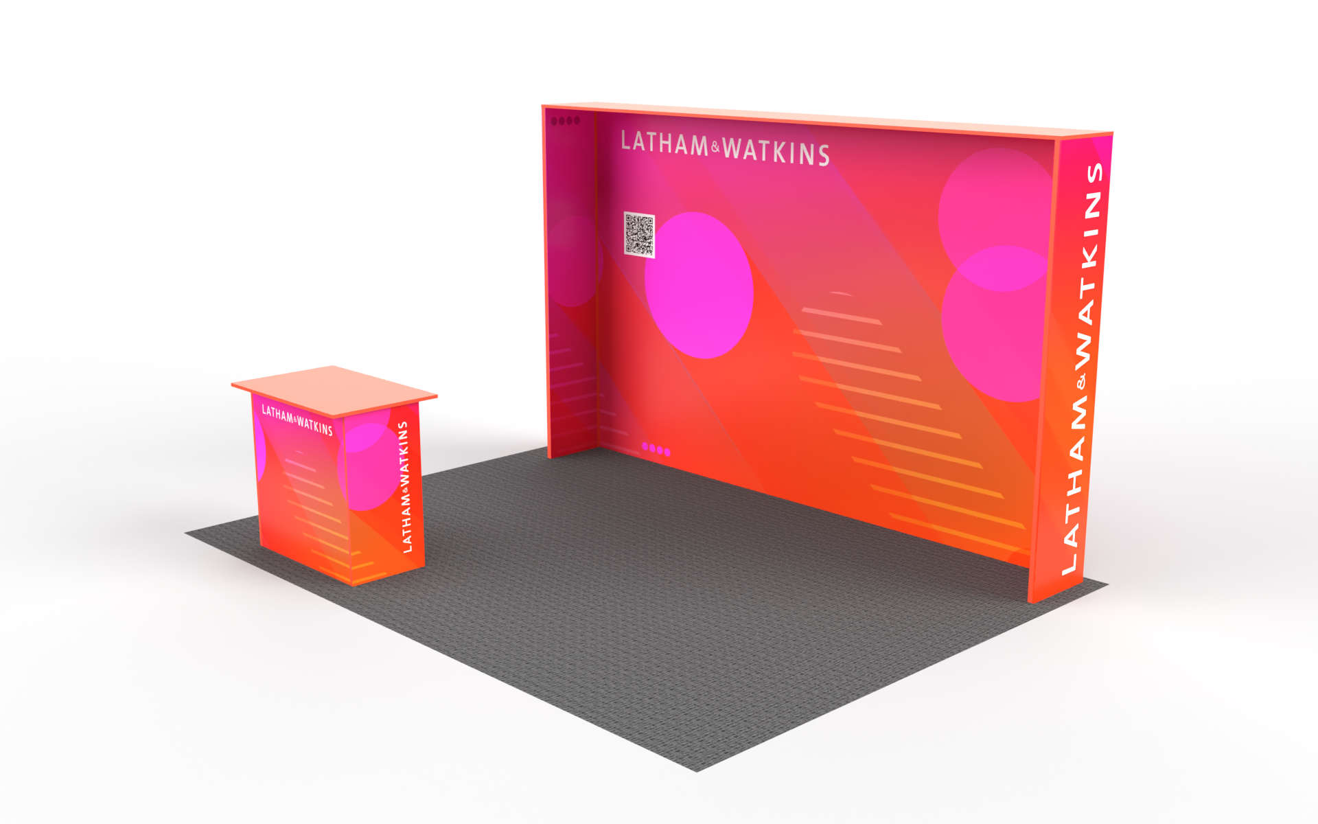
V2


2023 Design Process
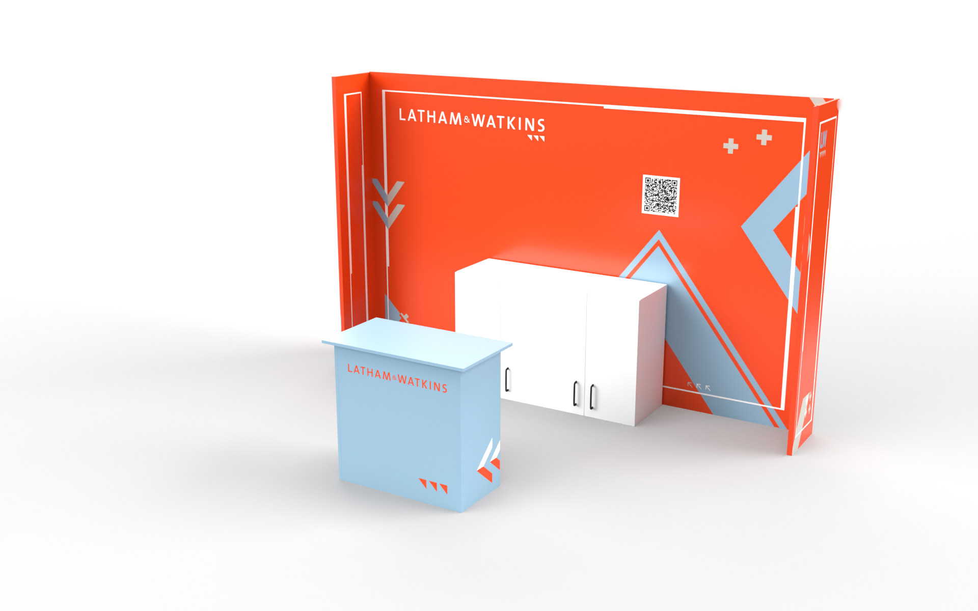
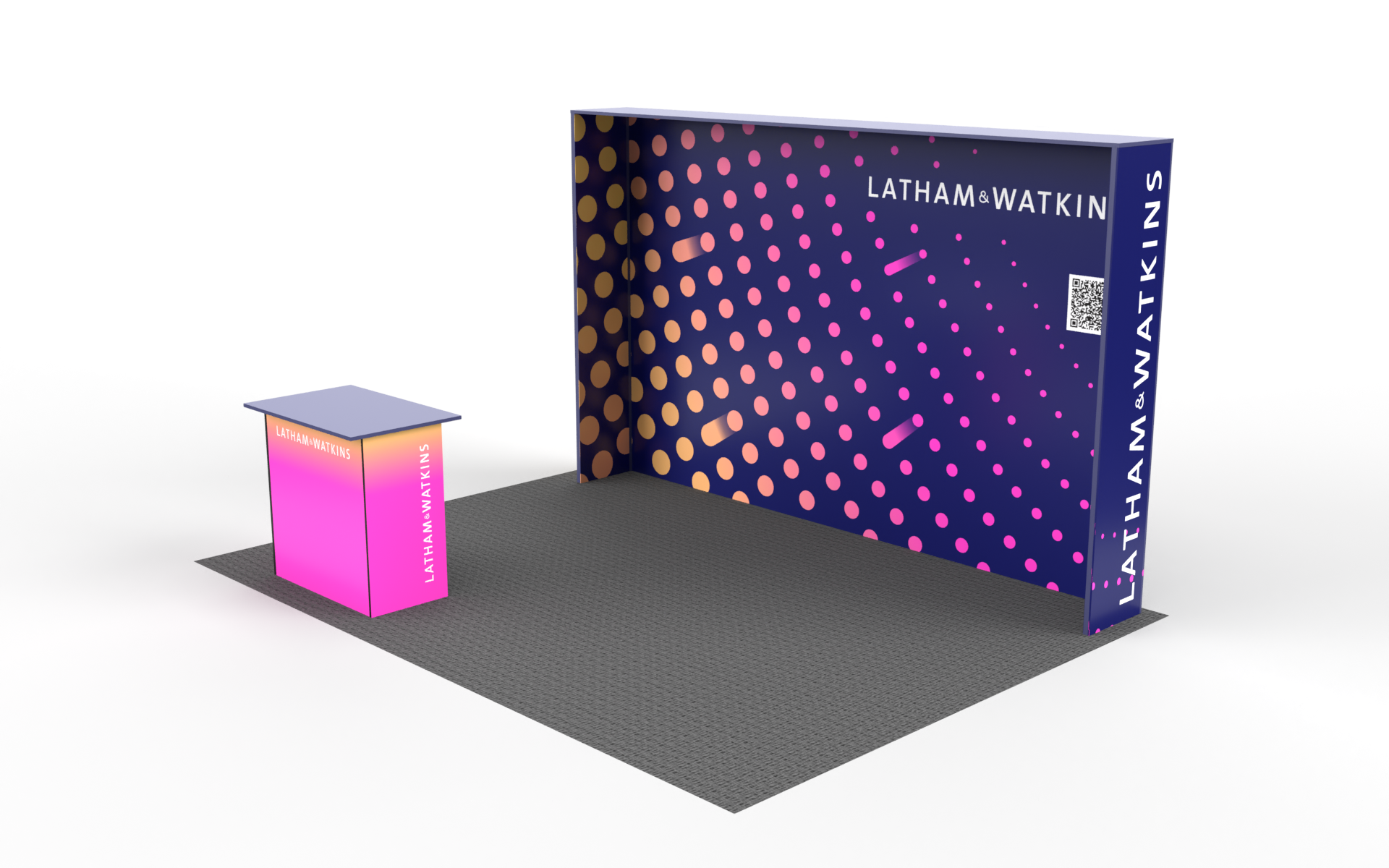
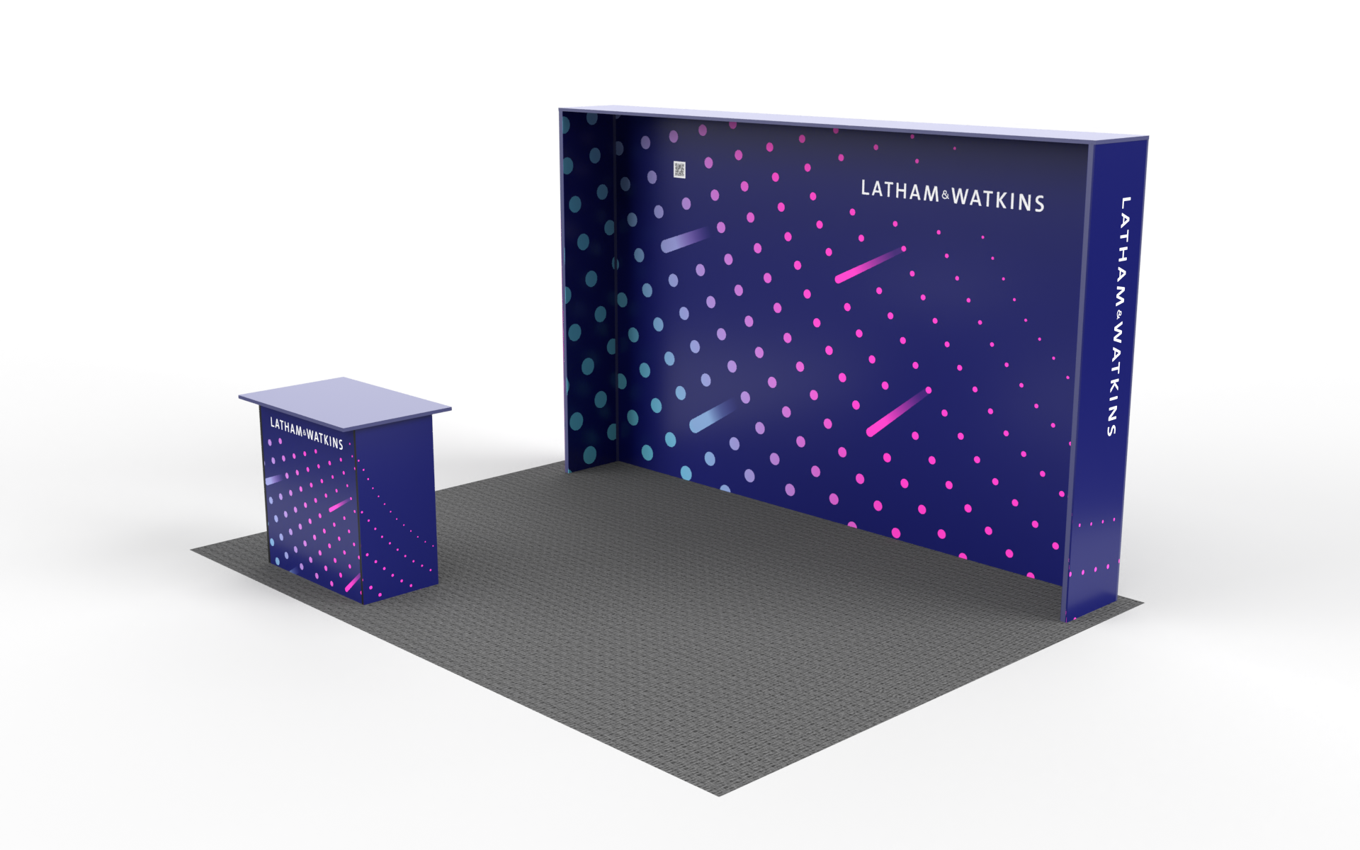
V3

2023 Design Process
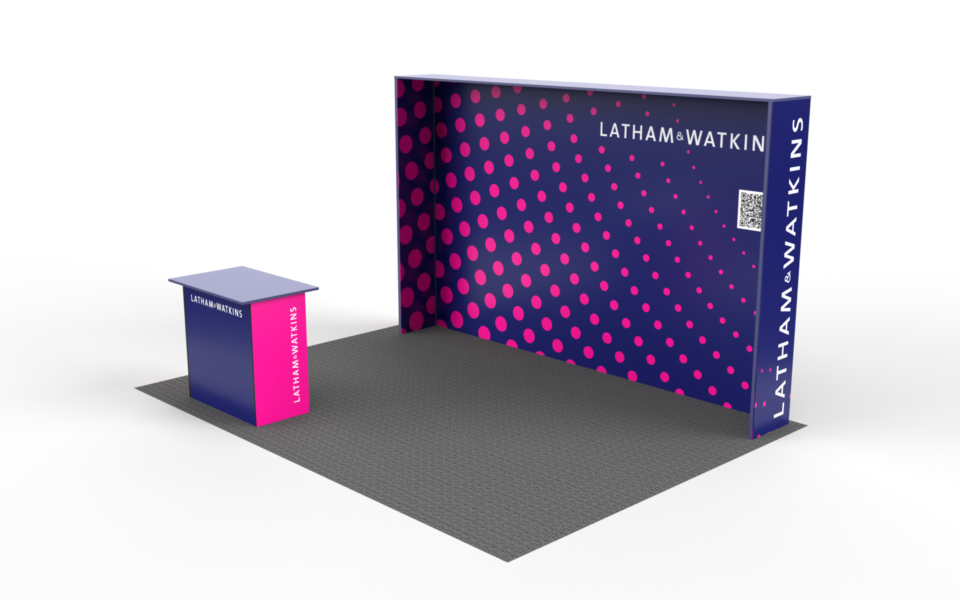
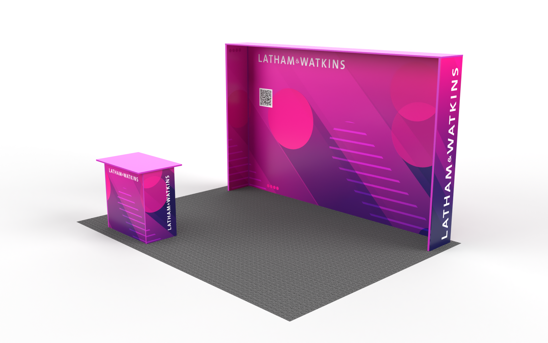
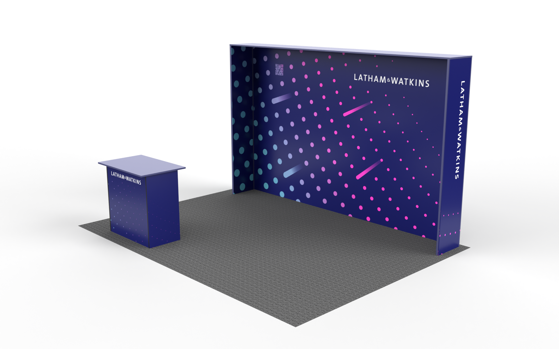
V4